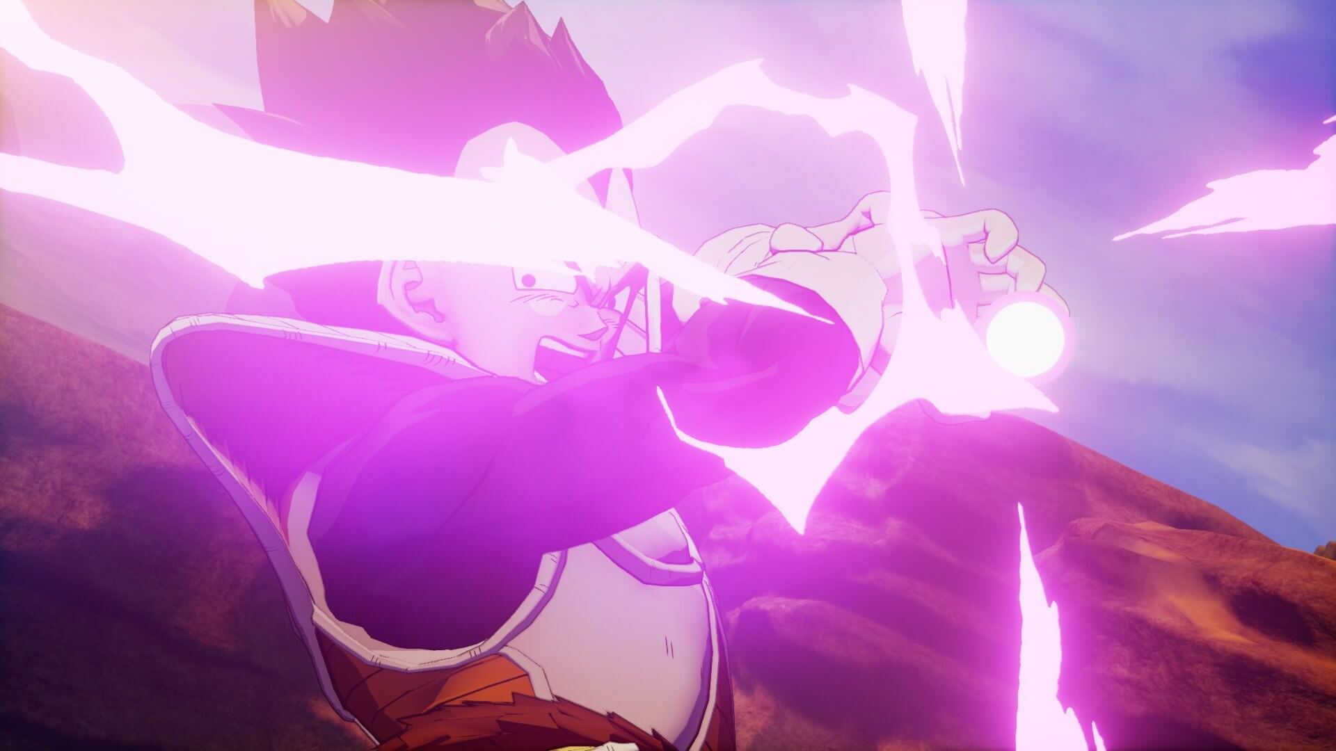
Having fun with it. Glad there is encyclopedia to tell you about the world. The graphics could be better, almost looks like a PS3 game.
It indeed looks quite bad. It's not even just a technical thing, it's more of a lack of art direction I think. Everything lack soul, life, there's something missing and it feels a bit dead. The color palette is also really off, I tried to correct it a bit with reshade but you can't do miracles, for some reasons it's way too saturated and contrasted, looks like playing on a badly calibrated tv. That green grass looks almost like some toxic grass in some areas.
It's weird because it's cyberconnect, they made the naruto storm games which imo are the best looking anime games, even storm 1 from 2008 looks a lot better than this game.
The visuals of this game give some kind of fan made work vibe, literally something that could be "Dragon Ball Z in Unreal Engine 4!" on youtube.