You are using an out of date browser. It may not display this or other websites correctly.
You should upgrade or use an alternative browser.
You should upgrade or use an alternative browser.
FINAL FANTASY XV - Niflheim Base Battle Footage
- Thread starter The Last One
- Start date
- Status
- Not open for further replies.
Honestly this isn't that big of a deal in the end and I don't know if many people feel this way but I really feel like the UI's style was at its best at the E3 reveal back then. I'm not talking about the features but the look of it. It's always been minimalistic but I really feel like they've been slowly taking out little things that made it unique.
The health bars in the lower right look so generic now.
The UI at the right is visually near the exact same as E3 2013. The other stuff is just new mechanics in FFXV.
When more mechanics are introduced, you see stuff like this more and more. FFXV at E3 2013 had an incomplete UI that didn't even function at times since it was plastered on.
Ser Pounce
Member
That looks incredibly cool. I haven't had the chance to play Duscae, but to those who have, does this gameplay look significantly different/improved?
TheGreatLugia
Banned
I just noticed the subtitles have Ignis saying "Noct" instead of "Highness" so maybe there's hope that Ignis' personality changes in the dub have been dialed back a bit.
BLACK AMERICAN PSYCHO
Junior Member
Going to be the greatest jrpg of all time.
That looks incredibly cool. I haven't had the chance to play Duscae, but to those who have, does this gameplay look significantly different/improved?
It looks very improved. Duscae didn't have aerial combat or magic. The camera also looks to be very improved.
DirgeExtinction
Member
Stealth sections :/ noooooooo
I'll no doubt just try and power my way through
Good thing stealth is optional.So dark can't see shit
Stealth is auto suck
But ending with stella dragoon is good
Blackleg-sanji1
Banned
It looke loads better than the demo which actually says alot because the demo wasn't to bad itself. Here it looks more refined, more variety,magic etcThat looks incredibly cool. I haven't had the chance to play Duscae, but to those who have, does this gameplay look significantly different/improved?
Japanmanx3
Member
Looked so much more fluid and faster than Duscae. Wow.
KCroxtonJr
Member
It looks MUCH better. And I really enjoyed duscae 2.0 combat so I'm super hype.That looks incredibly cool. I haven't had the chance to play Duscae, but to those who have, does this gameplay look significantly different/improved?
GoodMorningPluto
Member
Do we know what are blue and orange bars on left side?
Combat looks fun, but somehow this new UI annoys me. Like its taking too much space on the screen.
Combat looks fun, but somehow this new UI annoys me. Like its taking too much space on the screen.
I didn't see the ATR as I just woke up and haven't seen the YouTube video yet either. But was the Nilfheim villain they were going to show this Aranea Highwind lady?
She controls a mercenary group. But she is affiliated with Niflheim. She's not the main bad though.
generic_username
I switched to an alt account to ditch my embarrassing tag so I could be an embarrassing Naughty Dog fanboy in peace. Ask me anything!
Thanks for the replies everyone. Super hyped about this now!
Dark_castle
Junior Member
My thoughts:
- I really like that we can issue specific command to ally, especially with Ignis being able to mark certain spots for warp, and Prompto's strategic lighting effect that can help stuns nocturnal enemies or brighten the environment to see clearer. Lack of character switching doesn't matter me at all now. Hopefully more abilities will be unlocked that are useful in or outside of battles.
- Looks like we can now warp outside of battle(?). If so, that's great.
- Stealth section was surprisingly not very sluggish because warp and warp-kill makes the section fast-paced.
- Noctis's jump and jump attack seem to be better now, general animations tad more fluid and responsive, attacks seem quicker, though unfortunately holding to attack seems to be in place still. Noctis just feels more acrobatic and agile in general than the demo.
- Manual weapon switching is great.
- Cross chain system is improved with no more piss pool indicator, also seem more seamless now. Group combo has that Dragon's Dogma cinematic angle, which is kinda cool.
- Aerial combat is not 100% smooth, but it looks fairly functional if tad basic. Has potential to be a big part of the battles.
- Camera seems like a big step up from Episode Duscae, with some room for improvement.
- Magic looks sweet, and I love that Magic has influence from environment, and they're emphasizing on quality over quantity. Three basic elements, probably a couple more that's yet to be revealed, each with their useful characteristic and purposes apart from dealing damage. Sounds good to me.
- Great music, atmosphere, though environment seems a little empty. Hopefully that's just the specific base.
Overall: ALL MY YES.
I'm on board with the hype train again. Don't let me down, Tabata.
BlazingDarkness
Member
I didn't see the ATR as I just woke up and haven't seen the YouTube video yet either. But was the Nilfheim villain they were going to show this Aranea Highwind lady?
Partly.
They also revealed details of the Empire, the character names, and a new enemy that looks like a Judge.
I just noticed the subtitle have Ignis saying "Noct" instead of "Highness" so maybe there's hope that Ignis' personality changes in the dub have been dialed back a bit.
Huh, good observation.


The UI at the right is visually near the exact same as E3 2013. The other stuff is just new mechanics in FFXV.
When more mechanics are introduced, you see stuff like this more and more. FFXV at E3 2013 had an incomplete UI that didn't even function at times since it was plastered on.
Look I know this is a silly detail but I really miss the little diamond with a line running from it motif they used to have. It added a little personality. I know the E3 2013 stuff was a mockup but it was still there right before duscae and duscae itself had it but without the line. And now it's just blank boxes.
I know I'm being nitpicky as hell here though!
Ghost Slayer
Member
Do we know what are blue and orange bars on left side?
Combat looks fun, but somehow this new UI annoys me. Like its taking too much space on the screen.
That UI is not final. They said they still working on it
Really wish we could control other party members :
There wouldn't be a point to it, Noct is the jack-of-all trades who can use all of the weapons the other party members are using and has way more abilities and moves. Nomura actually designed him this way since Versus too.
Honestly this isn't that big of a deal in the end and I don't know if many people feel this way but I really feel like the UI's style was at its best at the E3 reveal back then. I'm not talking about the features but the look of it. It's always been minimalistic but I really feel like they've been slowly taking out little things that made it unique.
The health bars in the lower right look so generic now.
I don't know what it looked like at E3 2013, but I agree the UI looks extremely generic. To me, it just looks bland. Also, the environment looks... empty? I'm guessing it's like that to give you room when you fight but still. I'm not liking the artistic "style" of this clip at all.
That being said, the actual fighting looks good. This clip still has me interested.
DirgeExtinction
Member
They've said your allies have their own character skill trees that'll allow you to help them grow with better skills and (I think) commands.My thoughts:
- I really like that we can issue specific command to ally, especially with Ignis being able to mark certain spots for warp, and Prompto's strategic lighting effect that can help stuns nocturnal enemies or brighten the environment to see clearer. Lack of character switching doesn't matter me at all now. Hopefully more abilities will be unlocked that are useful in or outside of battles.
- Looks like we can now warp outside of battle(?). If so, that's great.
- Stealth section was surprisingly not very sluggish because warp and warp-kill makes the section fast-paced.
- Noctis's jump and jump better seem to be better now, general animations tad more fluid and responsive, attacks seem quicker, though unfortunately holding to attack seems to be in place still. Noctis just feels more acrobatic and agile in general than the demo.
- Manual weapon switching is great.
- Cross chain system is improved with no more piss pool indicator, also seem more seamless now. Group combo has that Dragon's Dogma cinematic angle, which is kinda cool.
- Aerial combat is not 100% smooth, but it looks fairly functional if tad basic. Has potential to be a big part of the battles.
- Camera seems like a big step up from Episode Duscae, with some room for improvement.
- Magic looks sweet, and I love that Magic has influence from environment, and they're emphasizing on quality over quantity. Three basic elements, probably a couple more that's yet to be revealed, each with their useful characteristic and purposes apart from dealing damage. Sounds good to me.
- Great music, atmosphere, though environment seems a little empty. Hopefully that's just the specific base.
Overall: ALL MY YES.
I'm on board with the hype train again. Don't let me down, Tabata.
KCroxtonJr
Member
Yeah the left side of UI still bothers me as well, takes up way too much space. Also kinda wish the mini-map/radar was square or rectangular instead of circular.Do we know what are blue and orange bars on left side?
Combat looks fun, but somehow this new UI annoys me. Like its taking too much space on the screen.
SolidSnakex
Member
I didn't see the ATR as I just woke up and haven't seen the YouTube video yet either. But was the Nilfheim villain they were going to show this Aranea Highwind lady?
She was one of them, but they also revealed the names of the rest of the characters as well as a new villain named Glauca

DirgeExtinction
Member
What looks empty? The enemy base? What do you expect from one?I don't know what it looked like at E3 2013, but I agree the UI looks extremely generic. To me, it just looks bland. Also, the environment looks... empty? I'm guessing it's like that to give you room when you fight but still. I'm not liking the artistic "style" of this clip at all.
That being said, the actual fighting looks good. This clip still has me interested.
Ugh, do people still not realize the stealth was completely optional? Also, mechs and stealth have been a part of various FF entries throughout the years, so it's nothing new.Add a cardboard box and gadgets and you got MGS. Going to buy the game but shit am I unhappy with this direction.
NoctisVsStar
Member
This footage is apparently from August/Sept according to the ATR. Also Noctis can't hijack the mechs.
flaxknuckles
Member
Now this looks like the Final Fantasy Versus XIII I was excited for so long ago. The stealth section would piss me off if it failed the sequence if you got caught so I'm glad they let it transition straight into battle instead. The warping means I might actually use stealth a bit instead of just bulldozing everything immediately. I hope it comes to PC cus if it does it's a day 1 (after reviews and other user impressions of course).
And that UI is nice and clean like the one in the new Battlefront. I hope they don't change it much.
And that UI is nice and clean like the one in the new Battlefront. I hope they don't change it much.
Huge Succeeded
Banned
any game that reminds me of deus ex, metal gear, and chrono trigger all at the same damn time is a winner in my book
Blackleg-sanji1
Banned
Preach.any game that reminds me of deus ex and chrono trigger at the same damn time is a winner in my book
cleveridea
Member
Is the whole game just that same few guys in your party? Not very colorful or different, one of the things I liked about the older final fantasy games was the diversity of your party's characters.
I know FFX-2 had the 3 female characters but the job/garment system meant at least was variety in that sense.
I know FFX-2 had the 3 female characters but the job/garment system meant at least was variety in that sense.
SolidSnakex
Member
Is the whole game just that same few guys in your party? Not very colorful or different, one of the things I liked about the older final fantasy games was the diversity of your party's characters.
I know FFX-2 had the 3 female characters but the job/garment system meant at least was variety in that sense.
Additional characters will join them every now and then, but it's primarily about a journey with those four.

E3 '13 (mockup)

Pre-duscae

duscae
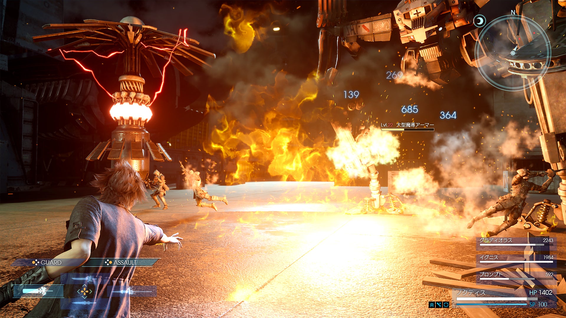
now
You guys see what I mean about the little diamond motif? Again this is so nitpicky, sorry, but the UI looks way too bland right now and I think it used to be better in that regard.
I think i will order the special edition ps4 for this game, because we all know its coming.
There better be!! Even if it's just Japan only I don't care I'll import.
Is the whole game just that same few guys in your party? Not very colorful or different, one of the things I liked about the older final fantasy games was the diversity of your party's characters.
I know FFX-2 had the 3 female characters but the job/garment system meant at least was variety in that sense.
No the three guys aren't the only ones who will join your party. They are the main character's closest friends and that's the reason they've only showed them so far. We don't know if other character will permanently join your party but we do know two so far that will be guest members.
cleveridea
Member
They sure seem very ambitious with this game, I hope we arent going to see further delays.
Really hope they have a PC version released, the demo ran quite rough on console (though they have plenty of time to improve it of course)
Really hope they have a PC version released, the demo ran quite rough on console (though they have plenty of time to improve it of course)
DR2K
Banned
None of that looked like fun, it looked like a bunch of mediocre western mechanics from other genres thrown in together(shooting section, supposedly optional stealth, cinematic after cinematic which look like one big qte without the obvious button prompts) or even an RPG outside of hit points being displayed.
Lighting looks good. They picked a good section to show off the stronger aspects of their engine. (Animation, lighting) while hiding behind the simplicity of a generic cargo bay.
Lighting looks good. They picked a good section to show off the stronger aspects of their engine. (Animation, lighting) while hiding behind the simplicity of a generic cargo bay.
You guys see what I mean about the little diamond motif? Again this is so nitpicky, sorry, but the UI looks way too bland right now and I think it used to be better in that regard.
I see what you mean. I thought it looked cool too, but the new UI maximizes on the space it takes up. It's more efficient now, I think.
That pointy thing is still for every other thing in the UI from what we've seen, like items and the menu.
The problem with directional buttons being mapped to weapon switching is that the UI has to reflect that. It takes up a lot of space.
bloodforge
Member
Damn that looked fantastic.
Liquid_015
Gold Member
You guys see what I mean about the little diamond motif? Again this is so nitpicky, sorry, but the UI looks way too bland right now and I think it used to be better in that regard.
I totally understand. I loved the UI design from E3 13. It's simple and easy to look at without taking too much space on screen/during gameplay.
As of now, the current UI looks like a merge of Type-0 and minimalism - looks very clustered especially when enemies on screen. I honestly hope Tabata can bring back the weapon display from the E3 UI.
Is it me or does anything think the appearance of the weapon wheel when Noct switches weapons look weird and out of place?
PeterLegend
Member
Dragoon lady is back, I'm hyped!
Blackleg-sanji1
Banned
1.what!?None of that looked like fun, it looked like a bunch of mediocre western mechanics from other genres thrown in together(shooting section, supposedly optional stealth, cinematic after cinematic which look like one big qte without the obvious button prompts) or even an RPG outside of hit points being displayed.
Lighting looks good. They picked a good section to show off the stronger aspects of their engine. (Animation, lighting) while hiding behind the simplicity of a generic cargo bay.
2. What do you want it to look like? Its a simple enemy base not a main base or anything
Se7enSword
Banned
I'm back on the hype train, I guess.
The battle footage was amazing, and dragoon lady was boss.
Weapon switching was seamless and beautiful.
The battle footage was amazing, and dragoon lady was boss.
Weapon switching was seamless and beautiful.
- Status
- Not open for further replies.