teruterubozu
Member
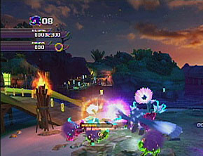
Metroid Prime


It's hard to express how beautiful this game is with just screens. The level design, music, atmosphere, architecture - everything is flawless. It's like playing a game Brian Eno would make.
Metroid Prime

Gorgeous corridors...
No, see, these are just bad. The games might look pretty, but the art direction itself is horrible.
Mirror's Edge, where realism meets color.


It's hard to express how beautiful this game is with just screens. The level design, music, atmosphere, architecture - everything is flawless. It's like playing a game Brian Eno would make.
Art direction is not just art style. It also involves how the game uses architecture to set an emotional tone, how lighting is used to convey information, camera angles for cutscenes and how space is used to set scope (how small spaces can make you paranoid or claustrophobic, while vistas and skyboxes feel epic and grand in stature), how character clothing conveys a certain style or national background, etc.
There are a lot of people in this thread who are basically posting games strictly because they are pretty. Some games are both pretty and have great art direction, others are ugly but have good art direction, others are pretty but have poor art direction.
Deadly Premonition is an example of a game that doesn't really look that great but that has great art direction. The way things are laid out in the town, the sense of scale, the way all the normal level designs "invert" when you are in the combat scenarios, the biome conveys that sort of mysterious cold foggy great ancient redwood Washington/BC feel, things like the coffee, the flies and beard that follow York around if he's dirty, the day/night cycle. But yeah, it looks like a PS2 game, kind of. But that's okay.
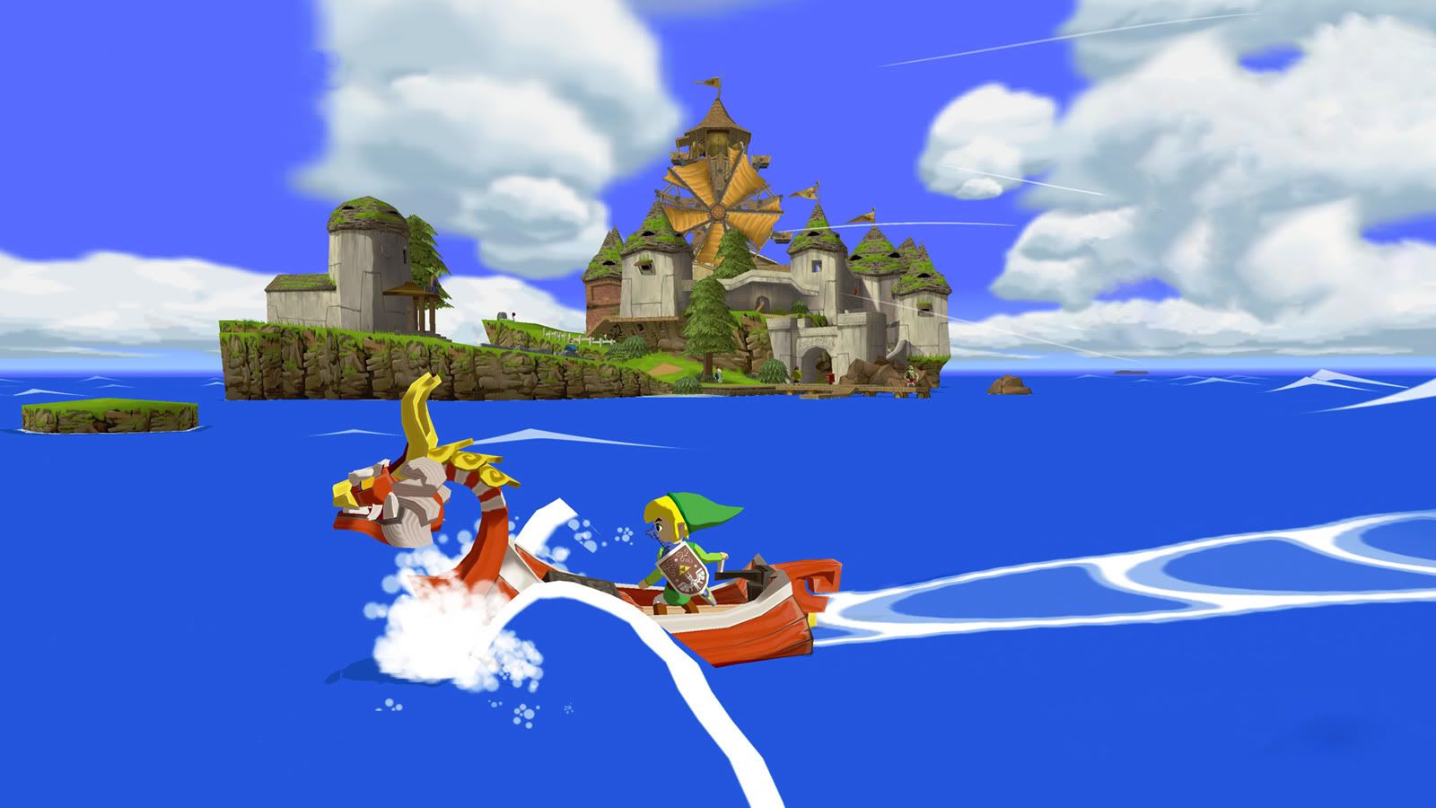
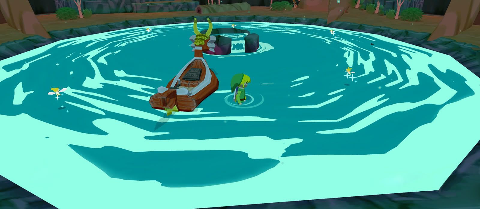
Bully and Mafia II both have great art direction in the way they deal with the passage of time. Zelda and Metroid both have very striking use of biomes and architecture and strongly themed areas to convey certain moods. Assassin's Creed 1 was hideous to me at least in part due to the scorching, bleaching lighting setup, but that did a good job of conveying what I expect the Middle East looks like. Mirror's Edge used really stark, clean environments to set up the theme that the world was safe, secure, and prosperous--by ruled by a panopticon surveillance and censorship regime.
Psychonauts, I thought had strong art design. The Milkman Conspiracy level's dimension bending, the Meat Circus level's clash of realities, the overall design and environment of the summer camp in general, the Fever Dream Neon Mexican Luchadore level. Great choices.


Aw, hell no.No, see, these are just bad. The games might look pretty, but the art direction itself is horrible.
Agreed. Screens do NOT do justice to Metroid Prime. Such breathtaking art direction.


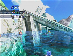
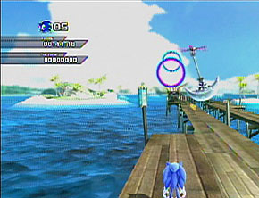
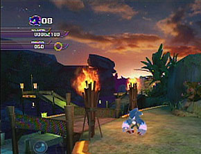
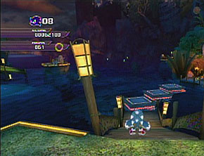
I just want to say that Adabat is so damned beautiful. God, the lighting and environmental design is exquisite. All of the environments in this game are beautiful (ex: Chun-nan, Apotos, Shamar), but Adabat really stands out to me. A nice, but very muddy-looking video comparing both the HD and Wii versions is here.
So pretty. :3


Eternal Sonata and Fragile Dreams needs mention.


Limbo has like no art direction. Dirty the other beautiful games in the OP with it.

Deus Ex: Human Revolution
Dark Souls, Paper Mario: TYD, El Shaddai.
One another note, I can't stand the way Okami looks. It boggles my mind that people praise it so much for it's art direction.

Aw, hell no.
Valkyria Chronicles has horrible art direction? What? Tales of Symphonia too? Have you played these games?

Hotel Dusk - Room 215 had a great style. The overall quality was pretty inconsistent though.
cntrl-f enslaved
c'mon son.
This is a very good post. I agree that good a art "style" does not necessarily equal "pretty," or even "interesting visuals," but I don't agree with everything you listed contributing to what an art style is. I don't think camera angles in a cutscene, for example, contribue one bit to the actual art style of a game. Everything about the environment, setting, characters could be top-notch, but a bad camera angle is just bad direction/photography/cinematography, nothing to do with the art. Good art design can stand on its own in just its conceptual stages.Art direction is not just art style. It also involves how the game uses architecture to set an emotional tone, how lighting is used to convey information, camera angles for cutscenes and how space is used to set scope (how small spaces can make you paranoid or claustrophobic, while vistas and skyboxes feel epic and grand in stature), how character clothing conveys a certain style or national background, etc.
There are a lot of people in this thread who are basically posting games strictly because they are pretty. Some games are both pretty and have great art direction, others are ugly but have good art direction, others are pretty but have poor art direction.
Deadly Premonition is an example of a game that doesn't really look that great but that has great art direction. The way things are laid out in the town, the sense of scale, the way all the normal level designs "invert" when you are in the combat scenarios, the biome conveys that sort of mysterious cold foggy great ancient redwood Washington/BC feel, things like the coffee, the flies and beard that follow York around if he's dirty, the day/night cycle. But yeah, it looks like a PS2 game, kind of. But that's okay.
Bully and Mafia II both have great art direction in the way they deal with the passage of time. Zelda and Metroid both have very striking use of biomes and architecture and strongly themed areas to convey certain moods. Assassin's Creed 1 was hideous to me at least in part due to the scorching, bleaching lighting setup, but that did a good job of conveying what I expect the Middle East looks like. Mirror's Edge used really stark, clean environments to set up the theme that the world was safe, secure, and prosperous--by ruled by a panopticon surveillance and censorship regime.
Psychonauts, I thought had strong art design. The Milkman Conspiracy level's dimension bending, the Meat Circus level's clash of realities, the overall design and environment of the summer camp in general, the Fever Dream Neon Mexican Luchadore level. Great choices.