In most games, navigating the menu is the first thing that players do, and it's something they do very frequently. The comfort and intuitiveness of the menu is important for a fluid experience and establishing a good first impression.
When Halo 5's menu was designed, it was clearly taking the reception of Halo 4's menu into account. For example, displaying players in a game session as "baseball cards" was replaced with something visually closer to what Bungie's Halo games used, following poor reception of the former. However, I think that the Halo 5 menu could be smoother to navigate and more natural in its layout.
Three issues that stand out:
1-Efficient input use
2-Weird element placement
3-Unnecessary Redundancy
1-Efficient button use
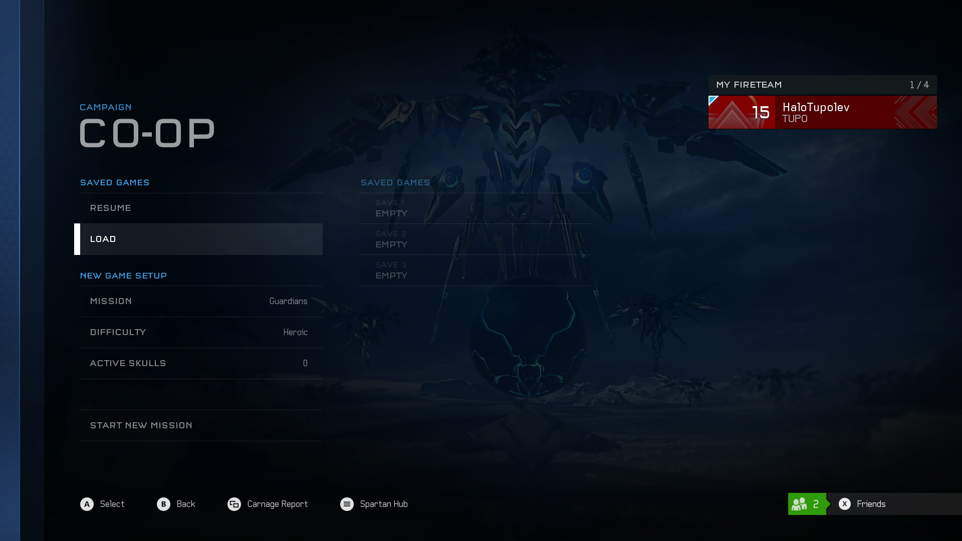
Consider the following screenshot of Halo 5's campaign level select screen.
The option to load a save is currently selected, and to the right is a sub-menu showing the current save slots (all currently empty, but whatever). How do we navigate over to the save slot sub-menu? Since it's lower in the heirarchy, it would make sense that the A button (select) would take us to it. However, since it's sitting to the right, it would also make sense that the right button on the D-pad would take us to it.
So what do we do? Here, Halo 5 chooses the first option: the A button is used to navigate to the submenu. Although this isn't terribly confusing (the bottom of the screen even includes notes describing how to navigate the menu), "why not both" applies. What if I take my right hand off the controller to take a drink, but I want to keep tabbing through stuff? Subtle touches like this, that make an interface "just work" no matter the circumstances, can be the difference between
functional and
great.
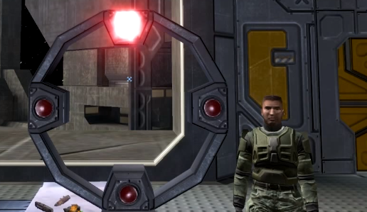
This is all partly puzzling because the Halo series used to experiment with stuff like this. For example, remember this from Halo 2?
A similar feature was first included in Halo 1, and it was used to help the player select between "normal" and "inverted" look. The game would ask you to look at each of the four points, then it would invert your view, and ask you to look at the four points again. At the end of this sequence, Halo 1 asked the player whether they wanted to go back to the first setting or use the new setting.
Halo 2 tried a "why not both" trick to massively streamline the process. The game would light up the top point and ask you to look at it. Regardless of whether you pressed up or down on the analog stick, your character would look up toward the point. The game was selecting "normal" or "inverted" based on how the player responded to the game's prompt, immediately giving the desired result regardless of your preference.
This approach wasn't used after Halo 3; perhaps it was too clever for its own good, making players who didn't understand what was happening think that the game was wasting their time for no reason (often frustrating even if it's actually cutting "filler" out). But such experimentation was a hallmark of the Halo series, and part of why it maintained a good reputation for having a generally slick interface and controls. (And, to be blunt, Halo
used to allow directional and heirarchical navigation in cases where both were applicable).
2-Weird element placement
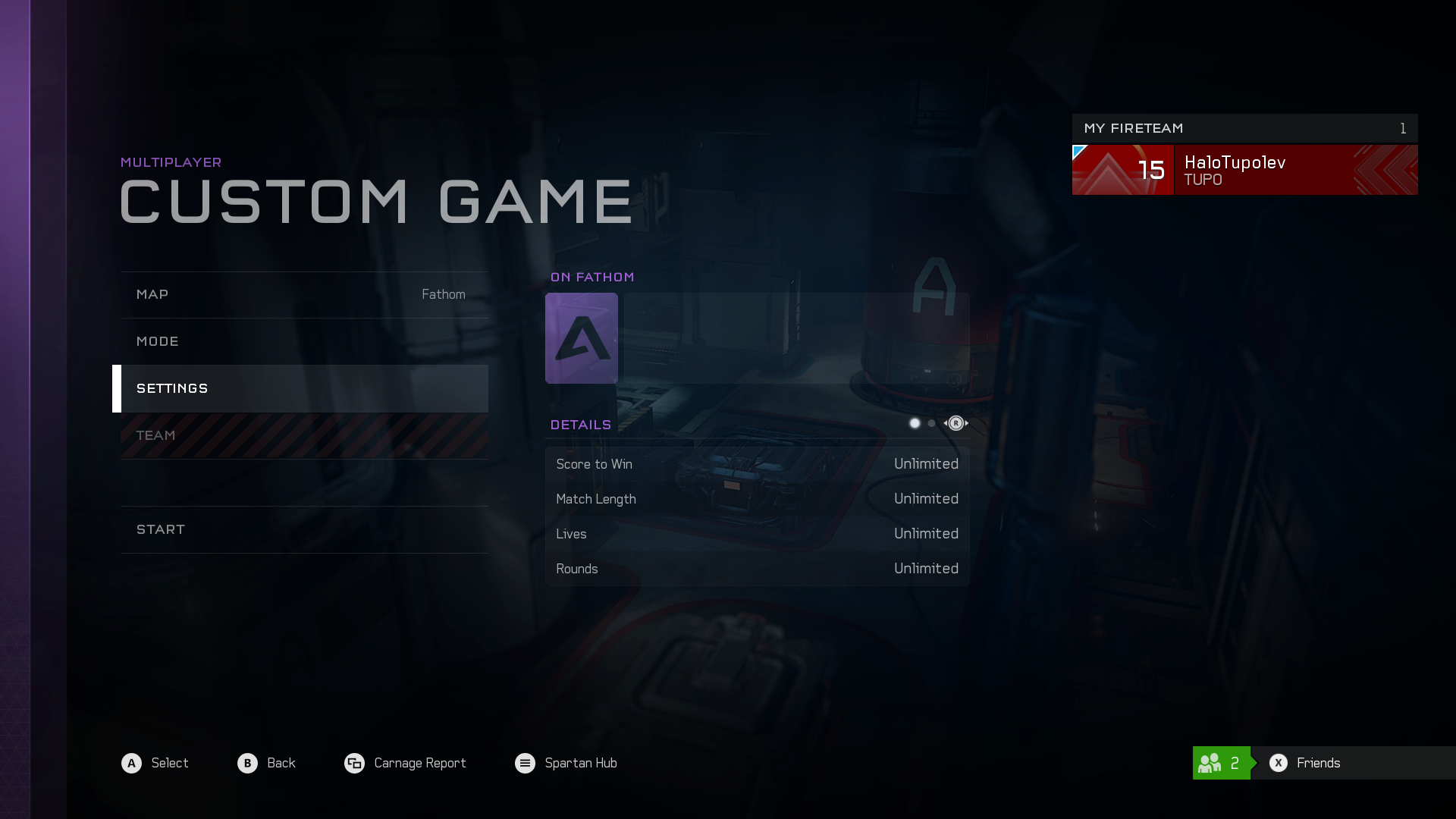
Sometimes things are categorized weirdly. Consider the custom game menu:
In the "my fireteam" list, my player tab on the right side of the screen shows up completely red here because I'm on red team. However, the "team" option on the left side is where I actually select which team I want to be on. It's odd that the selection for team, a per-player attribute, is placed in the area of the screen used for general game setup (map and gametype). This is a bit counterintuitive.
And, due to the team display in "my fireteam", it means that there are two outlets for the same data on the same screen when there could easily just be one. The whole thing just isn't as one-to-one as it seemingly ought to be.
Speaking of which...
3-Unnecessary Redundancy
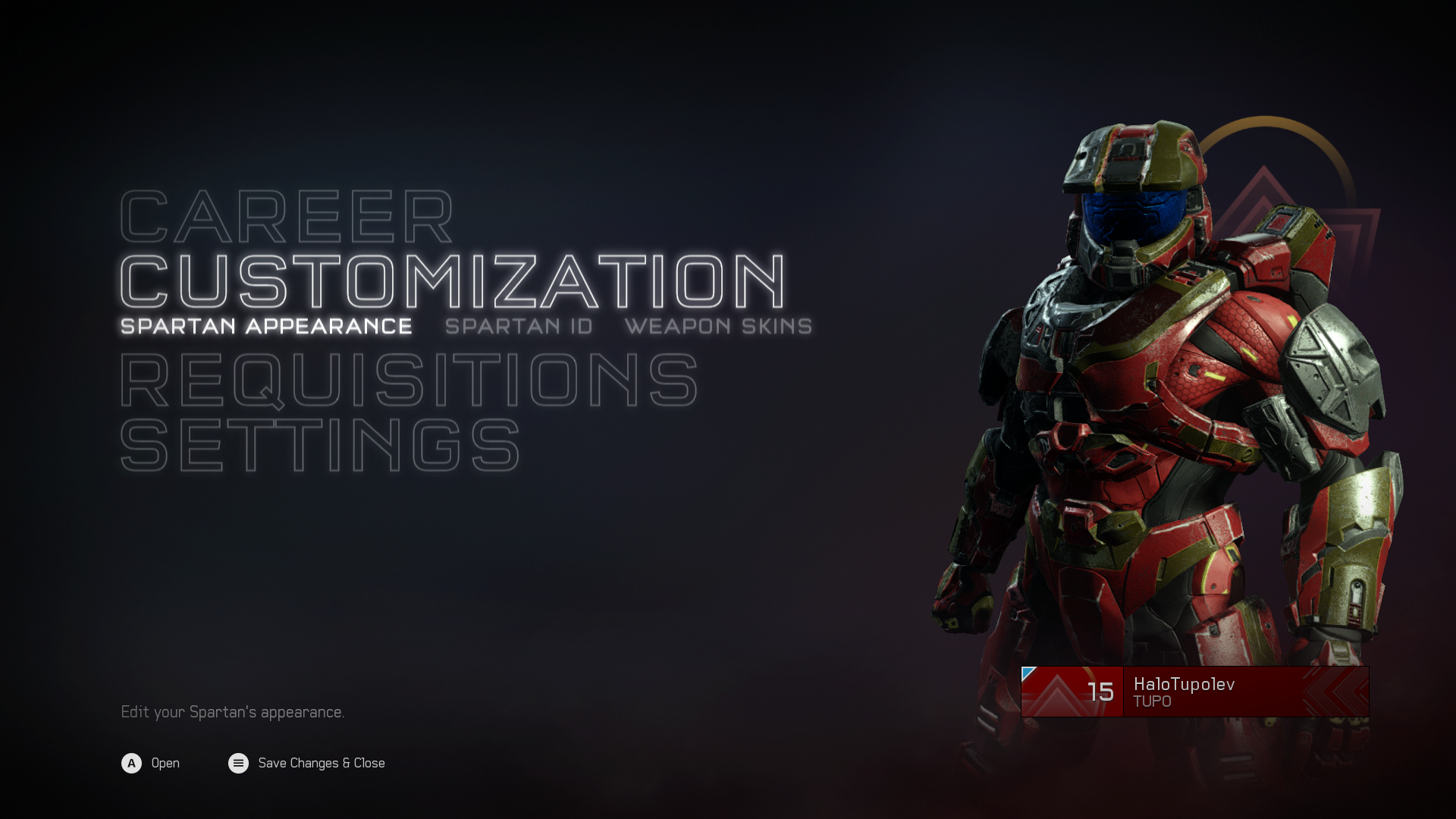
Consider the start button menu.
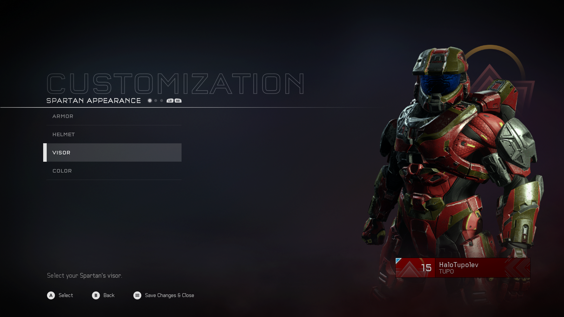
If we select "Spartan Appearance", we come to this menu:
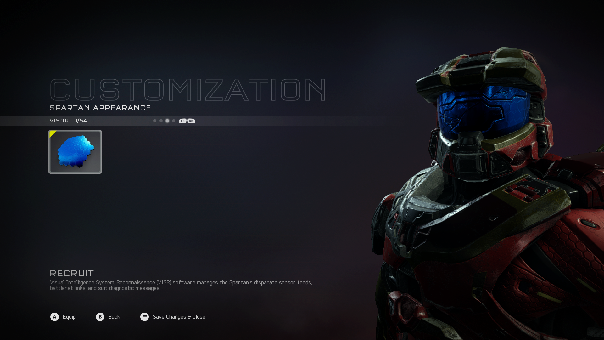
Here, up and down allow is to select customization menus for armor, helmet, visor, or color. If we press "A" to select visor customization, we get this screen:
See those four circles that we can navigate with RB/LB? They're the exact same armor/helmet/visor/color options that existed one level up in the hierarchy. Since it's just an intermediate duplicate of information that exists above and below, why does the level above this one exist? This bottom level of the heirarchy could be tweaked to better-indicate what the LB/RB tabs are, and we could get rid of the above level altogether, producing a clean interface with less layering.

