Majormaxxx
Member
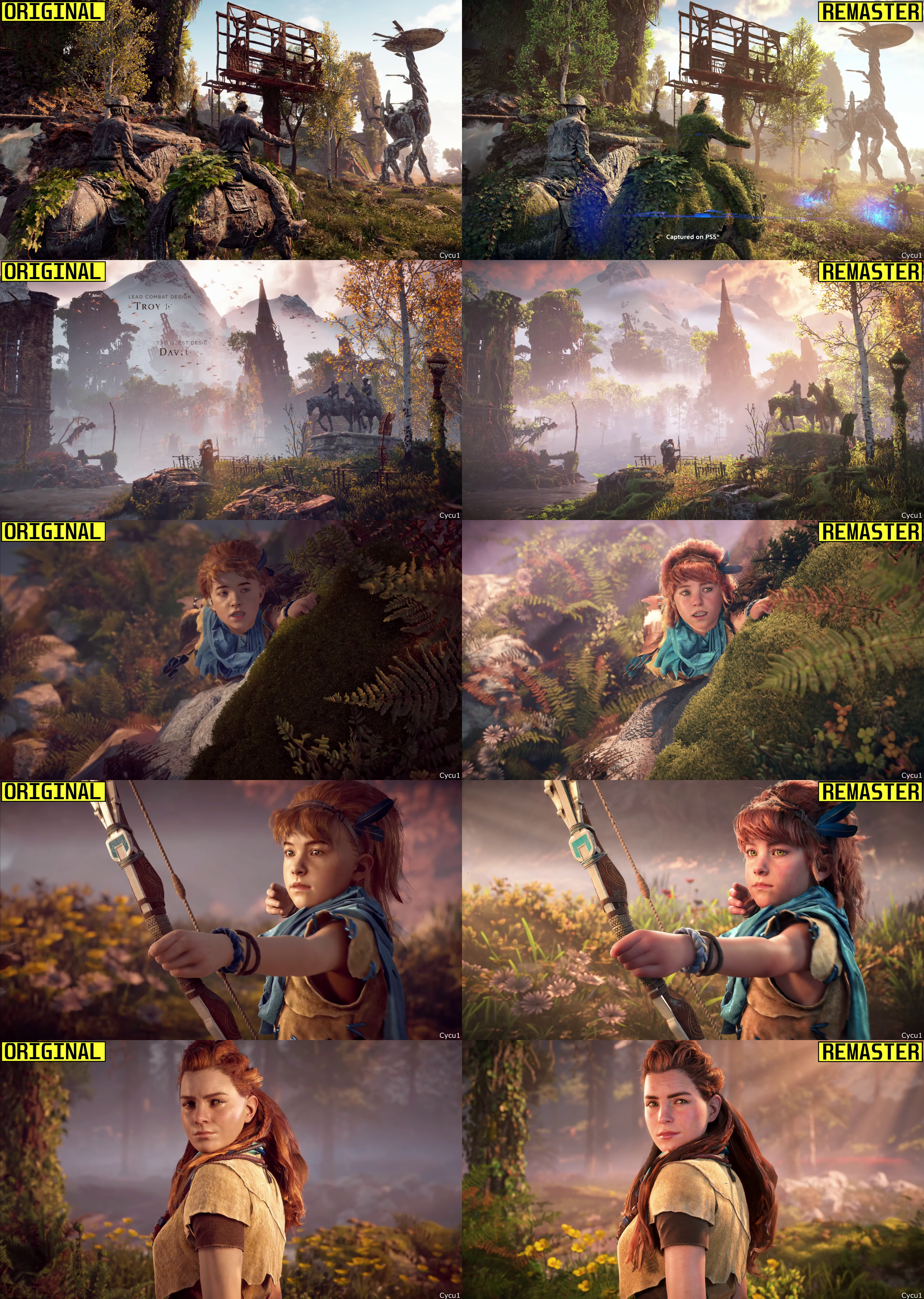
ummm why didn't they fix the cringe model of Aloy as a child. It is so creepy looking.
Character models are 99% the same. That 1% is different hair for Aloy.Have her ears become bigger?
While it definitely looks worse I think the reasoning is they de-aged him for those scenes. In that scene Rost is with a young Aloy whereas in the original in both the young Aloy timeline and grownup he has the same old man model.Most of the trailer looks like difference in color grading and some higher draw distance in some far shots.
Rost looks less detailed in the remaster for some reason. They removed the blemishes from his face and changed his hair color.


What the? Is Sony selling us downgrades?Most of the trailer looks like difference in color grading and some higher draw distance in some far shots.
Rost looks less detailed in the remaster for some reason. They removed the blemishes from his face and changed his hair color.

God of HorizonLeaks of the new sweet baby collaboration on the remaster.

So, is the Remaster for PS3?

New :

Old :

To me, it looks like when phones do that AI face smoothing thing.Everyone got a Botox treatment.
I think the remaster is worse looking.Most of the trailer looks like difference in color grading and some higher draw distance in some far shots.
Rost looks less detailed in the remaster for some reason. They removed the blemishes from his face and changed his hair color.

Looks worse in every shot like they literally turned off Self shadowing.

New :

Old :

$9,99 upgrade or $49.99 for the complete editionThis is a free upgrade?
Coffee > this game.its $10, just dont buy a coffee for a day and you can upgrade.
ill play it again
This game simply does not need a remaster.
This, so much thisIf that's the case, keep playing the original version for free
Problem solved
This looks horrible, reminds me of the Prince of Persia remake.Most of the trailer looks like difference in color grading and some higher draw distance in some far shots.
Rost looks less detailed in the remaster for some reason. They removed the blemishes from his face and changed his hair color.

Done, thanks.What nots to ignore from bandwifth limit exceeded.
Try directupload.eu ?
You'd think this would be something a 4th grader could decipher. But, here we are.If that's the case, keep playing the original version for free
Problem solved
You think this game was made by people who go outside?It all looks too clean, look at the blokes little arts and craft thingy. It's way too blue and pristine now. Like he hasn't spent a day outside.
Looks like a cute kid now instead of a horrendous halflingWere you expecting different from a GAF Horizon Thread?
Not sure how some of those comments will age once gameplay gets compared.. 90% of this is Pre-Rendered vs Real-Time.


I love GAF.. Horizon Threads though..Today's takeaway - more GAF users need vision improvements than once thought!

The eyes look soulless in the remaster

