Guay, RFK and Quinton Hoover... so nostalgic.
If I were gonna try to list some classic Magic artists who best combined a strong personal style with excellent composition, strong technical skills, and a broad imagination (and, er, I had an hour to kill after getting back from a long trip):
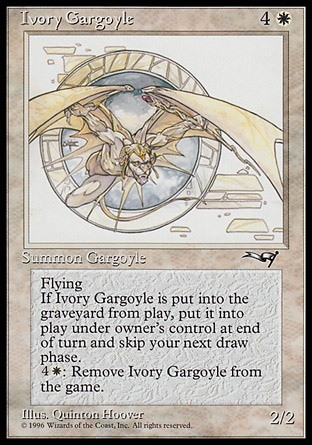
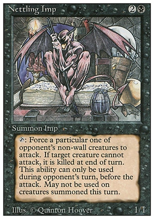
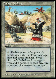
Quinton Hoover
The combination of crisp linework with bold composition and a fine eye for detail made Hoover the standout artist in Alpha, and the last two cards here are still all-time classic illustrations. One of the people whose paintings immediately captured my attention way back in the day.
RIP Quinton.
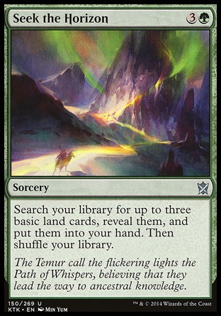
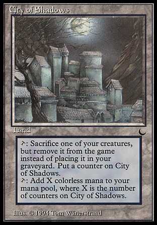
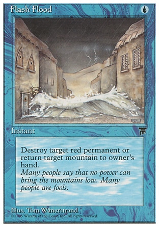
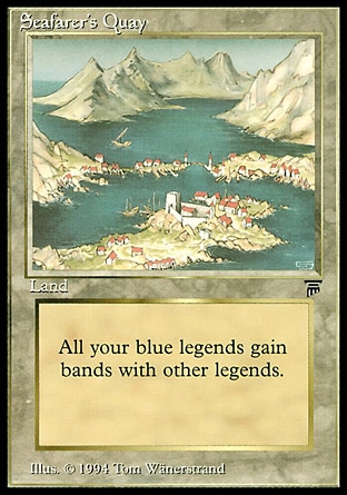
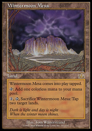
 Tom Wӓnerstrand
Tom's illustrations early on had some of the most interesting use of color -- either heavily muted palettes to give cards a hazy, lost-to-time feeling or oversaturated ones to make them feel extra alive.
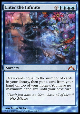
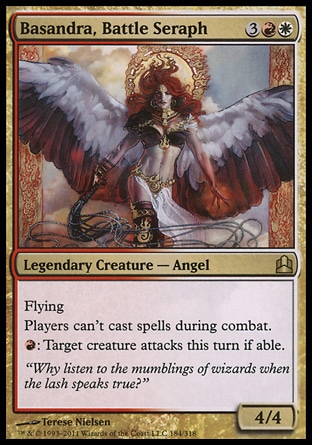
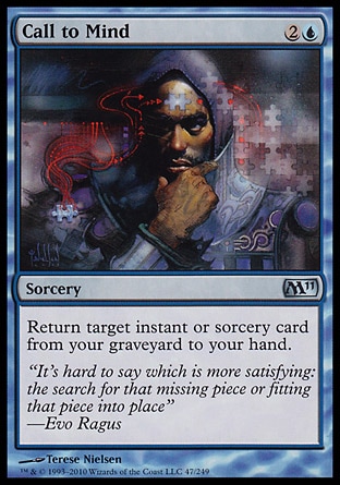
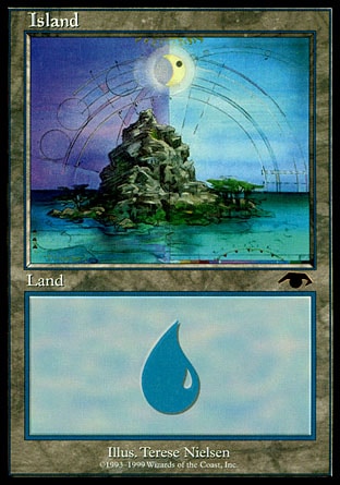
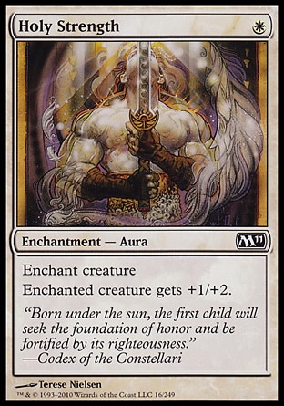
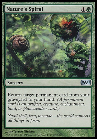
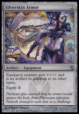
Terese Nielsen
More than probably any other Magic artist, Nielsen combines skill at direct representation with a knack for striking abstraction. Her best stuff ranges all the way from conceptual to fine-detailed realism but stands out either way.
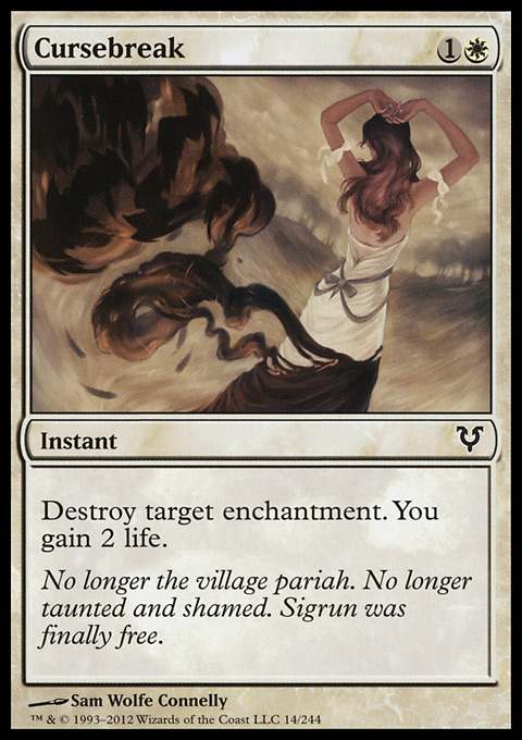
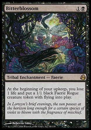
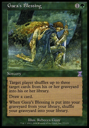
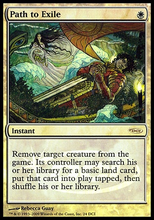
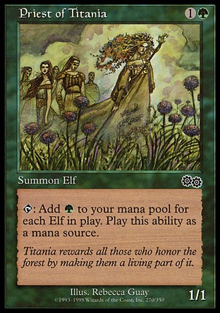
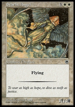
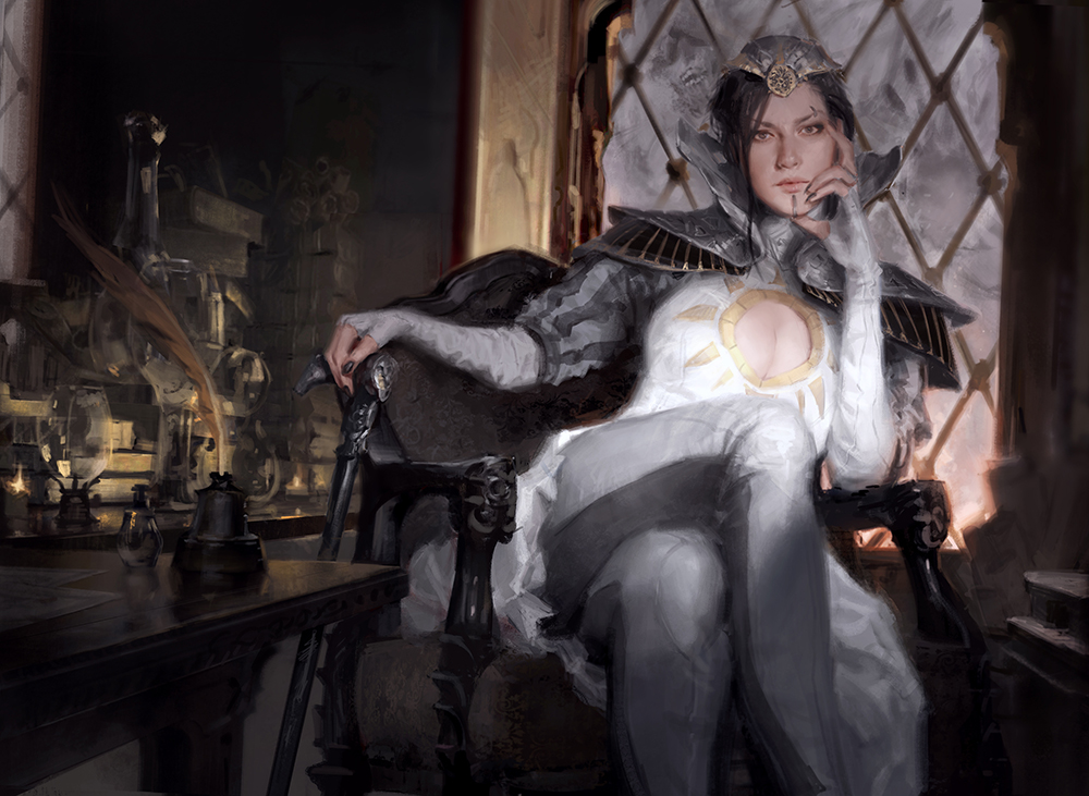
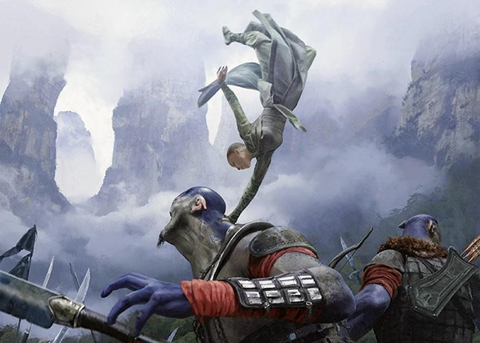
Rebecca Guay
The artist infamously fired by the art director because she wouldn't appeal to the game's target 13-year-old-boy demographic, then brought back when everyone presumably realized how idiotic that was. Her art is beloved for that delicate faerie tale quality; thankfully they got her to provide some excellent pieces for Lorwyn and Theros to play to that strength.
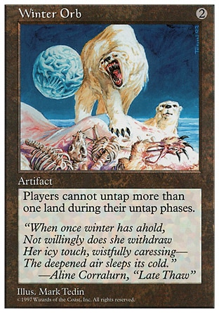
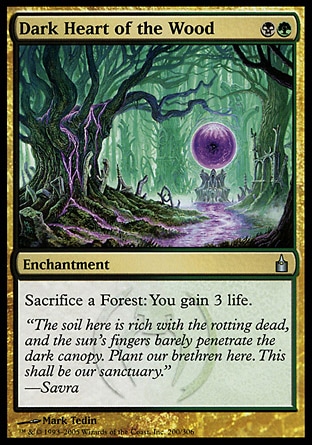
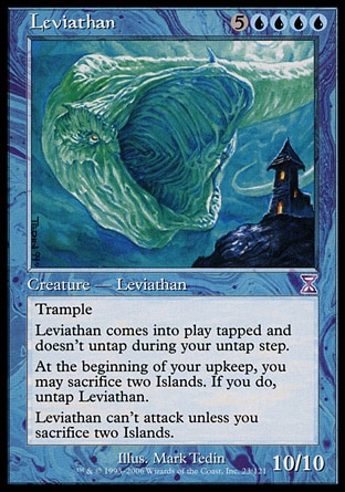
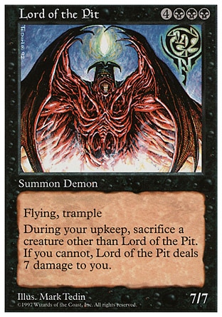
Mark Tedin
Tedin has this great ability to make things look just gnarly and weird. He illustrated a bunch of the best and most famous cards from early in Magic's history and he was a concept artist on many sets so his style is pretty ingrained in the game's history.
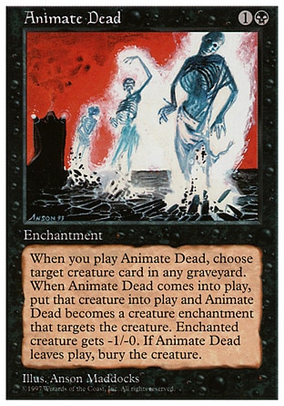
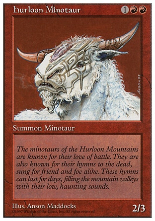
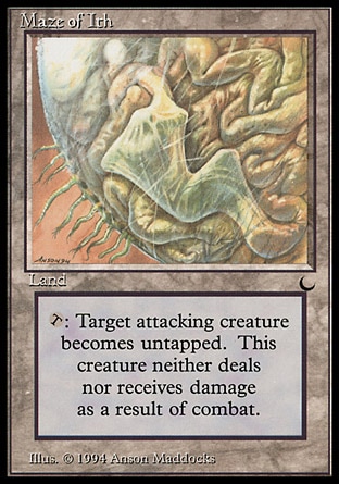
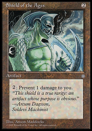
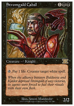
Anson Maddocks
What Tedin does for rough, odd inanimate objects, Maddocks does for smooth organic creatures. His anatomy and odd compositions give his stuff a living feeling that a lot of other artists miss.
Scott Kirshner
Kirschner's stuff looks like an illuminated manuscript gone wrong. Another artist whose work brings a surreal storybook feeling to the game.
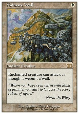
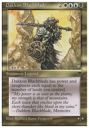
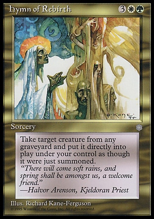
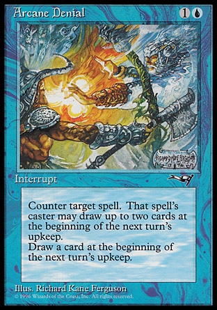
Richard Kane Ferguson
RKF uses excessive detail and bright colors to make everything feel dynamic, and puts a larger-than-life comic-booky edge on the legendary characters he illustrates. Another person who put a really strong stamp on the game early on.
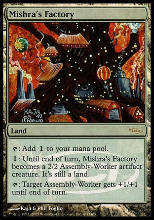
Kaja Foglio
Her husband's more famous, but I always thought Kaja had a great sense of composition and did a great job on some pieces that lightened the tone of the game without just being explicitly silly like Phil's.
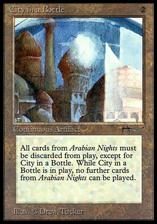
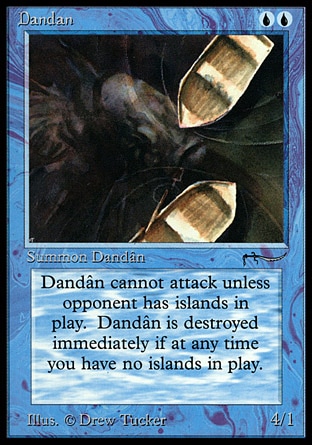
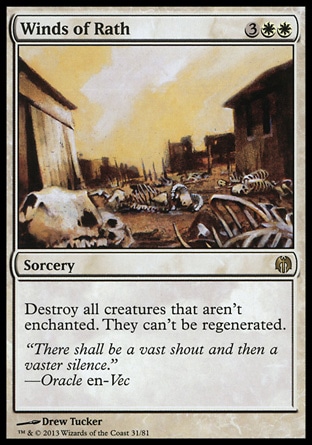
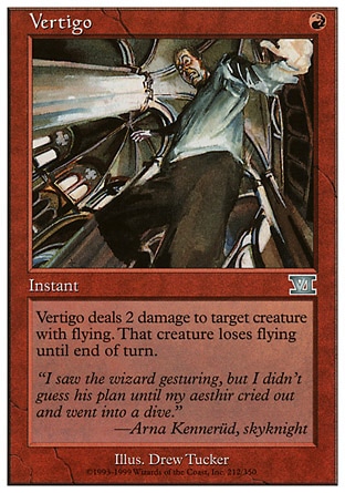
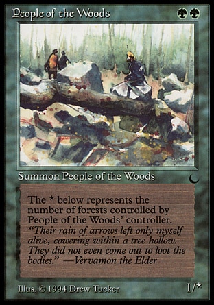
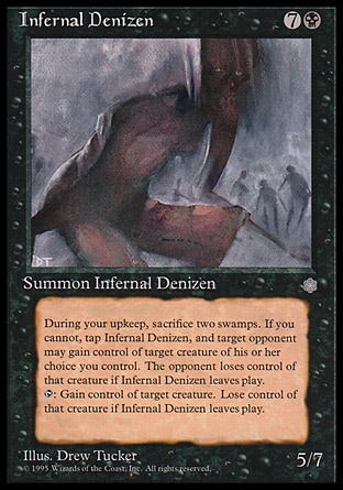
Drew Tucker
I saved the best for last. Drew Tucker is the perfect embodiment of what Magic art is missing out on today: an unrepentant impressionist illustrator whose work uses implication and tone to tell a story in a way that far more detailed artists never could. (And Dandan might be one of the best MTG illustrations ever.)
This list leaves out a bunch that were already well-known for work elsewhere like DiTerlizzi, Brom, Carl Critchlow, Geof Darrow, Donato Giancola, etc.) or those who have a personal style that used to stand out but is now a bit swamped by hyperrealistic digital imitators (thinking mostly of Kev Walker, rk post, and Matt Cavotta here.)
I think any of those would improve things if they were utilized today and allowed to actually follow their own styles -- a lot of these came back for Time Spiral block but weren't able to push the boundaries as hard as they had early on.