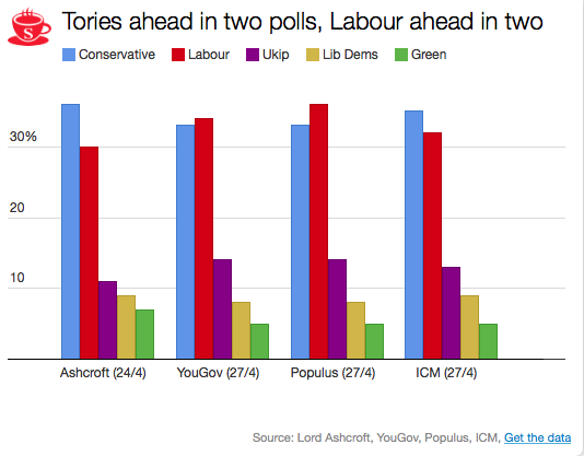
Given this, and in order to help interpret new polls as they are released, the plots below depict the 90% predictive intervals for each party, for each pollster, given their typical sample size (of voters that express a preference), their house effects, and our current national pooled poll estimates. These are estimates of what polls from these pollsters might show if they ran a survey over the last few days. The vertical lines in the graph are the prediction intervals, and the points are actual poll results from the past 10 days.
Two things stand out from these plots. First, we can see the variances for each pollster. As we saw in the plot of the Labour-Conservative margin, the prediction intervals are wide, particularly for the larger parties. This reflects the fact that there is a good deal of uncertainty in individual polls. Second, we can see the relative biases of each pollster. Almost all recent polls fall within the prediction intervals for the pollster that conducted them. This suggests that even polls that seem to show relatively large changes have been within the expected range of estimates for that pollster.
How should these prediction intervals inform our interpretation of new polls? First, if a new poll comes out, and it is inside the range we show for that pollster for all parties, this is an indication that the poll is not surprising given that pollster’s house effects and where the polls are more generally. To reiterate: this can occur even if the pollster shows a substantial swing from their previous poll, as there is substantial uncertainty in every poll.
Second, if a new poll comes out, and it is outside the range we show for that pollster for one or more parties, there are two possible interpretations. Either this is one of the 1 in 10 polls that will inevitably fall outside a 90% prediction interval, or there is some recent movement in the support for the parties that our model has not yet incorporated. While the latter is the more exciting interpretation, the former will usually be the correct one.
So, if a new poll is inside our prediction interval for that pollster, it probably indicates nothing has changed, and if it is outside our prediction interval for that pollster, it still probably indicates nothing has changed. This reflects the fact that, in general, no single poll is going to give a very strong indication that public opinion has actually changed. As these plots show, individual polls are too uncertain, relative to the magnitude of real swings in voting intention. The only way we can be confident that change has occurred is if we see evidence from many polls, each taken in the context of what the corresponding pollsters had found in their previous polls.


