TurnipFritters
Member
tbf that was only 100 bucks and you got both raidou versus king abaddon and nocturne maniax chronicle edition
It kind of beats paying 300 dollars just to get Raidou in Nocturne.
Wow, I don't even spend that kind of money on waifus!
I don't spend any money on waifus.
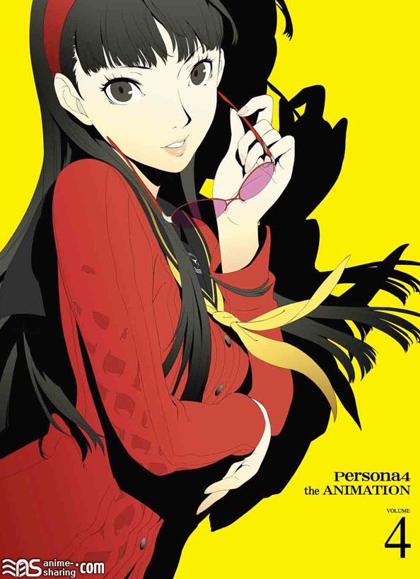
But you bought Persona 4.
Unrelated, but the full art for the Persona 3 Drama CDs (Daylight & Moonlight) is AWESOME.
...post it.

The protagonist's side is used as the cover for Daylight. Aigis's side is used for the follow up drama CD, Moonlight. It's by far one of my favorite Soejima drawn images, perhaps second only to my avatar.
Awww yeah already added it to my desktop slideshow
The protagonist's side is used as the cover for Daylight. Aigis's side is used for the follow up drama CD, Moonlight. It's by far one of my favorite Soejima drawn images, perhaps second only to my avatar.
The protagonist's side is used as the cover for Daylight. Aigis's side is used for the follow up drama CD, Moonlight. It's by far one of my favorite Soejima drawn images, perhaps second only to my avatar.
P3? Or were they introduced with FES? Either way, it's not an excuse for DLC.
I think this illustration is the first time Soejima used his current style. Super fine lineart and much better eye-shapes.
I think this illustration is the first time Soejima used his current style. Super fine lineart and much better eye-shapes.

And yet I'll always miss his crisp original style.
No question, something was lost in the transition.
SMTIV's success makes me happy.
You did good, Japan.
Stealth "too anime" post.
That's the thing I wanna know most about P5: What the characters look like.
And yet I'll always miss his crisp original style.
No question, something was lost in the transition.
For lack of a better term, I think that best describes it. His new P3 art style is borderline generic.

The protagonist's side is used as the cover for Daylight. Aigis's side is used for the follow up drama CD, Moonlight. It's by far one of my favorite Soejima drawn images, perhaps second only to my avatar.
Was this ever a doubt?
How much is a "success" in terms of sales anyway? Never paid attention to numbers, but want success for obvious reasons.
For lack of a better term, I think that best describes it. His new P3 art style is borderline generic.

That's just Soejima imitating Kaneko though, whereas now he does his own thing. It's like when you look at Doi's Trauma Center work, and it's just a blatant Soejima ripoff, then in Trauma Team he got the chance to impress everyone with his own style.
Ken ruins everything.
Well, his characters have been getting more... I don't want to say attractive, because that doesn't seem like the right word, but his female characters post-P4 have gotten more curvy, and he's started giving everyone these really long eyelashes and whatnot. If you compare, say, FeMC to Chie, it's immediately noticeable. I think it will carry on in that direction.
I'm also expecting mega stylish designs. Again, post-P4 it seemed like a conscious decision.
I've never seen Kaneko do a perspective piece like that. To me that's the picture that defines Persona 3, and says that this is the new style.
I think Catherine might be like that because sexuality is such a strong theme in it.
But yeah, it's totally gonna be stylish.
I just wish I was good enough at photoshop to edit him out of the picture.

Confession time: I'm not too big on Kaneko's art style. It works in some cases (Raidou) but usually, he makes his characters look really glossy and weird looking. I hate to be "that guy" but its really apparent when you compare Persona 2 character art to Persona 2 IS. I love Soejima's new style though, so vibrant and colorful.
(uses trafuri)
I'm "good" at photoshop.
How is this anything other than amazing?
How is this anything other than amazing?
I admit, I like Kaneko's monster designs more than I do his human designs.

I admit, I like Kaneko's monster designs more than I do his human designs.
Teehee, you took my awful attempt at making a transparent image and plopped it on there.
You can tell it's bad because you can see all the little artifacts around it.
Mostly because I am lazy and you can't tell they are there on light backgrounds.
Although, it still looks better than having Ken in the photo.
He's slightly abstract. I like him though. I like Doi as well. Atlus has a great team of artists.
What I do is just use the wand in Photoshop to select around the parts I want, then cut it all out, then select the leftover part I want, and paste it into an empty canvas.
But again, I'm no expert. No one notices anyways because it get's shrunk down.
B-b-b-b-but Maki!
Demons are his calling. His people look like vampires. (Only a negative if you consider it one though.)
I didn't say I outright hated them.
His Lucifier design is badass, as are the human designs in Nocturne. Yet I don't care at all for his stuff in DDS for example.
...Come again? :/
Well not always. His designs from Nocturne don't really look like vampires, they're pretty stylized.
Sure, not always. I wouldn't say it about the P2 cast either.
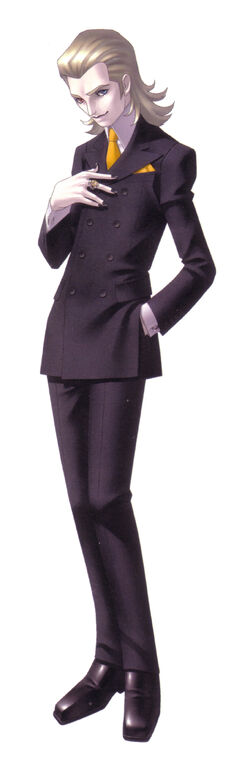
The DDS crew and Raidou in particular are full-on Twilight though.
I don't really like the character designs in Digital Devil Saga.

You both sicken me.
Sure, not always. I wouldn't say it about the P2 cast either.
The DDS crew and Raidou in particular are full-on Twilight though.
Sure, not always. I wouldn't say it about the P2 cast either.
The DDS crew and Raidou in particular are full-on Twilight though.
I think his DDS stuff is the most otherworldly. I just feel a disconnect form it and the characters. :\
i mean the only raidou character that's particularly white is the guy who is literally a vampire so
and i guess gerin and nagi