brandonh83
Banned
:lol :lol @ Playstation Playstation PlaystaionP
Metalmurphy said:That one is awful. The bridge alone with the spaceships would have been so much better.
Ceb said:Before someone quotes your tag, I have to add that I'm not really fond of that one either. It was a weird paint effect to it and due to the bridge in the background and the perspective, the Chimera coming out of the water look like giants and more goofy than scary.
jjasper said:I don't see why people keep saying that. The bridge and spaceships would mean nothing to to a random person just browsing. It could have been the collectors edition box (not seen because of the outer package) but not one on a store shelf.
Private Hoffman said:It looks like they're trying to copy Halo 3's box art, which also had a similar paint effect and just looked terrible.
Can't believe they decided to go with this.
To the random person looking at a boxart, Resistance 2 looks like a sub-par, third rate shooter based solely upon the box. It looks ridiculously cheesy, low quality, and generic.
Private Hoffman said:To the random person looking at a boxart, Resistance 2 looks like a sub-par, third rate shooter based solely upon the box. It looks ridiculously cheesy, low quality, and generic.
Dever said:I like the backround, but I'm not really liking Hale and the Chimeras. Imo they should keep the backround, but have Hale looking the other way around. Also remove the chimeras. Essentially it would be Hale watching the Chimeran ships tearing the bridge to pieces, helpless to do anything about it. I thought they were going for a sense of desparation in the game, so it would reflect that I guess.
Here's a quick sketch! Your eyes have been warned.
http://i35.tinypic.com/2ai3eb8.jpg
Yeah I'm bored.

Guled said:Did they take the IGN thing into consideration when picking the cover?
~Devil Trigger~ said:Perfect If Hale's body was facing us, and he's looking back at the Chimeran invasion, witht the glowing eyes
Private Hoffman said:It looks like they're trying to copy Halo 3's box art, which also had a similar paint effect and just looked terrible.
Can't believe they decided to go with this.
Wollan said:Not that I ultimately care that much..
But I'm not a big fan of either of the cover arts. The R2 logo shouldn't have that black silhouette behind it, looks like it's a sticker or a cut-out from another image. Don't quite like that Nathan portrayal either, a lack of detail and maybe a bit too standard angry soldier?
I find it surprising though because R1 & R&C had two of the very best covers this gen. R2 is probably Insomniacs biggest game this gen considering the software and the time of release, would have been nice to have a spectacular cover to go alongside it.
Ultimately I don't care too much though.
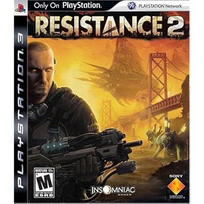
jjasper said:regular edition box art:
Private Hoffman said:Ultimately, it doesn't really matter, but you have to question who thought this was a good idea.
Rapping Granny said:HOLY CAMEL SHIT!
That is the most generic looking boxart ever, wtf is up Nathan Hale? why is he glowing? Why does he look like he came from a late 90s PC game? What's with the floating Chimera and Why is there no color on the box, I thought R2 was pushing for Color.
Slap the guy that made this and slap whoever let this pass through.
SPLASH?!!!Dever said:I like the backround, but I'm not really liking Hale and the Chimeras. Imo they should keep the backround, but have Hale looking the other way around. Also remove the chimeras. Essentially it would be Hale watching the Chimeran ships tearing the bridge to pieces, helpless to do anything about it. I thought they were going for a sense of desparation in the game, so it would reflect that I guess.
Here's a quick sketch! Your eyes have been warned.
http://i35.tinypic.com/2ai3eb8.jpg
Yeah I'm bored.
jstevenson said:oh if covers could tell stories...
jjasper said:regular edition box art:
thuway said:I've said this before, but I'll say it again: This is fucking Insomniac. When have they ever let us down?
Kagari said:Just get the collector's edition if you don't like the standard edition cover...
How can you pass on that delicious figure, artbook, and hard cover box? You know you want itPrivate Hoffman said:Maybe that's their intention!
I don't buy CE's though. Standard version for me. I'll make my own cover or something from the official artwork that gets released.
.thuway said:How can you pass on that delicious figure, artbook, and hard cover box? You know you want it
Linkzg said:That looks really bad. Is this confirmed to be real? I sure hope not.
maybe they made the cover bad so people might be more willing to get the LE :lolKagari said:Just get the collector's edition if you don't like the standard edition cover...
Guled said:maybe they made the cover bad so people might be more willing to get the LE :lol
haha sameFreedom = $1.05 said:It worked on me for MGS4 *le sigh*
Freedom = $1.05 said:It worked on me for MGS4 *le sigh*
Freedom = $1.05 said:It worked on me for MGS4 *le sigh*
scoobs said:I'm a little confused, when can we access the public beta?
Guled said:maybe they made the cover bad so people might be more willing to get the LE :lol