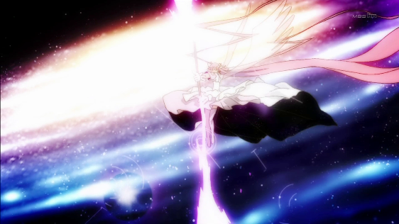
[Eureka Seven AO] - 17
After watching the latest episode of
Eureka Seven Ao I felt like I had just been trolled. Now, this isn't an unusual reaction to watching an episode of
Eureka Seven Ao because there's usually two or three
LOST-style twists that have my eyes rolling skyward. However, this time around I felt like I'd been manipulated because of how
good the episode was. It honestly felt like it dropped out of some other, better show. It might be favourite episode yet.
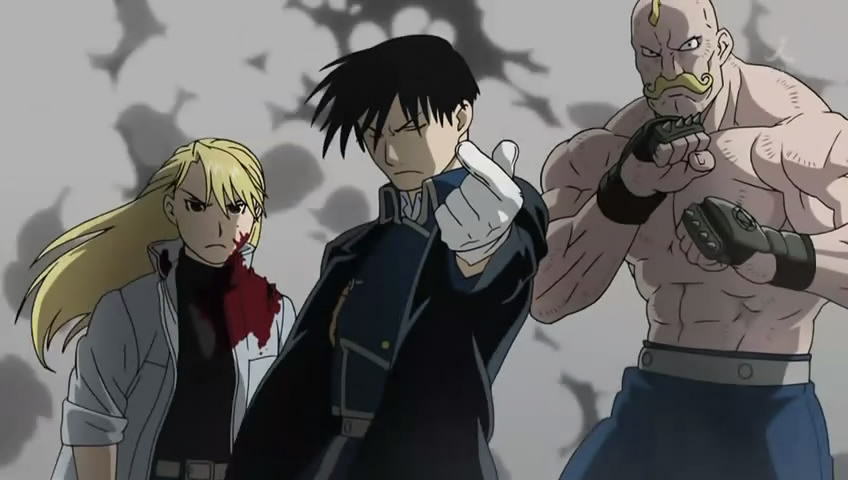
A brief visit to ANN revealed that the episode director wasn't anyone particularly noteworthy, however the storyboarder was: Mizushima Seiji. You may know him as the director of
Fullmetal Alchemist,
Dai Guard,
Gundam 00,
Oh! Edo Rocket and
Un-Go. He's certainly been around the block!
Now, this episode wasn't just good because it had some neat visuals. I was actually surprised how much
logical* world building occurred over the course of a single episode and how the events from the previous episode were handled in this one. I was genuinely shocked because the show has, up until this point, been quite happy to pick up and dump plot-points in a fairly sloppy and haphazard manner. This, however, felt extremely deliberate.
Deliberate is a good word to use with regards to the visuals and the pacing of the episode. Everything felt a bit more reigned in than usual - I'm sorry that I can't simply illustrate what I mean through an image. It's very easy to say "this episode has good pacing" but very hard to back up my observation with evidence. Nearly every scene seemed to go on a little bit longer than it would in a normal episode of this show, which isn't to say that they were dragged out, rather they just had time to breathe. It was a lot easier to soak up the mood of the episode because we weren't constantly cutting between lots of different sequences at a frantic pace - which is something that really hurt earlier episodes.
I can't really finish up my impressions here without discussing some of the visuals from the episode:
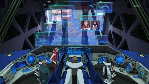
This control room, with the elevated central tower, lower-level consoles, projected map always reminds me of the
Evangelion control room. Yet I assume
Evangelion must have ripped it off from some other show or movie that I'm not aware of. Does anyone have any ideas?
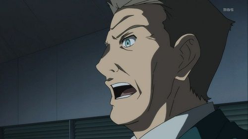
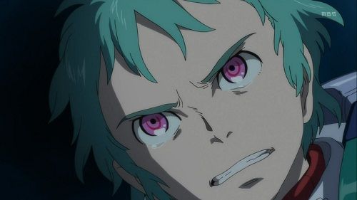
I really like the way Mr. Second in Command was portrayed throughout this episode. He looked even more aggressive and inflexible this episode than ever before. The contrast in this shot does a good job in highlighting his expression.
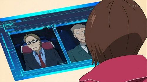
I thought it was a pretty nice touch that Blanc briefly pulled this expression he was interrupted during his conversation with Hannah. I just like the way this gave made him a little bit more human, I guess even he doesn't like Stanley's bluntness.
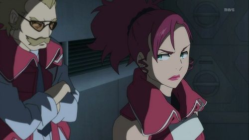
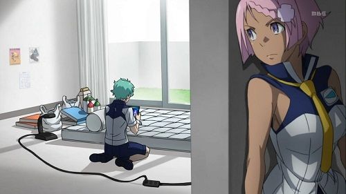
Speaking of people who aren't impressed with Stanley, I like the expressions here as well, even if it's all in their eyes. I also hadn't noticed how bland and flat all the background art inside the main base is until I started examining this episode closely.
I can't really speak to what this scene was about, but I enjoy Fleur's expression. Most of the expressions on the characters in this episode are naturalistic and believable, but for this rather sillier scene they go more comical which works well.
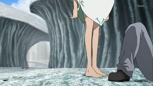
I really like how this shot of Naru explores two things that you rarely see done well - a sense of scale and the depth of the frame. Now, I'm sure you're all aware what scale is, but perhaps 'depth of frame' is something that requires a little bit of explaining. In film it's quite often to see movement across the 'fame' of the image, either from left to right or right to left. However this makes the whole frame feel flat, like a stage, when really it should be a window into a world. Having stuff move at the back of the image demonstrates that the world actually has some depth.
In this shot, for example, Naru's legs are in the foreground but you can just see a car moving towards her from the back of the frame.
IMG]http://i835.photobucket.com/albums/zz278/Jexhius/EurekaSevenAO1710.jpg[/IMG]
Another technique that they employ throughout the episode is 'pulling focus' where the 'camera' shifts it's focus from one aspect of the frame to another so that the viewer realises what's important in the image. It also shows that the character who is in focus is generally the one who has the most power in the scene.
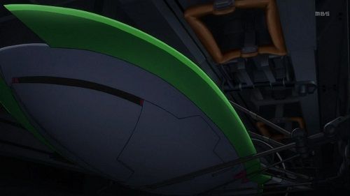
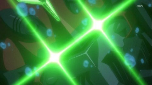
This lower-angle shot of the Quartz Cannon, combined with the low-level lighting, really make it look huge and ominous as it looms over us. Combine that with the way it thrashes around violently and it's pretty clear what we're supposed to think of it this device.
Having the action of a mecha directly mirror the action of a character in the preceding shot is an extremely common trope in anime, however it's common because it's an effective way of reminding us that the mecha is just a giant representation of the pilots will and desire. It also makes a pretty cool start to a sequence.
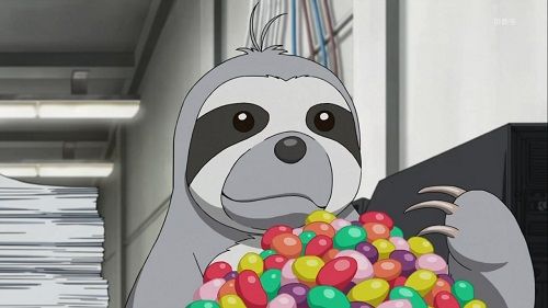
Now, while the episode itself contained no actual trolling or silly twists the preview for the next episode was pretty amazing. It showed very, very little of note but instead repeatedly cut back to a shot of Noah eating on multiple occasions. He literally made up half the trailer. Truly amazing:
Now what I didn't bother to talk about was all the ugly CG rubbish that infested various shots of this episode, from cars, to screens, to parts of furniture and other miscellaneous what not. Disgusting.
* I really have to stress the word logical because we've had plenty of really silly world building up to this point.
Started into Infinite Ryvius last night with the first four episodes. Good stuff so far. I think I'm liking Hisashi Hirai's character designs better here than in any of the other series I've seen that he's worked on. The soundtrack (very R&B/hip-hop influenced) is very different than what I was expecting. Not sure how I feel about it but maybe it'll grow on me.
That's interesting because I found them to be pretty terrible. I found it pretty hard to sell some of those people apart.


