• Hey, guest user. Hope you're enjoying NeoGAF! Have you considered registering for an account? Come join us and add your take to the daily discourse.

After replaying Mario World, I realized it's not all that. 3, YI and NSMBU are better

ZeoVGM

Banned
I can see the comparisons saying 3 and YI are better, but NSMBU? Dafuq?

It's been explained a number of times why, mostly related to the actual level design.

Instead of saying "dafuq," explain why you think they're wrong.

The level design in NSMBU is phenomenal. Yes, the art style is old and comes off as a bit lazy, as does the music. But the game itself is fantastic.
 

Riposte

Member
Yoshi's Island shouldn't really be in the conversation. It's not really like a 2D Mario game at all. Too focused on collecting things, aiming and shooting, and very little platforming challenge.

NSMBU's visual aesthetic isn't really bad at all. The music is as bad as everyone says though. Literally just carried over songs from Wii.
 

OmegaDL50

Member
Nah, SMW is great. Game as a whole has tons of new mechanics, lots of variety... good secret system. Strong visuals and sound.

YI & SMB3 are great too.

NSMB* is fucking trash. Regurgitated ideas. Boring level after boring level. Poor variety. Weak visuals and sound. Terrible games.

Nope. The main take away from the NSMB is mainly it's art style but U in particular has some of the best level designs in the entire series.

Hell I'd say there is far MORE variety in the NSMB games than even World. Sharing roughly the same world concepts with even SMB3 (Desert, Ice, Plant, Sky, etc)

SMW doesn't even have Desert or Sky themed levels. Yoshi's Island and the Donut Plains are almost identical. Both the Chocolate Island and Vanilla Dome use a similar Rock Style and underground theme settings for their worlds. The Forest of Illusion neat I suppose, and outside of Butter / Cheese Bridge area basically being more plateau areas. The variety of world types actually lessened from SMB3.

Hell the lack of Valley of Bowser having proper volcanic area stages was somewhat disappointing after the rather unique Bowser / Dark World in SMB3.

The main attractor I'd say was the introduction of the Ghost Houses and the Star World, which the NSMB games retread upon with even better stage layout and world design.
 

bionic77

Member
A lot of people praising MarioU.

Hope it and all of the other good games on U get ported to Switch because it was one of the few Nintendo consoles I have not played.
 

cHinzo

Member
NSMB U (and Luigi U) had really great levels. Especially the secret ones. I still prefer SMB 3 over it though, but they're both really good. Never really understood the hate for NSMB U, except maybe for the artstyle. The platforming and new power-ups are top notch.
 

ZeoVGM

Banned
A lot of people praising MarioU.

Hope it and all of the other good games on U get ported to Switch because it was one of the few Nintendo consoles I have not played.

There are so many good games on Wii U.

Mario 3D World is pure gaming bliss.
 

Y2Kev

TLG Fan Caretaker Est. 2009
Yoshi's Island shouldn't really be in the conversation. It's not really like a 2D Mario game at all. Too focused on collecting things, aiming and shooting, and very little platforming challenge.

NSMBU's visual aesthetic isn't really bad at all. The music is as bad as everyone says though. Literally just carried over songs from Wii.

Yoshi's Rare Island ooooo
 

QisTopTier

XisBannedTier
nsmbu > smb3 > smw
for me

Don't believe the lifeless lies
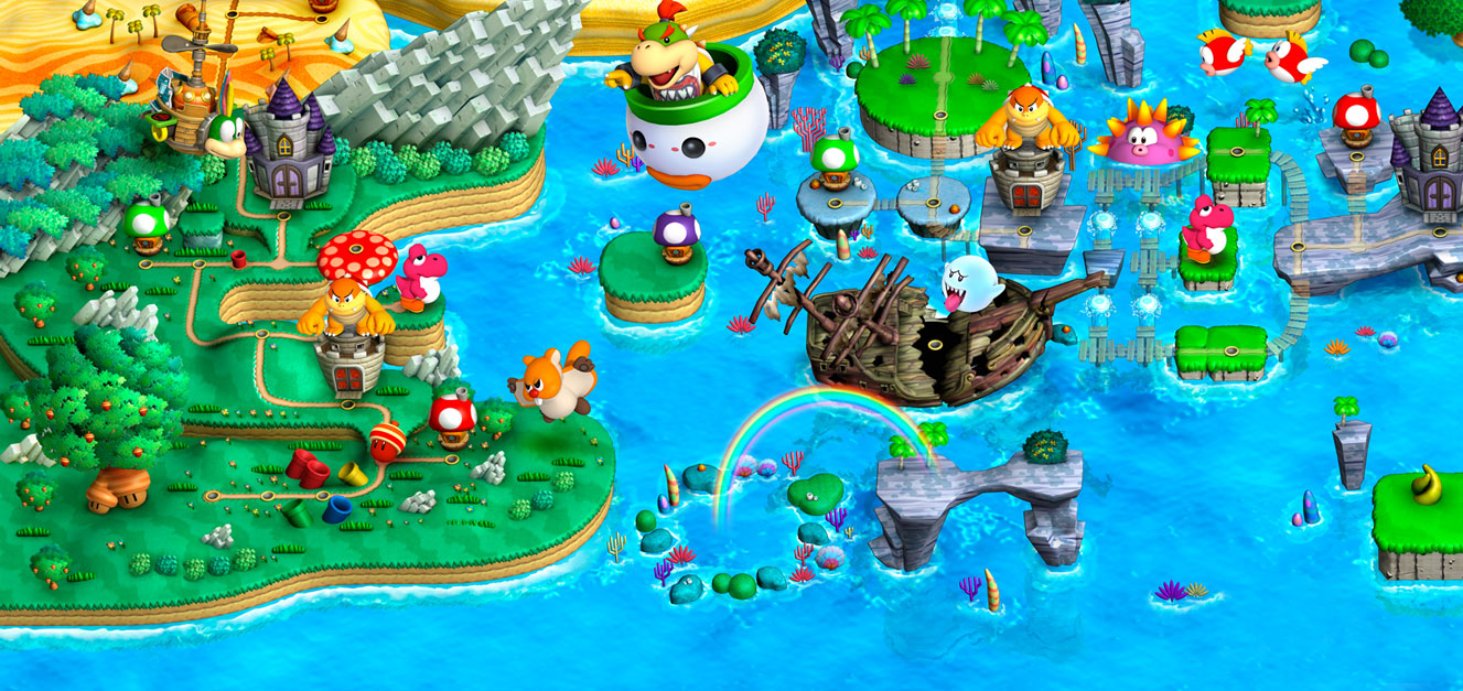
nsmbu-presentation.jpg

71JEameZSTL._SL1280_.jpg

New-Super-mario-Bros-U-map.jpg

nsmbu_thumb1.jpg

1.png
 

LordRaptor

Member
The main attractor I'd say was the introduction of the Ghost Houses and the Star World, which the NSMB games retread upon with even better stage layout and world design.

SMWs addition of multiple routes and secret levels / secret exits was superb, and (mostly) signposting where a level contained a secret exit by having a different coloured worldmap icon was done much better than in the NSMB games which usually are just guesswork based on where a route might be by looking at the world map
 
I do agree that NSMBU's level design is the best of the bunch, but I dunno, something about the presentation makes me want more. Like full 3d rendered graphics instead of pre rendered 2D objects, with some fancy camera perspective change for some levels like Tropical Freeze and Sonic Generations

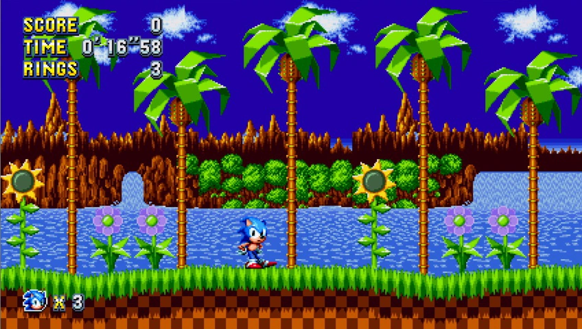
edit: btw, this is what the first level in Sonic 1 looks like:

latest


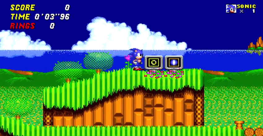
And this is what the first level in Sonic 2 looks like:

latest


How on earth do you make a sequel look worse than the original?

The least you can do is post the actual Sonic 1 Green Hill and not Mania's which has small graphical improvements to the original look

 
Sonic 2 aimed to be too big for the time they had so a lot of it was rushed or dialed back, I always put that as part of the blame as to why sonic 2 can look a little plain in areas compared to the original.
 

Saoshyant

Member
I honestly feel the same. World has never managed to grab my attention after different attempts at playing it. For someone who adores Mario 3 as the best game ever made(tm), World feels floaty and boring.
 

Mark1

Member
NSMBU suffers from the fact that the art and musical style had been used over and over again. It's a shame they didn't go the extra mile, because from a gameplay perspective it might actually be the best one.
This is why I don’t consider World or NSMBU to be the best from a 2D perspective. The latter had such a great gameplay style which would’ve taken the best 2D Mario if it wasn’t for its very generic theme and music score.

SMB3 is the best thus far. But I feel that should’ve been easily overtaken years ago.

It’s why I consider the 3D Mario games, especially 64 and the Galaxy games, to be vastly superior. And suspect Odyssey will end up being better than those ones as well - going by what I’m seeing anyway.

Edit: I would go as far to say that Sonic Mania and 3/Knuckles are up there SMB3 and NSMBU.
 
I've always thought that 3 was just the better game. I like both but World was clearly more of a rushjob or something to get something on the new hardware. 3 just has more to it and feels better. World is very floaty/slippery in a way I don't like

I have always felt World was slippery and it does a lot for my sanity to hear other people say the same haha
 

AGoodODST

Member
In terms of level design NSMBU is definitely the best. Fantastic game. World and 3 definitely have better art and music.

3 is better than World.
 

Vanillalite

Ask me about the GAF Notebook
A Team and new top Nintendo blood all been on the 3d games for 2 decades now.

I actually think U is legit, but understand why 3 still probably tops. The core focus has been 3d Mario.
 

kunonabi

Member
Yeah, id place all those ahead World too. I liked it well enough at launch but it just doesnt hold up under scrutiny.
 

LordRaptor

Member
In defence of SMWs visuals...

it occured to me while replaying it recently, that
GReiRdR.gif

riding a platform of skulls across lava while fire dragons emerge from the fire is metal as fuck
 

noquarter

Member
I also don't think every Mario game needs to follow the grass world ice world water world fire world desert world sky world Bowser world formula, though there's nothing inherently wrong with that.
I don't think that anyone is saying it needs to follow the formula introduced in 3, just that it should have more defined worlds. Almost all of the levels in World could be anywhere on the map and the game would still have the same feel. The only reason you know you are entering new areas is because the game tells you you are. The areas themselves don't have any defining characteristics that show up in the levels.

SMB3 really felt like you were exploring a world, each area has characteristics that permeate through the levels of that area. If you took a level from World 2 and put it in World 5 it would be out of place. If you took any level from Donut Plains and put it anywhere else in the game, it wouldn't matter, it would fit the aesthetic since the whole game feels the same.

Should just be Super Mario Island. It doesn't feel like any kind of world.
 

Oblivion

Fetishing muscular manly men in skintight hosery
I don't think that anyone is saying it needs to follow the formula introduced in 3, just that it should have more defined worlds. Almost all of the levels in World could be anywhere on the map and the game would still have the same feel. The only reason you know you are entering new areas is because the game tells you you are. The areas themselves don't have any defining characteristics that show up in the levels.

SMB3 really felt like you were exploring a world, each area has characteristics that permeate through the levels of that area. If you took a level from World 2 and put it in World 5 it would be out of place. If you took any level from Donut Plains and put it anywhere else in the game, it wouldn't matter, it would fit the aesthetic since the whole game feels the same.

Should just be Super Mario Island. It doesn't feel like any kind of world.

So I can kind of understand where people are coming from with this complaint, but I don't think it holds water. Donut Plains, Vanilla Dome, Butter Bridge, The Forest of Illusion, Star Road, Valley of Bowser all have a distinct theme and identity. The only ones that you can possibly make a case for are maybe Yoshi's Island (the level) and Chocolate Island being too similar, but that's being generous.
 

RagnarokX

Member
It's been explained a number of times why, mostly related to the actual level design.

Instead of saying "dafuq," explain why you think they're wrong.

The level design in NSMBU is phenomenal. Yes, the art style is old and comes off as a bit lazy, as does the music. But the game itself is fantastic.

NSMBU's art doesn't come across as lazy. It's actually the most effort they've put into backgrounds in the entire series, including the NES and SNES games. It comes closer to a Sonic the Hedgehog level of detail in that the backgrounds change to show progression through the world. The only thing it does poorly is possibly reusing models from NSMBWii, cuz Mario's model looks bad. But that's a series tradition:
81IKwKk.png


The only NSMB game that looked ugly was NSMBWii, but unfortunately that's the one most people think of when they thing of NSMB because Wii was so popular.

People call NSMB bland, but SMW is way more bland. At least the NSMB games have lots of color, detail, and variety. SMW couldn't even be arsed to have unique backgrounds for Valley of Bowser levels.
 

PKrockin

Member
Now that y'all bring it up, they could have done a lot more with the dinosaur/prehistoric theme. I always forget about it until I see those crappy dinosaur enemies.

NSMBDS was uninspired IMO, but I can definitely acknowledge NSMBU as a game with very, very good level design despite my fatigue with the series.

I have always felt World was slippery and it does a lot for my sanity to hear other people say the same haha
It's really weird hearing people describe World, not 3, as slippery. 3 is the "slippery" one, as in, Mario has a lot of momentum. You need to hold the opposite direction for a little while to finally reduce your speed to zero. Meanwhile, World Mario stops and turns almost on a dime. This is one of the major reasons I never liked World Mario as much--the challenge in mastering Mario's momentum is pretty much gone. Momentum-based gameplay was the core appeal of Mario 1 and they changed it here.
 

Y2Kev

TLG Fan Caretaker Est. 2009
I feel like World is the best example of friction with the surface, actually. I feel like it's the least slippery. YI feels pretty slippery to me. Maybe because you automatically run.
 

Lothars

Member
This is maybe one of the most tired debates in all of gaming.

Some prefer 3,some prefer World. I am a World guy, and played Mario before he was even Super. Most of your points are flimsy opinions, and a similar opinion list could be made of 3.

It's cool to prefer whichever, but yowza am I sick of the debate.
agreed, it’s beyond tired at this point.
 
As much as I hate the music in NSMBU, it is objectively the best 2D Mario to date, and pretty similar to World.

Having said that, I really want them to experiment more with the 2D line. There's still so much they can do with a 2D Matio?.
 

Griss

Member
I love Mario World, but there's a lot of truth in the OP.

Not enough people realise that NSMBU is the best 2D Mario of all.

As for SMB3, it's a phenomenal game, but for me the levels are just too short. They introduce ideas, and while most games beat them to death, in SMB3 they actually don't spend enough time on them because they have so many great ones.

The 4 koma design is -
1. Introduce idea -> 2. Increase difficulty -> 3. Twist / mix the new idea with old ones -> 4. Conclusion. In SMB3 there isn't enough of parts 2 and 3.
 
As much as I hate the music in NSMBU, it is objectively the best 2D Mario to date, and pretty similar to World.

Having said that, I really want them to experiment more with the 2D line. There's still so much they can do with a 2D Matio?.

I'm not sure you quite know what the word "Objectively" means.
 
That's cuz World is easy as fuck. I had the same realization some years back. I was like man, this shit is too easy. Maybe I should fire it up and do a couple more of the secret levels.
 

zenspider

Member
Maybe we should poll: how many fans of NSMB ever played >100 hours SMB1 decades before NSMB?

Hundreds of hours easily.

I liked NSMB and loved NSMBWii (top 3 Mario for me), and thought NSMBWiiU was 'meh'.

I think there are interesting criticisms of World, but it is a hard sacred cow for me to topple. I have stopped playing it annually however, since NSMBWii and 3D World scratch those itches better.

Not sure the hypothesis for the poll tbh. Oldheads would or wouldn't enjoy NSMB?
 
Not that length is a metric necessarily, but I critical path'd both SMW and YI on the Mini, replaying everytime I died, so it was basically one log playthrough.

SMW = 3 hours 10 min
YI = 10 hours 5 min

I opened up the Star Road on SMW and like I said, only critical'd both games otherwise.

I gotta say, I was shocked at the difference in length of game per hour.

And I ended up loving YI quite a lot. Dunno where SMW ranks for me, but YI blew me away.
 

RagnarokX

Member
I feel like World is the best example of friction with the surface, actually. I feel like it's the least slippery. YI feels pretty slippery to me. Maybe because you automatically run.

World is the least slippery of SMB3, SMW, and NSMBU. SMB3 is the most slippery. NSMBU strikes a nice balance, as Mario's physics in SMW are way too tight and were designed to make the game easier and more accessible, while SMB3's are too slippery. NSMBU physics are closer to SMW with little more momentum on the ground and closer to SMB3 levels of momentum in the air.
 

MisterHero

Super Member
I like to consider that SMB3 came in NES's prime while SMW was at the beginning of SNES's life. I don't think it's a fair comparison to say because one uses the most of a console's resources and the other is just the beginning. Of course, Yoshi's Island 'cheats' a bit with the Super FX-II chip, but it is still a game that SNES in its prime could deliver.

SMB3 has a more diverse soundtrack, while SMW experiments with context-specific music (having/not having Yoshi).

SMB3 has a better multiplayer component (both co-op and VS), but I haven't used it since the early 90s.

SMB3 has more power-ups and more rewards for secrets, while I think SMW had more hidden paths in general.

Both are excellent but I just like SMB3 more. It probably had more time to cook.
 
I love Mario World but I always thought 3 was better hell I also think NSMBWii is better as well, I do like the physics in World though, haven't play U since I didn't have a WiiU but seeing as NSMBWii is so good I am willing to bet is as well.
 

ItIsOkBro

Member
I've never played NSMBU.

I prefer the physics in 3 compared to World. I dislike how much air control you have in World.

World's lack of diverse themes really kills it. All the levels just kind of blend together.

(All-Stars) 3 has a better art style.
 

RagnarokX

Member
I like to consider that SMB3 came in NES's prime while SMW was at the beginning of SNES's life. I don't think it's a fair comparison to say because one uses the most of a console's resources and the other is just the beginning. Of course, Yoshi's Island 'cheats' a bit with the Super FX-II chip, but it is still a game that SNES in its prime could deliver.

SMB3 has a more diverse soundtrack, while SMW experiments with context-specific music (having/not having Yoshi).

SMB3 has a better multiplayer component (both co-op and VS), but I haven't used it since the early 90s.

SMB3 has more power-ups and more rewards for secrets, while I think SMW had more hidden paths in general.

Both are excellent but I just like SMB3 more. It probably had more time to cook.

That's a decent argument, but then NSMBU came out as a launch title as well and was an improvement over NSMBWii with much better art, the most variety in visuals in the series, better level design, better and more powerups, and better features. SMW's development was similar as well. They started by importing SMB3 to SNES, and SMW was originally going to feature SMB3's powerups.

Here's a beta screenshot of NSMBU using NSMBWii assets:
ceMKuM7l.jpg


And here's the same level in the finished game:
pRosMbzl.jpg
 

ZeoVGM

Banned
That's a decent argument, but then NSMBU came out as a launch title as well and was an improvement over NSMBWii with much better art, the most variety in visuals in the series, better level design, better and more powerups, and better features. SMW's development was similar as well. They started by importing SMB3 to SNES, and SMW was originally going to feature SMB3's powerups.

Here's a beta screenshot of NSMBU using NSMBWii assets:
ceMKuM7l.jpg


And here's the same level in the finished game:
pRosMbzl.jpg

That's a great comparison.

U looks really nice.
 

Lynx_7

Member
Glad some people are finally seeing the light. ;P
SMW was actually my first Mario game, but even back then when I got to try 3 on the All Stars collection I though "wow, this is much more fun". I actually didn't appreciate World too much back then and it wasn't until I went back to 1 and 3 that I really started getting into the series. While I eventually gave World a second chance and nowadays I hold it in high regard, 3 is still the superior title.
 

ramparter

Banned
It's been explained a number of times why, mostly related to the actual level design.

Instead of saying "dafuq," explain why you think they're wrong.

The level design in NSMBU is phenomenal. Yes, the art style is old and comes off as a bit lazy, as does the music. But the game itself is fantastic.
Yes. I cant decide which of the two, NSMBU or NSLU is the best 2D Mario game. They are both exceptional.
 
Top Bottom