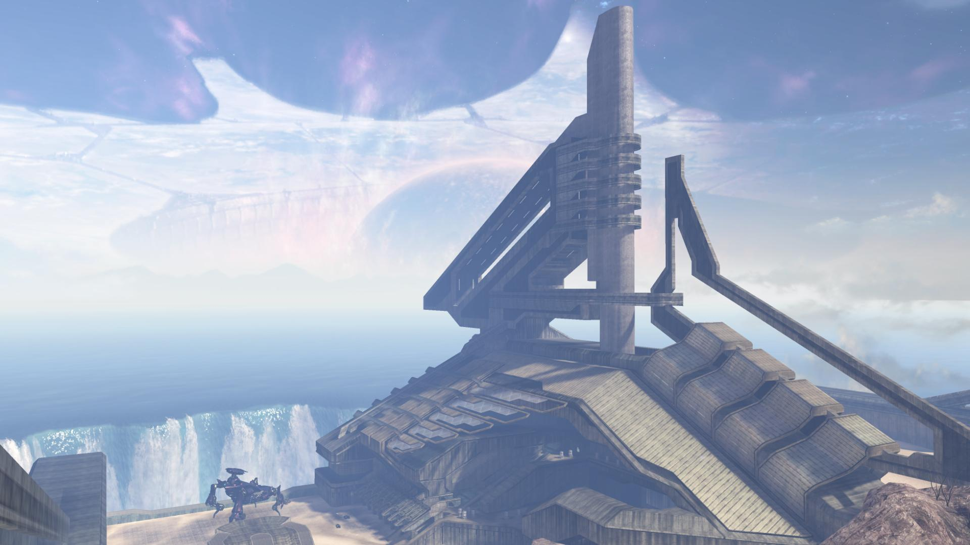
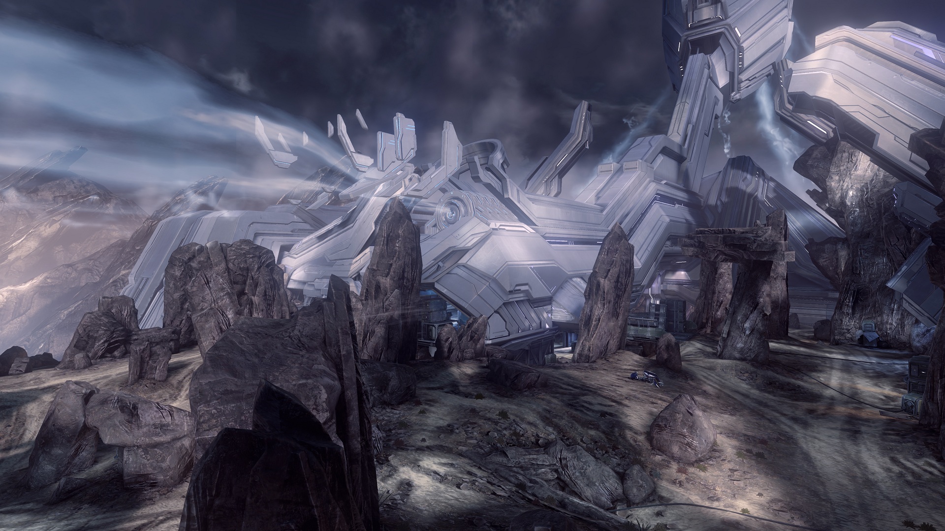
Ragnarok Flames
Banned
They'll adapt if they want to be haloGAF good. I mean hell it only takes a few minutes on the internet to learn callouts.new kids are gonna be confused as shit when we say green room now
They'll adapt if they want to be haloGAF good. I mean hell it only takes a few minutes on the internet to learn callouts.new kids are gonna be confused as shit when we say green room now
Would be my guess aswellYeah I don't think it'd be a huge leap to say forge reveal with Coag and Lockout playable at PAX, right?
Looks alright. Can't get excited over that map though
It's been in like every Halo game since 2. Either in Forge or the H3 remake. Would have liked to see something different tbh
probably due to how the set up the images to wipe from old H2 to new.
edit: I would also be totally cool with Containment as the last big map. Never felt like I got to play that map enough.
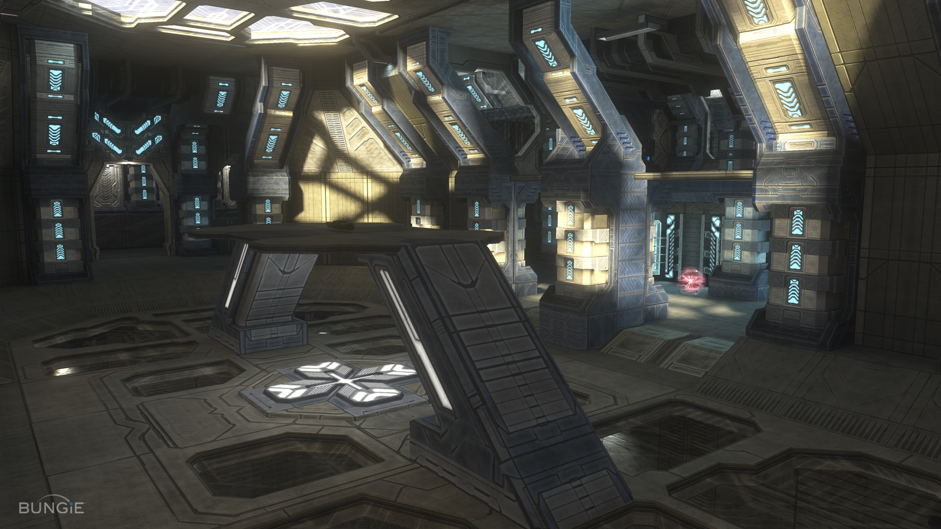
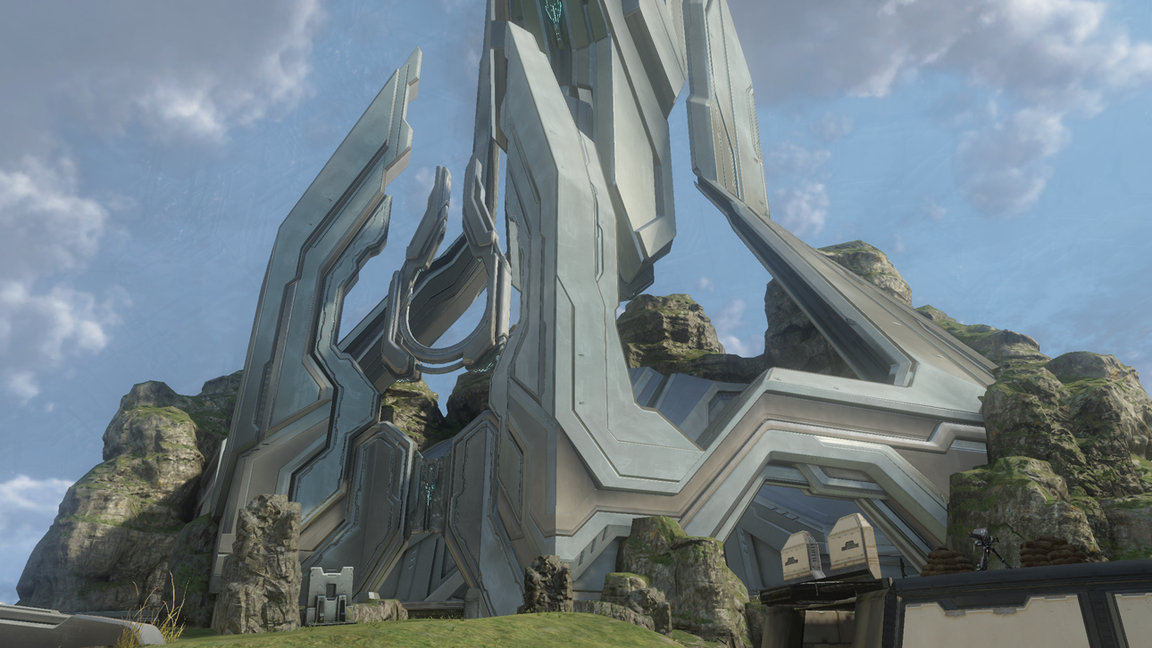
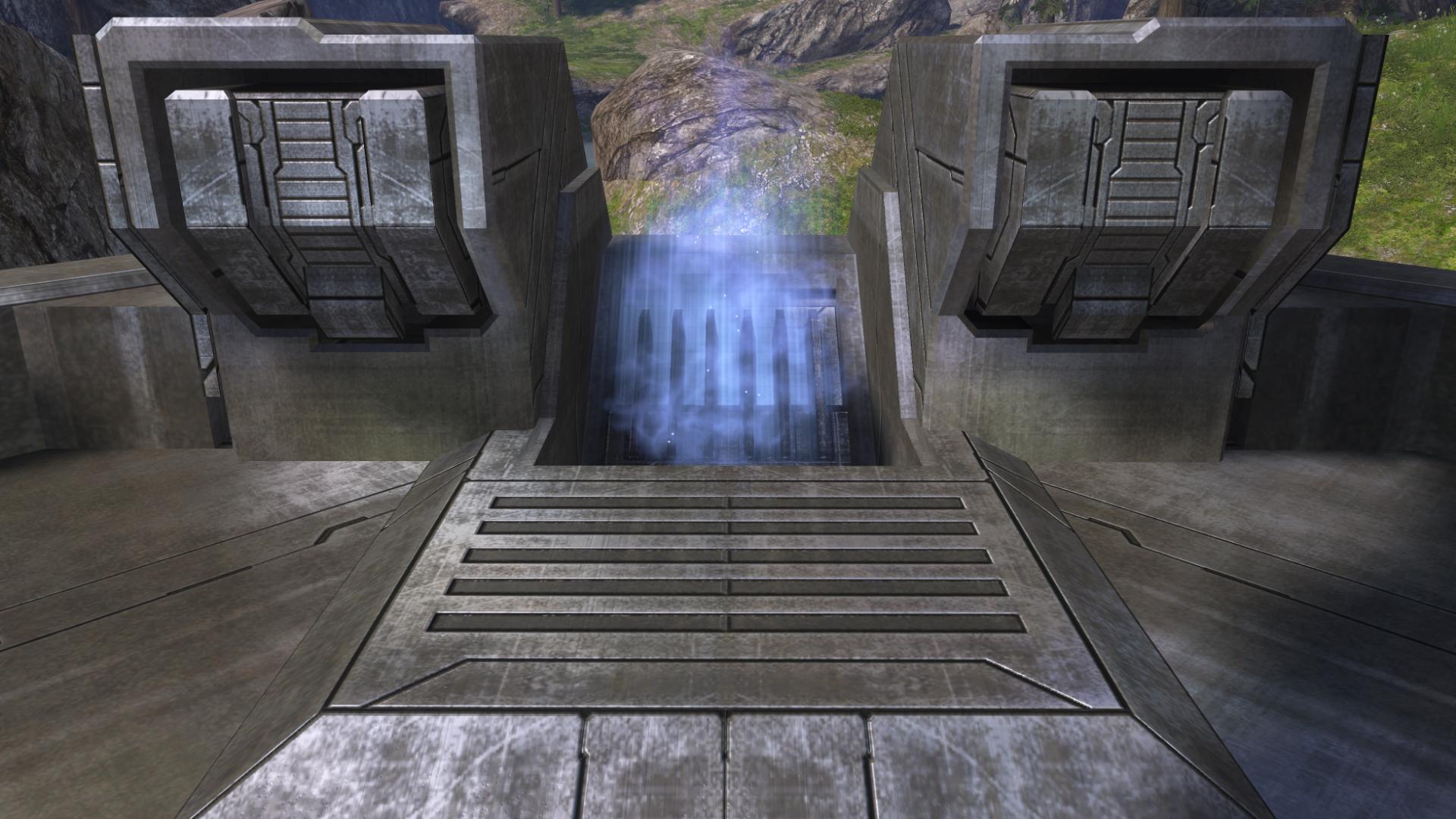
Next remade map for Halo 2 Anniversary is Lockout:
Assault doesn't exist anymore.Has anyone seen assault on any H2A maps? I hope for assault at PAX.
Assault doesn't exist anymore.
Assault doesn't exist anymore.
It doesAssault doesn't exist anymore.
Not in halo 4. H2A yes, but that seems to be about it.It does
Lighting reminds me of solace which I wasn't a fan of. Kind of a washed out, brownish/gold tint to everything. Probably looks better in game... there's just too many forerunner themed maps.
agreed.Not to mention 343i's Forerunner style is kind of bad in my opinion. I don't like shiny metal with all the dark chamfers, indents, and lines. I preferred the old and textured gritty metal.
Hmm. Looking back at Halo 3's Forerunner architecture, it isn't too much different. There's something about it in 4 I dislike though...
That's just asinine. If you don't like something about the newer game, its your right as a consumer to complain about it. If no one spoke up then we wouldn't have balance patches and the like.agreed.
It just brings back memories of H4 *shutters*.
its whatever though, im not gonna complain about anything in H2A since we have classic untouched H2.
Its not really the look of the map that bothers me, just that this particular aesthetic has a negative effect on gameplay because all the crevices ruin grenade gameplay.That's just asinine. If you don't like something about the newer game, its your right as a consumer to complain about it. If no one spoke up then we wouldn't have balance patches and the like.
Looks like Lockout has an interactive element to help face off against entrenched enemies.
I'm actually very curious how this will affect lockouts dynamic of Sniper Tower vs BR tower.
two moar slepz
two moar slepz
Not to mention 343i's Forerunner style is kind of bad in my opinion. I don't like shiny metal with all the dark chamfers, indents, and lines. I preferred the old and textured gritty metal.
Hmm. Looking back at Halo 3's Forerunner architecture, it isn't too much different. There's something about it in 4 I dislike though...
Look absolutely nothing like
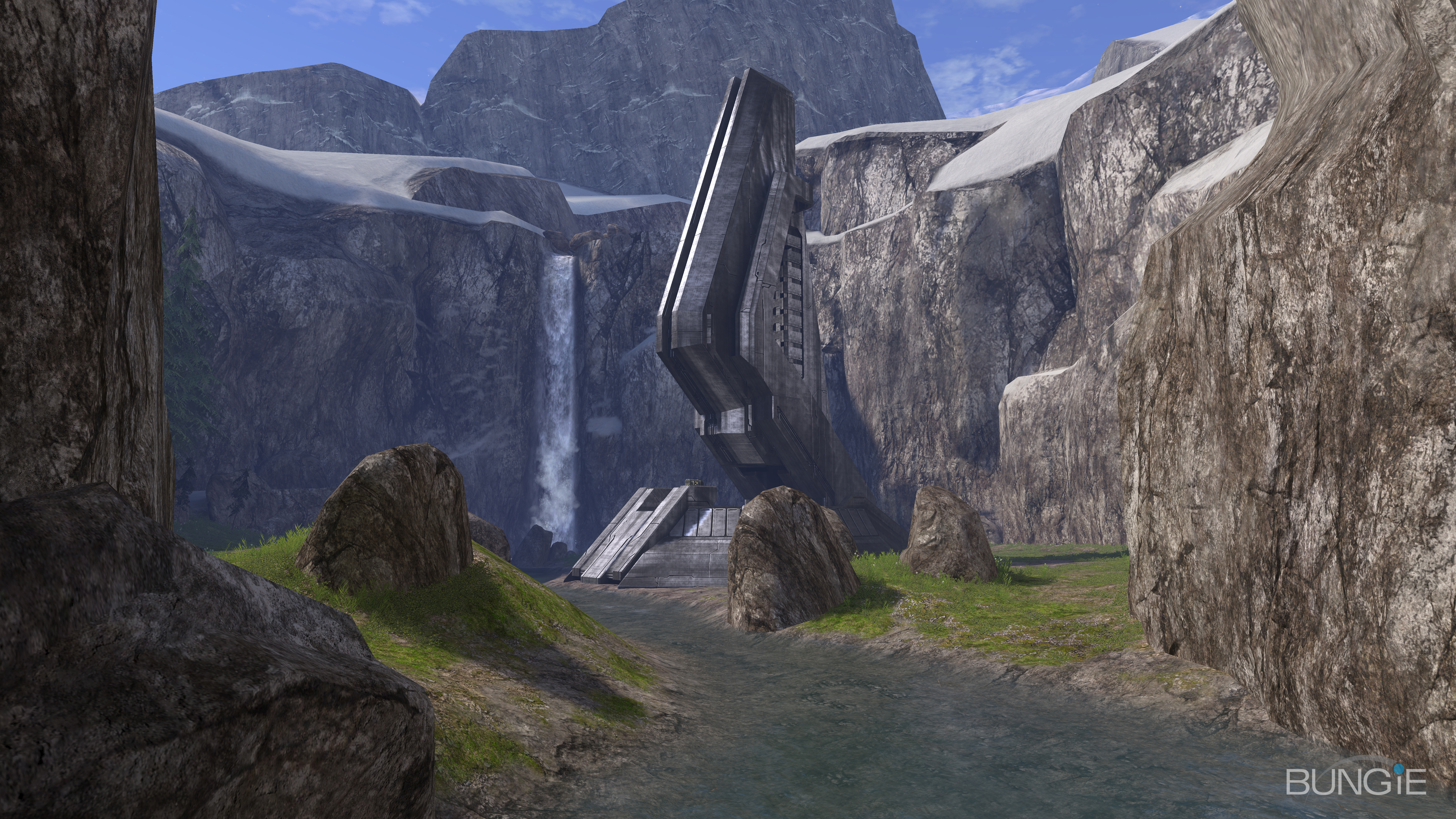
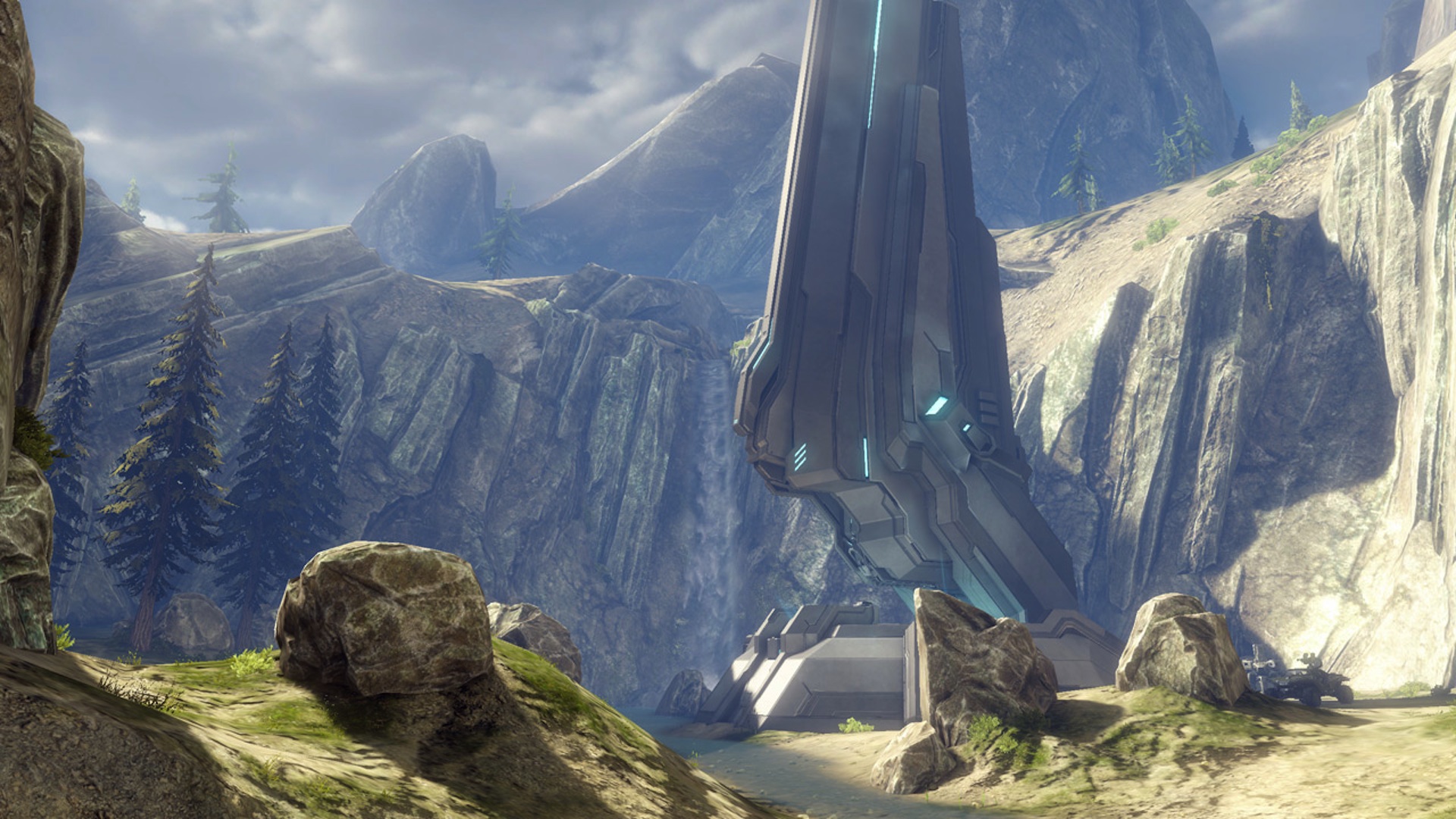
Photos of halo 3 Valhalla still gives me monster erections.
They'll adapt if they want to be haloGAF good. I mean hell it only takes a few minutes on the internet to learn callouts.
Despite the higher res/extra details everything looks so soft and bland compared to Halo 3.
I hate the Halo 4 'look' and I'm pretty disappointed H2A looks so similar. I know on a techical level Halo 4 is the best looking Halo so far but I still think Halo 3 looks better.
Despite the higher res/extra details everything looks so soft and bland compared to Halo 3.
http://majornelson.com/2014/08/28/xbox-live-games-gold-september-2014/
Halo Reach is free in September. Interesting. Surprised that they don't just do Halo 4 already
http://majornelson.com/2014/08/28/xbox-live-games-gold-september-2014/
Halo Reach is free in September. Interesting. Surprised that they don't just do Halo 4 already
I'm halogaf's top-tier lore whore, but I have to imagine Halo 4's finale was pretty easily interpreted as "never found a body," bare minimum. In most CoD campaigns you usually knife / nuke / whatever the resident bad guy so I'm sure it raised a few eyebrows - that, and the Didact's ending narration.
Still looks blurry, hope that's Gamespot's fault.
I always thought it was the worst looking Halo 3 map graphically. I always wondered why it wasn't on the same visual level as the rest of Halo 3's maps.
At least it was super fun.
Also hilariously enough I think Ragnarok is easily the worst looking Halo 4 map.
two moar slepz

Wat.
Look absolutely nothing like
A pretty good direct example of how the Forerunner stuff is completely different between 3 and 4 is Valhalla
The screenshots and videos released at Gamescom look WAY cleaner than these Lockout shots.I don't think it's Gamespot's fault - notice that the 343i watermark is crisp.
I've seen this same softness in the gameplay videos and the other screenshots, although admittedly these screenshots it's a good deal more noticeable. It would seem that they're using an overly-aggressive post-process anti-aliasing solution and it's blurring the whole image.
I'm guessing it's the same AA as Halo 4, so most likely FXAA. Halo 4's FXAA, however, was less aggressive and allowed some jaggies here and there. I'm hoping they just don't have it configured properly in this build and release will look sharper. It's too bad they didn't go with SMAA. Infamous, for example, shows just how incredible a proper SMAA T2x implementation can look - game looks damn near supersampled.
Of course, all this is assuming the multiplayer is actually running at 1080p natively. I tried to check in the past, but the softness in the images has been too much to get an accurate pixel count.
Looks awesome, I just wanna play MCC already.
Me too bro, me too.
Reach is free, oddball, swordbase anyone?