tryagainlater
Member
Raven's the hottest. Both Vulcan and Raging.
Has anyone heard anything about the MGS Legacy coming to next gen consoles?
gimm gimme

sn4ke gimme da goodz u dirty teaser


These posts are so adorable!
what is wrong with you people

Just make sure you guys don't get this thread closed.

When is Kojima showing dog companion gameplay?
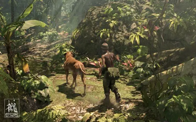

STAY BACK COMMAND WITH DIAMOND DOGS LOGO NEXT TO IT
DOG COMPANION CONFIRMED
That leak guy meant you can take 1 soldier with you, which could also be. And the Diamond Dogs logo seems to mean that.Ocelot
Progress report:
- Compiled avatars and usernames into one master list (combining the original list from Gamescom and the new one)
- Compiled the chosen image into the proper size, and rendered a sample mosaic (draft, no cleanup done)
I wanted to stop here to point out a few things which caught my attention about this new image:
- We are left with a lot of "negative" space around the image. While we did have that with the previous image as well, we did have some black / grey to balance things out as well.
- The lack of detail affects how smoothly the tiny avatars blend into the image. With the previous image, the details on the hair / beard / cigar...etc provided a nice canvas for the avatars
- The eyepatch here is more angular than it is in the other image, so the shape of the Gaf logo is just a little bit less attractive to me (opinion)
For comparison, at the bottom of the post is what the original image looked like (also without cleanup work)
From this point, I'd like to pursue only one of the below, and get the avatars properly lined up and spread out.
I know many people loved the original, but many also wanted to try the new one. So now that we see how each look within a mosaic, which do you guys prefer?
New Image
Original Image


I'm starting to think it would be better to use a colored image instead of Shinkawa art because the white space really ruins it a bit. The problem I have with the old image we used is that many people think it's Ocelot
Actually, I really wonder how something like this pic would look like as a mosaic.
I'm starting to think it would be better to use a colored image instead of Shinkawa art because the white space really ruins it a bit.
Example:
New Image
Took me ages to find myself. 5 times, if I count correctly. That shall do it. Thanks.
STAY BACK COMMAND WITH DIAMOND DOGS LOGO NEXT TO IT
DOG COMPANION CONFIRMED
That one's out of focus though. I honestly feel the original we made is fine, the negative space was there but it complemented a highly detailed image at the focal center.
If we want something with more color variety, I'm up for it, but we'd need to secure an image in a high enough resolution, while also making sure it relates to MGS V.
Are you fucking serious? Dude wasted his entire Saturday making the fucking mosiac.
And no one with half a brain would ever think it's Ocelot.
If I don't like something, I will always say that. I always say what I think bro. So even if I know Joe spent his free time on it, I will always share my honest opinion.Actually, I really wonder how something like this pic would look like as a mosaic.
Dawg, I have a much bigger picture of this, I just post the link because It's too big.
http://daxgamer.com/wp-content/uploads/2012/09/Metal-Gear-Solid-Ground-Zeroes_screenshot-11.jpg
or a different, even larger one:
http://www.hybridgames.co.uk/metalgearsolid/mgs5/artwork/001.jpg
Quick and dirty (personally still prefer the original overall)
I'd like Joe to give the first image a try. If it doesn't work out, I'm fine with the current mosaic then. Hint: you could change the MSF patch on his shoulder to a GAF logo.
Sorry if I seem demanding... I'm just very perfectionistic (is this even a word?) and I'd like the best image possible.
But yeah, I don't want to give Joe TOO much work of course.
Aye, this one is still my favourite now
OH LOOK WHO COPIED MY PIC WITHOUT GIVING CREDIT TO THE OWNER!!!
I'm totally joking wuv you dawg and yeah i really think this is a command for a doge in the game.
To be completely honest with you, I'd love it if it were a dog... but that command would fit a soldier as well. And the Diamond Dogs logo would make sense if it was a soldier.
I'm not saying the leaks are true, but it would make sense.
bu...but there will be a doge in the game!! the fox engine demo from 2011 and the artwork hinted strongly on a dog for MGSV ....they didn't make this all for nothing ...a doge is pretty much confirmed.
I mean we haven't seen Diamond Soldier gameplay yet for MGSV but we have seen a dog gameplay so this most likely will be a command for the doge seen in the jungle demonstration.