Progress report:
- Compiled avatars and usernames into one master list (combining the original list from Gamescom and the new one)
- Compiled the chosen image into the proper size, and rendered a sample mosaic (draft, no cleanup done)
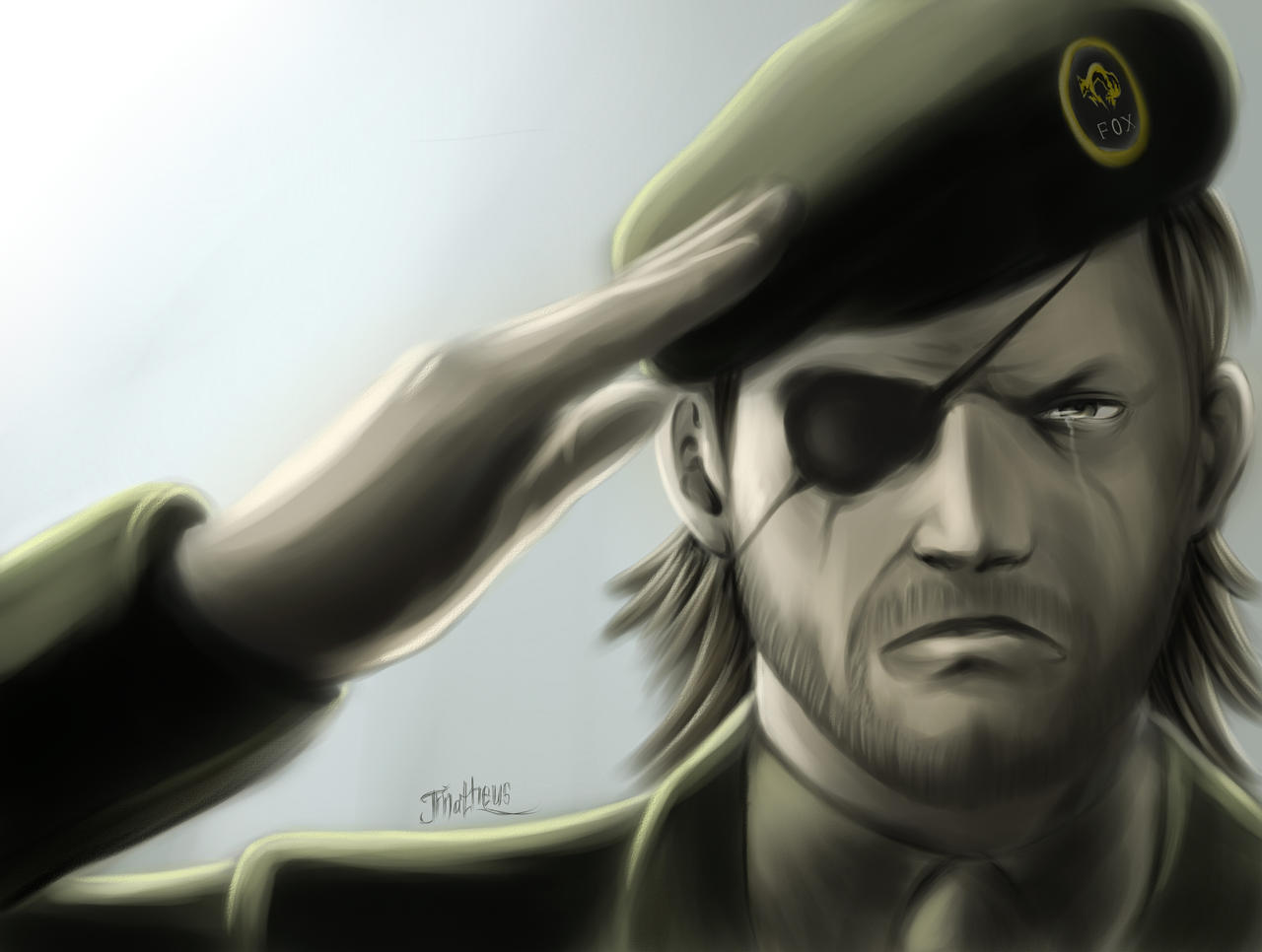
I wanted to stop here to point out a few things which caught my attention about this new image:
- We are left with a lot of "negative" space around the image. While we did have that with the previous image as well, we did have some black / grey to balance things out as well.
- The lack of detail affects how smoothly the tiny avatars blend into the image. With the previous image, the details on the hair / beard / cigar...etc provided a nice canvas for the avatars
- The eyepatch here is more angular than it is in the other image, so the shape of the Gaf logo is just a little bit less attractive to me (opinion)
For comparison, at the bottom of the post is what the original image looked like (also without cleanup work)
From this point, I'd like to pursue only one of the below, and get the avatars properly lined up and spread out.
I know many people loved the original, but many also wanted to try the new one. So now that we see how each look within a mosaic, which do you guys prefer?
New Image
Original Image


