FYI, not good shots at all, but I finally got around to doing this. Here is a comparison between RGB (by retro_console_accessories) vs Component (1st party) both captured with same settings on the Framemeister.
RGB:
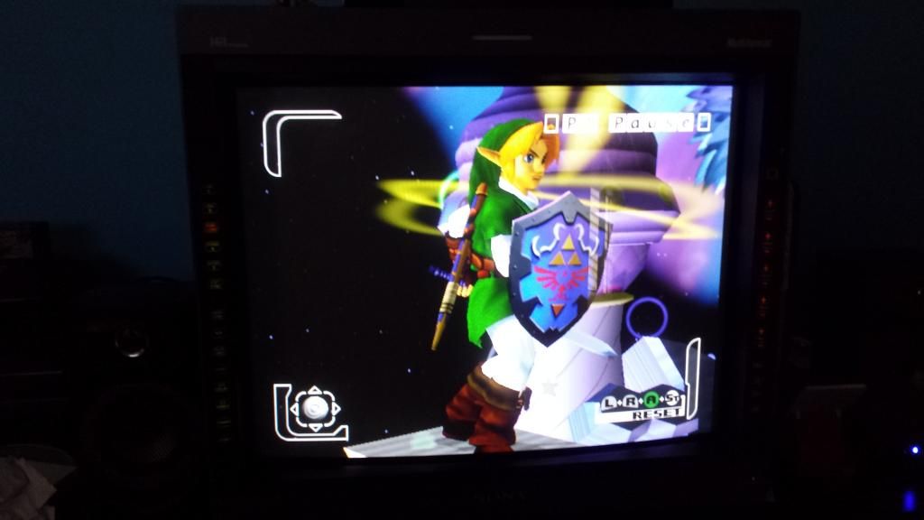
Component:
Sorry, I have no way of directly capturing this. I wish we can save screenshots onto the SD card in the Framemeister. The difference is quite noticeable in person. The iphone pics are not really picking up what I'm seeing.
In person, the color red via Component looks a bit oversaturated and dominates the picture a bit too much. For example, the gold shine on the right most part of the red Castlevania logo (in the corners) is far more pronounced via RGB than it is via Component.
Color separation is indeed just far more pristine over RGB. Which is very interesting considering both pictures are equally sharp and detailed. I could find nothing "lost" via component or vice versa. Each image has the same level of detail. Based on my gut and observations, it feels like each pixel represents the same exact thing, but RGB perhaps just looks slightly more "calibrated" and natural without any adjustments. Component looks like someone changed the tint/chroma/color settings to look slighty inaccurate.
But sharpness, contrast, brightness, and details and even overall IQ looks pretty much the same.
Edit: dodgeme, check your PM's.


") .
.