Jack Random
Member
but in FOUR LANGUAGES!burgerdog said:Checked the manual and it's a piece of shit black and white, 4 page thing.
but in FOUR LANGUAGES!burgerdog said:Checked the manual and it's a piece of shit black and white, 4 page thing.
Jack Random said:but in FOUR LANGUAGES!
burgerdog said:I'm not convinced that the cutscenes are pre-rendered. Why wouldn't they use better shadow filtering and AA if they were?
burgerdog said:Like I said, a piece of shit!
JohngPR said:They can be prerendered using the in-game art assets. A lot of developers do that.
burgerdog said:I know that. As others have said, FFXIII, U2, and GoW3 are prime examples of this.

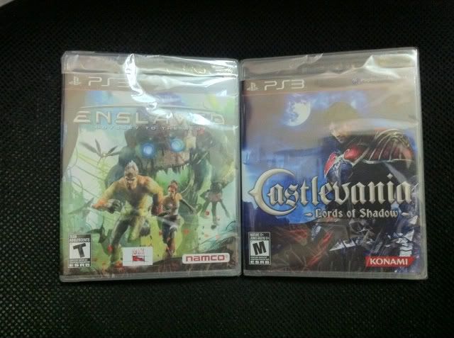
dragonflys545 said:Ughhh just couldn't resist after seeing my mom and pop store has it!!!
Jtyettis said:Great to hear! Gamepro Germany did mention something about the colors. One thing though did you install both discs? Playing all installed from the second disc? Should be able to install from menu on the first and dashboard on the second. Can you confirm?
Well I did love Bayonetta, but man there are so many good to great games coming this month. The demo was great.
santi_yo said:C'mon. Enslaved + Castlevania. I'm gonna cry.
Aklamarth said:Why isn't the Mercury Steam logo on the cover ?!
polyh3dron said:If I didn't have my Amazon order with $20 credit I'd go to my local store too, they already have their copies...
brandonh83 said:marketing purposes
The less logos on a cover, the better.Aklamarth said:Why isn't the Mercury Steam logo on the cover ?!
Of course, but Lords of Shadow is a Mercury Steam game. Where is the logo?Mt Heart Attack said:The less logos on a cover, the better.
Phloxy said:I installed both discs from the dashboard and just started from the second
Kojima made this fucking game in his underwear, got damn dont people know nothin these daysAklamarth said:Why isn't the Mercury Steam logo on the cover ?!
Phenomic said:Wouldn't they have wanted to put the Kojima logo instead I thought they were going to do that.
Bustin'...makes you feel good?brandonh83 said:It was a joke but yeah, if the game performs well enough it should give them more credit. If they had put the Kojipro logo on there instead I would have busted someone's nuts.
brandonh83 said:It was a joke but yeah, if the game performs well enough it should give them more credit. If they had put the Kojipro logo on there instead I would have busted someone's nuts.
Almost all Japanese games have only the main company logo on the front.Aklamarth said:Why isn't the Mercury Steam logo on the cover ?!
thetrin said:Bustin'...makes you feel good?
Aklamarth said:Why isn't the Mercury Steam logo on the cover ?!
Which i won't get, since it's 100 and has a stupid mask i don't want.CaptYamato said:I think this might be my favorite cover of the year. Especially the LE cover.
CaptYamato said:I think this might be my favorite cover of the year. Especially the LE cover.
That first link is pretty damn awesome.Tokubetsu said:Since everyone seems to be getting it early, to celebrate the release here are two of my favorite Castlevania sampled hip hop tracks:
http://www.youtube.com/watch?v=5ftPdyq_Yro
http://www.youtube.com/watch?v=LGK0UR5h0cM
http://www.youtube.com/watch?v=s05-GXblvAI
thetrin said:i can't stand CG covers.
Foffy said:Up to Chapter 4 already, and I'm really digging the game. I'm surprised at how difficult the game is, as I've died a lot more than I did in Lament of Innocence. And that's counting The Forgotten One.
The art design in the game is fucking fantastic, and while I may stare at the screen in a state of confusion when I see naked pixies on screen in a Castlevania game, the style is clearly expertly presented. I just wished for the more gothic style but that's more of an eventuality instead of an if. The story on the other hand seems a bit flakey at the moment..even with the fancy bells and whistles of the voice cast, it really comes off very similar to some of the more recent titles when it comes to narrative in that it's a bit too straightforward, which is fine that it doesn't bog itself down. It's just there are already some scenes I've come across that I think would have been a bit more interesting with more exposition. In a sense the game is very retro; you literally press start, change the brightness, and choose a difficulty. It doesn't bog around with options when you first load it up. Maybe some of the scenes are supposed to reflect this mentality as well.
+5 for, too.the Portal reference in the game via one of the scrolls
brandonh83 said:Same, but admittedly, this one is one of the least offensive I've seen. It is a nice, simple image.
Square Triangle said:Tuesday..where the fuck are you? I got a chance to take a look at the CE and my God, best cover art this gen- just gorgeous.
NeoUltima said:Another review for y'all.
17/20 from Jeux Video
perineumlick said:I'm up to Chapter II, and so far it's a solid action game. Not amazing or best thing ever, but solid and enjoyable. The camera could be better, and the combat is a tad clunky compared to GOW3(yeah I went there, lol. Closest comparison IMO), but it plays well enough. Visually it looks pretty good; not the best graphics I've seen but definitely above average. I like the art style. I believe if most go in with realistic expectations they will be pleased. If you're expecting GOTY quality you might be let down a bit. Granted I'm still early in the game, so things could ramp up a bit still.
1up said:"This won't replace Symphony of the Night as the oft-argued greatest Castlevania"
