FINAL FANTASY XV - Niflheim Base Battle Footage

Status
Not open for further replies.
This isn't Final Fantasy, what happened to this series? Where is my ATB? Just looks like mindless hack and slash with some tacked on stealth elements. :sad

Oh boy, this opinion again.

There's a lifetime supply of ATB Final Fantasy games, and they're getting ported to Steam.

A lot of the FF games have an initial threat at the beginning that your characters are facing only for another greater or more sinister threat to rear its head.

Niflheim reminds me of the empire and Shinra. I have a feeling they'll be destroyed half-way through the game.

83-ffvi29_183.png
President-Shinra-killed.png
 
I'm not sure if anyone else has done this before but here is what I made some time ago and I think this is a good time to post it. (Sorry if this is old stuff)

By taking the demo map and the two maps (1/2) from the previous ATR and putting them above each other you get this:


Version with only the demo and the big map (You can see the playable area):


And adding this old map you get roughly this:


Pleas note that they changed the shape and positions of the world quite a bit and that my editing skills aren't perfect.
 
This isn't Final Fantasy, what happened to this series? Where is my ATB? Just looks like mindless hack and slash with some tacked on stealth elements. :sad

It has crystals, all of the FF monsters and summons, its made by square.

Its an FF. Some of the FF games don't even have as much "FF" stuff in them as this game.

It may not be what you want but it is a FF game.

Its like people are completely ignoring that the series has been varied as fuck outside of the above stand bys forever.

and regardless...we have known about this games direction for how long now? If you were truly into FF like many of you claim...then you surely would know about what type of game this was always going to be, no? I am really confused where all of this "THIS ISN'T MUH FINAL FANTASY" stuff is coming from considering how long this game has been in development. It seems like many have been off the FF boat for a while then....if so then welp you got boat left...hold dat.
 
The left-side in this footage definitely is the weakest from all the builds we've seen so far, imo. Somehow looks really cheap.

And after seeing the weapon-switching-circle effect a few more times: yeaah, this is really bad. Don't know what they were thinking. Looks tacked-on and lasts way too short with no visual transitioning/blending. Let's hope they'll change it :/
 
Hooded guy plz.

He better still be in the game.

Having another potential main adversary outside of the the main villains would add a nice element to the story.

Of course he is, i think a cool looking villain a la Sephirot/Seifer/Kuja would be another great move to make this successful.
 
They have changed a lot of stuff compared to Duscae.
Camera and targeting seem both definetly improved. HUD looks simple and functional.
I definetly welcome (although we already knew about that) the fact they have removed the auto-switching weapon system that in my opinion was the weakest element in Duscae, it was confusing and not giving enough freedom and control to the player.
They are definetly nailing the ''fantasy based in reality'' concept, even for the use of magic which is fantasy but has realistic effects.
Nice to see the dragoon lady is back as well....is she going to reveal herself as undercover Luna? Or Stella trollolol? :P
Anyway without playing it it's impossible to tell how much these changes have actually improved the game and most importantly it's impossible to tell how the game will feel when someone plays it without knowing ''how to play it'' like clearly it was the case in this video.
Btw really looking forward to the March event which should give us a full length trailer and the release date that I'm expecting to be in September/October (I don't think they want to go against the mega western blockbusters in November).
 
I don't mind the d-pad direction, but just the way it's represented could be better imo

CaEI6lfUkAE5BEJ.jpg:orig

CaEJKeDUYAAA-zk.jpg:orig


Top is the one we got last week's screenshot, bottom is today's video.

Bottom has over-simplified weapon icons, the size, and the circular shaped buttons that looks like smartphone touchpad UI...
The top one at least seems more detailed imo.

Theory: they switched the UI for feedback reasons.

If you're reading this S-E, the top UI is superior!
 
And after seeing the weapon-switching-circle effect a few more times: yeaah, this is really bad. Don't know what they were thinking. Looks tacked-on and lasts way too short with no visual transitioning/blending. Let's hope they'll change it :/

Didn't it say something about it missing a visual effect in the progress report?
I know that footage is old compared to the base footage but its possible they still haven't put it in yet.
 
While the weapon switching UI looks worse when it's circular, I think it works a lot better. Things are actually evenly spaced out and and corresponds properly to the four directions. The rectangular version doesn't look right, but it looks more detailed and more visually appealing.
 
It has crystals, all of the FF monsters and summons, its made by square.

Its an FF. Some of the FF games don't even have as much "FF" stuff in them as this game.

It may not be what you want but it is a FF game.

Its like people are completely ignoring that the series has been varied as fuck outside of the above stand bys forever.

and regardless...we have known about this games direction for how long now? If you were truly into FF like many of you claim...then you surely would know about what type of game this was always going to be, no? I am really confused where all of this "THIS ISN'T MUH FINAL FANTASY" stuff is coming from considering how long this game has been in development. It seems like many have been off the FF boat for a while then....if so then welp you got boat left...hold dat.

Relax Mr thought police. People are allowed to be disappointed. If the posts bug you, ignore them or block them. I mean I kinda hate all the hnnng-i-have-an-erection-so-hyoe-take-my-money posts, but yeah....whatever.
 
A lot of the FF games have an initial threat at the beginning that your characters are facing only for another greater or more sinister threat to rear its head.

I know, but it's pretty apparent now that that's going to be something seen in this game as well. There were people who thought the WHOLE focus of the game was going to be Noctis and crew traveling to Niflheim to retrieve the Lucis crystal, and then return home, and that's it. It's rarely that simple. Even FFI wasn't that simple.
 
While the weapon switching UI looks worse when it's circular, I think it works a lot better. Things are actually evenly spaced out and and corresponds properly to the four directions. The rectangular version doesn't look right, but it looks more detailed and more visually appealing.

Let's compromise. Ovals.

The details of the weapons in the rectangles, but the round curves of the circles.
 
Mindless button mashing?

In pretty much every FF you can win 95% of normal battles by just mashing "Attack", let's not kid ourselves. Turn-based doesn't automatically mean it's "strategic" and FF in general always was piss easy outside of bosses and sidequests. The only difficult one is Lightning Returns, where even many normal battles kept me on my toes - the best battle-system in the series so far.
 
The left-side in this footage definitely is the weakest from all the builds we've seen so far, imo. Somehow looks really cheap.

And after seeing the weapon-switching-circle effect a few more times: yeaah, this is really bad. Don't know what they were thinking. Looks tacked-on and lasts way too short with no visual transitioning/blending. Let's hope they'll change it :/

In the 2nd progress report they said the weapon switching effect is only 70% finished. It will probably look better in the final build with some particle effects and such.
 
I know, but it's pretty apparent now that that's going to be something seen in this game as well. There were people who thought the WHOLE focus of the game was going to be Noctis and crew traveling to Niflheim to retrieve the Lucis crystal, and then return home, and that's it. It's rarely that simple. Even FFI wasn't that simple.
I think the Summons/Espers/Eidolons might play a big role. They showed Leviathan during the attack on Altissia and I don't think it's on the side of Nilfheim.
 
Question from someone who has not followed development of this game at all.

Where are the awesome Summons? Are they still a part of the gameplay?

if you have played the demo, then you already know how awesome they will be.
I'm guessing they will not show that until closer to release date but be at ease, they are there and they are awesome.
 
In pretty much every FF you can win 95% of normal battles by just mashing "Attack", let's not kid ourselves. Turn-based doesn't automatically mean it's "strategic" and FF in general always was piss easy outside of bosses and sidequests. The only difficult one is Lightning Returns, where even many normal battles kept me on my toes - the best battle-system in the series so far.

While LR did keep me on my toes in regular battles, which is a plus. I found it's battles got really tedious, really fast. It was definitely the most active.

I like the second one too

Between the two, I also like the second one more than the rectangles, if I had my way we are getting those weapons lined up.

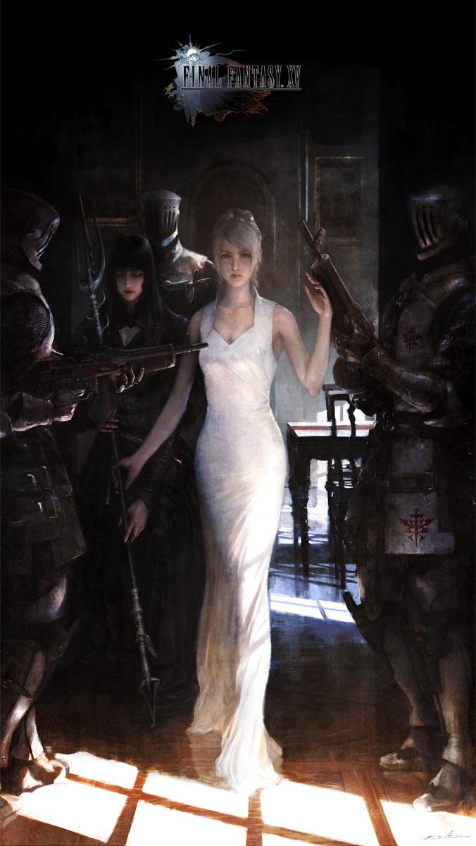
One look at this artwork for the game tells you it has a much grander plot further down the line.

http://i.imgur.com/OqOPXei.png

Can't wait to fight Ultros.
 
While LR did keep me on my toes in regular battles, which is a plus. I found it's battles got really tedious, really fast. It was definitely the most active.


Between the two, I also like the second one more than the rectangles, if I had my way we are getting those weapons lined up.

Don't think weapons lined up works for the button arrangement we have now.
 
Theory: they switched the UI for feedback reasons.

If you're reading this S-E, the top UI is superior!

I think the bottom is better.
The effect is the same but the old rectangles are just too big. The purpose is just to be a reminder of the weapon assigned to a direction, you can't waste that much space for this.
 
I mean it's 2016 and mainline FF is supposed to be cutting edge. Gameplay evolves with the times and tech. It's still an RPG but going action based and including some elements like stealth (which has been around a long time; and in an action game you want to typically want dispatch enemies with the least amount of resistance) or turrets (which is a remnant of Versus XIII and it makes sense to use them in a militarized setting) works best for a mainstream audience.

I don't know how genre-shifting makes something cutting edge, and this doesn't even look like that within the genre they shifted to. It looks like an unfocused amalgam of ideas that isn't as well-executed as the games they're inspired by.

There's World of Final Fantasy for you... I fear people are forgetting about that game.

I'm excited for World, but I'd like something with the budget and tone of a mainline Final Fantasy. I'd trade World, Setsuna, Bravely Default and even DQ11 for that.
 
I think the Summons/Espers/Eidolons might play a big role. They showed Leviathan during the attack on Altissia and I don't think it's on the side of Nilfheim.

One theory people had was that Niflheim was going to harness the powers of the summons and use them against various cities to conquer them, but I don't believe this to be the case. They stressed that magic was more in the line of what Lucis was big on, and given that art piece showing the numbers of airships/planes, magitek armor and soldiers, as they said in the ATR, Niflheim's strength is their technology and their numbers. Besides, harnessing the powers of summons to attack nations was already a thing(FFIX), and Niflheim basically has the majority of the world under their control by the start of the game. I think Leviathan, who is said to be the guardian of Accordo, is summoned by the people there, or senses the heavy military arrival(with all the airships and soldiers) and aims to protect its nation, despite its powers being extremely destructive to everything(including the nation it aims to protect).
 
Don't think weapons lined up works for the button arrangement we have now.

You can still assign them, to a directional button. It's just easier to arrange them according to the cardinal directions, makes sense visually.

The current lay out makes sense, the one I want doesn't but would look cool.
 
Hmmmm. Ever since VIII I've had a penchant for female villains; I hope not Freya isn't wasted (putting it nicely...) the way Jihl was. Good to know Luna's BF looks awesome!
 
I know, but it's pretty apparent now that that's going to be something seen in this game as well. There were people who thought the WHOLE focus of the game was going to be Noctis and crew traveling to Niflheim to retrieve the Lucis crystal, and then return home, and that's it. It's rarely that simple. Even FFI wasn't that simple.

Oh I'm expecting a coup to happen or the Empire went to far with they war effort and awoke or made something they can't control.

Or its something totally unexpected and out of left field.
 
While the weapon switching UI looks worse when it's circular, I think it works a lot better. Things are actually evenly spaced out and and corresponds properly to the four directions. The rectangular version doesn't look right, but it looks more detailed and more visually appealing.

I highly disagree. The circles come from nowhere, and add a new shape to the mix. As a result, the UI looks sloppy. It's not even level with the topmost name on the right. If the rectangle/parallelograms were better spaced out, I'd much prefer that.

Or you know, add the diamonds back to the health bars and make the weapons into a diamond pattern. Boom, consistency.
 
FFXIII-2 is definitely a tonal shift from FFXIII, but I found it welcoming. There is a good story SOMEWHERE in Final Fantasy XIII, it's just presented in a terrible way. I see why people like it's story and themes, but it's delivery was so sloppy. Data logs and flash backs just didn't really help it out.
I'm not going to comment on XIII-2 and LR because I think those chucked the story off a cliff due to it going into time travel and not doing it very well at that.

However, I think XIII's story had potential some where in it. Part of it's problem was it also locked story behind the novel that released in Japan. Most people won't have read it because it didn't get officially translated. People had to read a fan translation.
I don't mind the d-pad direction, but just the way it's represented could be better imo

CaEI6lfUkAE5BEJ.jpg:orig

CaEJKeDUYAAA-zk.jpg:orig


Top is the one we got last week's screenshot, bottom is today's video.

Bottom has over-simplified weapon icons, the size, and the circular shaped buttons that looks like smartphone touchpad UI...
The top one at least seems more detailed imo.

Yeah. My other problem with the bottom one is, it's minimalist, but at the same time, it takes up so much space unnecessarily.
 
For sure, there is something else there than the "Niflheim vs World" conflict.

Of course, and it likely has something to do with the planet being sick and how the worse it gets, the longer the nights get(eventually shrouding the world in eternal darkness). I think this will be a major plot point of the game, connecting to that artwork and Luna's importance. In essence, this is all VERY FF(at least to me), especially considering the effect of longer nights, and eventually a world of darkness(which might be likened to the latter portions of FFV(
merged world that is ravaged by Void holes
), FFVI(
World of Ruin
), FFVII(
Meteor looming in the sky
), FFVIII(
Time Compressed Overworld
), and FFIX(
Post-Terra Mist world
).
 
I highly disagree. The circles come from nowhere, and add a new shape to the mix. As a result, the UI looks sloppy. It's not even level with the topmost name on the right. If the rectangle/parallelograms were better spaced out, I'd much prefer that.

Or you know, add the diamonds back to the health bars and make the weapons into a diamond pattern. Boom, consistency.

I think it looks sloppy, but I also think it works well. It's just not visually appealing as the rectangular setup.

And I don't know how adding diamonds would make it any better.
 
jULK0ha.gif


Man, this is an awesome gif, but it kinda disappoints at the same time. I see whoever is playing is just holding attack to do those combos. I hope I can actually jump that high myself (duscae's jump sucked a lot) to do those attacks, and the combat feels smooth when just pressing attack rather than holding.

They did say that there'll be two modes of attack in this, I wonder if this is the more laid-back one and that there's a more action one.
 
I'm not going to comment on XIII-2 and LR because I think those chucked the story off a cliff due to it going into time travel and not doing it very well at that.

However, I think XIII's story had potential some where in it. Part of it's problem was it also locked story behind the novel that released in Japan. Most people won't have read it because it didn't get officially translated. People had to read a fan translation.

I'm judging the game by the content of what I play on the disk not some novel. That's really not a problem in my opinion, because I shouldn't have to go out of my way to understand the story with supplemental material.

Does anyone have a link to the Progress Report video they showed? I wanted to save it for further viewing.

Enjoy.
 
Status
Not open for further replies.
Top Bottom