-
Hey Guest. Check out your NeoGAF Wrapped 2025 results here!
You are using an out of date browser. It may not display this or other websites correctly.
You should upgrade or use an alternative browser.
You should upgrade or use an alternative browser.
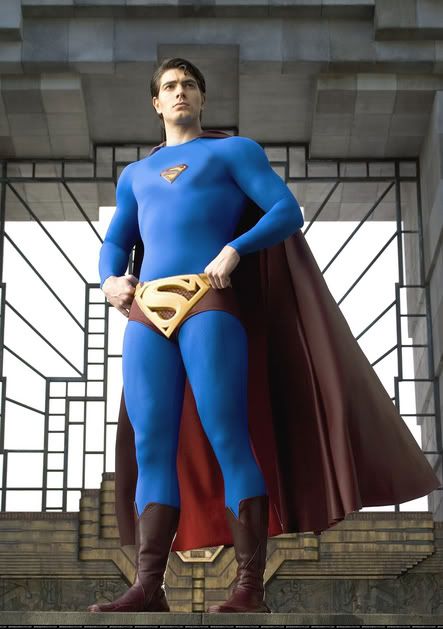
First pic of Routh as Superman
- Thread starter Matrix
- Start date
- Status
- Not open for further replies.
Willco said:Who fucking cares? Superman is such a lame character.
I guess you didn't buy Bill's argument in Kill Bill pt 2 then. I thought it was a fresh perspective on Supes.
DJ_Tet said:I guess you didn't buy Bill's argument in Kill Bill pt 2 then. I thought it was a fresh perspective on Supes.
I never heard this new perspective on Supes. What is it?
OpinionatedCyborg
Member
WordofGod said:I never heard this new perspective on Supes. What is it?
Superman was born being Superman, not Clark Kent. Superman's costume isn't really a costume, it's his normal clothing. Clark Kent is the face and costume Superman puts on when he wants to blend in with the rest of us. Clark Kent is weak, blithering, nerdy, bookish, and helpless--exactly how Superman sees the human race.
That line of thinking really only applies to certain series of the Superman books/movies. The earlier comics depicted Superman as being a much more alien like figure, whereas the new one's have played up his connection with humans. Smallville's a good example of how the perspective has changed dramatically.
The costume isn't bad. The worst travesty about the movie so far for me is the storyline. While it is cool that they are continuing from Superman II(and ignoring the horrible sequels),
Sorry about spoiler, but the plot still sucks.
they pretty much ruined it by having Lois Lane marrying someone and having CHILDREN while he was away for 6 years to investigate Krypton.
Sorry about spoiler, but the plot still sucks.
tenchir said:The costume isn't bad. The worst travesty about the movie so far for me is the storyline. While it is cool that they are continuing from Superman II(and ignoring the horrible sequels), they pretty much ruined it by having Lois Lane marrying someone and having CHILDREN while he was away for 6 years to investigate Krypton.
That could have used some spoilers.
Sukahii16 said:That could have used some spoilers.
Clark Kent is Superman.
Bacon said:Clark Kent is Superman.
Impossible, Clark Kent wears glasses and is mild-mannered.
Bacon said:Clark Kent is Superman.
You mean Superman is Clark Kent.
Anyways, Singer sucks, I told ya so, neener neener neener and all that jazz.
ThirstyFly
Member
Impossible, Clark Kent wears glasses and is mild-mannered.
Hahaha. Perfect. :lol
Ninja Scooter
Member
Sukahii16 said:Impossible, Clark Kent wears glasses and is mild-mannered.

"THE MOLECULAR MAN!"

Kai Dracon
Writing a dinosaur space opera symphony
I'm not going to get FANK WANK POWER HATE! on here. I'm just kinda meh on it. At most, I'm disappointed that they seem to be following the trend started by Tim Burton's Batman where they think bodysuit style super hero costumes need a "3D" element to define them. Thus on Supes we get rubber emblem, more detailed and rubbery boots, and an overly sculpted rubbery belt. My problem is that the entire trend makes 'em look like plastic action figures. Awkard. Molded in one particular position.
Though any arguments about the "lameness" of the Superman costume aside... the pics of Reeves as Superman once again reinforce that he was Superman, period. It's not that he doesn't look "lame" in the way people are judging lameness. It's that Reeve FIT that. Reeves had a classical, swashbuckling adventurer's squareness, chin, jawline, an curly fluff of hair on top. Except he was a real live guy. Reeves made you -believe-, petty questions of how "cool" a fashion statement is aside.
Though any arguments about the "lameness" of the Superman costume aside... the pics of Reeves as Superman once again reinforce that he was Superman, period. It's not that he doesn't look "lame" in the way people are judging lameness. It's that Reeve FIT that. Reeves had a classical, swashbuckling adventurer's squareness, chin, jawline, an curly fluff of hair on top. Except he was a real live guy. Reeves made you -believe-, petty questions of how "cool" a fashion statement is aside.
Kai Dracon
Writing a dinosaur space opera symphony
DJ_Tet said:I guess you didn't buy Bill's argument in Kill Bill pt 2 then. I thought it was a fresh perspective on Supes.
Bill's Superman monologue was *awesome*. Rather than judge supes based on our flighty and changing standards of lame and cool, it put supes beyond that. Flipped the entire thing on its head.
I hate this "bright colors = gay and everything I don't like = gay" shit. I'm gay and I don't like this, so that makes it straight? Ban that shit.
Though it's kind of interesting, I do think openly gay people can accept more colors and things 'straights' don't accept because of cultural stereotypes. But that doesn't make this 'gay' costume any better. The problem is that the original design is lacking for live movies. The color scheme is at home in comics, but sticks out in real environments. Either rework the costume or go Sin City with the color scheme and directing style.
Singer is obviously afraid of colors if you look at X-Men, but maybe the pics aren't accurate. In the end, I don't care how Superman looks so much as how good the movie is.
Ninja Scooter
Member
Dragmire said:I hate this "bright colors = gay and everything I don't like = gay" shit. I'm gay and I don't like this, so that makes it straight? Ban that shit.
Though it's kind of interesting, I do think openly gay people can accept more colors and things 'straights' don't accept because of cultural stereotypes. But that doesn't make this 'gay' costume any better. The problem is that the original design is lacking for live movies. The color scheme is at home in comics, but sticks out in real environments. Either rework the costume or go Sin City with the color scheme and directing style.
Singer is obviously afraid of colors if you look at X-Men, but maybe the pics aren't accurate. In the end, I don't care how Superman looks so much as how good the movie is.
Singer actually is gay though, so if he doesnt like bright colors, maybe that means bright colors=straight! Batman is SUPER gay?!
Fatghost28 said:I don't like the belt, but otherwise the costume looks ok. It looks pretty retro, like Supe's costume in the golden age with the higher neck line and smaller emblem.
I agree, I think the costume is good aside from the extra S symbol on the belt. It's really redundant and not necessary to have.
Dragmire said:I hate this "bright colors = gay and everything I don't like = gay" shit. I'm gay and I don't like this, so that makes it straight? Ban that shit.
I hope you're joking.
Except for the size of the S, I don't think the suit looks bad at all. I think I'm more concerned by the guy they have playing Supes. It might be bias informed by my childhood, but Routh is missing something that Reeve had and try as I might I can't really buy Routh being Superman. Maybe it will be different when actual footage is available.
WordofGod said:Check this comparison out:

Dean Cain is the Cedric Ceballos of Supermen.
Spike Spiegel
Member
That comparison does a good job of illustrating just how small this new S- symbol is. Also, the new high collar affects how the cape drapes across his shoulders, it looks off. And it's too damn long! Look at the cape Reeve is wearing; Superman's cape ends at or just below his knees, it doesn't hang down to his ankles. He's not Batman, for chrissakes.
The colors and belt don't tick me off so much as the other, little things they got wrong.
EDIT: The Cain costume is just embarrassing. Did it really look that bad?
The colors and belt don't tick me off so much as the other, little things they got wrong.
EDIT: The Cain costume is just embarrassing. Did it really look that bad?
Meh, kinda what i was expecting.
Havent really seen anything to excite me about this film yet except singers involvement.
talking of which, did any of you watch his "The Call" videoblog for the movie?
http://www.bluetights.net/video_large.php?id=7
Peter Jackson calls him up and flys him out to new zealand to direct Kong for him while he takes a nap! :lol
Ninja Scooter
Member
DMczaf said:Dean Cain is the Cedric Ceballos of Supermen.
Reeve=Michael Jordan
Routh=Ben Gordan
...
Dean Cain=Pete Myers?


OpinionatedCyborg
Member

Spike Spiegel
Member
Jade Knight 08
Member
Roth needs to beef up those muscles if he wants to play Supee!
He looks great playing Clark Kent but they need to hire another actor to play supee!!!
My choice:
Keep Roth as Clark Kent while another unknown actor plays Superman.
So, that way when it is time for Clark Kent (Roth) to turn into Superman they'll zoom in on Roth chest while he opens the shirt to expose on the symbol then zoom out the camera then it'll show superman playing by different unknown actor. Vice versa Supee to Clark Kent (Roth).
Jade Knight 08 said:Roth needs to beef up those muscles if he wants to play Supee!
He looks great playing Clark Kent but they need to hire another actor to play supee!!!
My choice:
Keep Roth as Clark Kent while another unknown actor plays Superman.
So, that way when it is time for Clark Kent (Roth) to turn into Superman they'll zoom in on Roth chest while he opens the shirt to expose on the symbol then zoom out the camera then it'll show superman playing by different unknown actor. Vice versa Supee to Clark Kent (Roth).
He looks just as buff as Reeves to me...
Wendo said:He looks just as buff as Reeves to me...
I agree. Reeves was a bit more muscular but Roth is fine. I'm glad the Superman in the movies reflects a more Superboy/Johny Byne physique rather than the ballon muscles that some artists use to depict Superman today.
...those comparison shots make it look better, if anything. Singer has created an updated, stylized version of the old costume. Accept the change! I don't think it rapes the suit in any way, and I really can't say the smaller S makes any major difference in the look of the costume.
Ned Flanders
Banned

Holy christ on a cardboard cross. Truly the worst photoshop ever, including the future and any parallel dimensions that may exist.
Spiegel nailed the critique of Rouths suit though, especially about the cape. It's too long and is slung oddly about his shoulders, not to mention it looks like its made from walrus leather in comparison to Reeves' getup. I guess I'm still the only one carrying the torch about his manshorts being too "low-rise", making his torso look even longer. They should bring them up closer to his navel. Nothing about the costume could be altered to fix his sumo stumps though..
I remember during the "Making of" docs for Spider-Man, Raimi obsessed about the size of the chest spider because he knew that full-body shots would be rare compared to bust shots and he didn't want the spider-icon to be cut-off or go unseen. Singer could be thinking along the same lines with the smaller shield, hoping to squeeze it into more close up shots. Though, personally, I think showing half a shield is fine and gives an impression of a larger chest in bust shots.
Spike Spiegel
Member
So I decided to try my hand at editing the Routh costume... Check it out, I made it this morning.
http://spiegelspike.homestead.com/files/routh_edit2.jpg
A list of changes: 1) made the red more vibrant, and (inadvertently) the blue darker; 2) made the chest S- symbol about 20% larger; 3) made the boots taller; 4) made the cape shorter, so that it ends at/around his knees; and 5) dropped the background, duh. I left the collar alone because I couldn't get it to look right.
I know the image is a little small, but at its original size it would've quickly KO'ed my site's bandwidth. I kept the larger version, if anyone wants to host it or knows where I can put it.
You people need to understand that the suit probably won't look like that in the film, as through the MAGIC that is POST, it'll look a lot different. This is as dumb as that Batman suit unveiling against a white background that everyone thought sucked, and then as we saw it in the trailers, it looked a lot better.
DUH.
DUH.
Spike Spiegel
Member
WOW! You mean that after the magic of post-production, the cape will be shorter, the boots will be taller, the S- will be bigger, and the collar will be wider? It's going to look more like it should? They're really going to do all that? Well, then I guess I was all wrong about this! Consider my complaints retracted!
... 9_9
BTW, I'm still not that keen on the new Batsuit.
... 9_9
BTW, I'm still not that keen on the new Batsuit.
Spike Spiegel said:So I decided to try my hand at editing the Routh costume... Check it out, I made it this morning.
http://spiegelspike.homestead.com/files/routh_edit2.jpg
A list of changes: 1) made the red more vibrant, and (inadvertently) the blue darker; 2) made the chest S- symbol about 20% larger; 3) made the boots taller; 4) made the cape shorter, so that it ends at/around his knees; and 5) dropped the background, duh. I left the collar alone because I couldn't get it to look right.
I know the image is a little small, but at its original size it would've quickly KO'ed my site's bandwidth. I kept the larger version, if anyone wants to host it or knows where I can put it.
Also, he's been lit by a distant neon strip joint sign.

Spike Spiegel
Member
Yeahhh... that happened when I used Color Balance to change the red. The only way I can figure to avoid that would've been to individually lasso the red areas, taking great care to avoid all blue areas in doing so, but that would've taken too f*cking long. Same reason I didn't bother trying to fix the collar.
I'm not gonna waste all day on this. I have other unimportant things to do.")
I'm not gonna waste all day on this. I have other unimportant things to do.
Spike Spiegel said:WOW! You mean that after the magic of post-production, the cape will be shorter, the boots will be taller, the S- will be bigger, and the collar will be wider? It's going to look more like it should? They're really going to do all that? Well, then I guess I was all wrong about this! Consider my complaints retracted!
Considering that most of the complaints have been about the colors rather than the physical attributes, I was targeting my comments towards those complaints.
I mean, complaining that the symbol, collar and cape is pretty dumb. The comic book has so many variations of the suit. It's red, it's blue, he wears tights and it has the symbol. Anything else shouldn't matter.
BTW, I'm still not that keen on the new Batsuit.
I'm not saying you were keen, I'm saying that the complaints obviously dropped once the film went into post and Batman was not standing in front of white background.
MrPing1000
Member
Matrix said:SuperWang
:lol real lol moment there
Spike Spiegel
Member
Arguing over the size of the chest symbol is not stupid, because it's the key to his whole costume. The S-symbol is the most immediately recognizable thing about his whole look, and getting it right is essential. It's the first thing you see when you look at Superman -- this BIG red "S" in a pentagonal shield stretched across his broad massive chest. It can't look dinky.Willco said:Considering that most of the complaints have been about the colors rather than the physical attributes, I was targeting my comments towards those complaints.
I mean, complaining that the symbol, collar and cape is pretty dumb. The comic book has so many variations of the suit. It's red, it's blue, he wears tights and it has the symbol. Anything else shouldn't matter.
The collar and cape are less crucial, but still... The bigger the cape, the smaller the guy wearing it looks IMO. A long, floor-length cape works on Batman because it acts as a cloak; it's supposed to conceal. But Superman doesn't need to conceal, and the short cape actually helps create the illusion of him being taller, larger. Plus, it's gotta interfere with his aerodynamics.
The collar... well, when you were a kid, did you ever tuck a towel into the back of your t-shirt and pretend it was a cape? I'm just worried that without a wider neckline, it's gonna look like that.
Yeah, because the Batsuit was taken out of context in those early shots. But this publicity still of Routh, though, looks to be from the set and not a test shot in front of a blank screen. It's more like this...I'm not saying you were keen, I'm saying that the complaints obviously dropped once the film went into post and Batman was not standing in front of white background.

...which IIRC also drew some unjustified heat for the colors -- but not the overall design. That was spot on. Just a few fanboys pissed it didn't have McFarlane -size eyes.
Those colors from the Spider-Man test shot are noticeably off from what it looks like in the final film, Spike.
And arguing the symbol size is ridiculous. It's fluxuated in the comics over the years. The suit looks fine and I'm sure it'll look better when the film is done.
And what's with this Singer hate? He gave us two solid X-Men movies, one of the best films of the 90s in The Usual Suspects and a good King adaptation in Apt Pupil. He's not a trashy director or anything.
The one on the right almost looks like a $12.99 Walgreens superman costume in comparison. :lolWordofGod said:Check this comparison out:
BuckRobotron
Member
This guy seems to look fine for the part. Christopher Reeves had essentially the perfect look for the part, square-jaw and stature and all, so anyone else might come up somewhat wanting.
And this guy actually seems to have a bit of a younger Chris Noth look, which might go over Big with women.
And this guy actually seems to have a bit of a younger Chris Noth look, which might go over Big with women.
- Status
- Not open for further replies.