It's still technically the best looking game on any platform. Burning shores' clouds are indeed a wow moment. But yes, all you have to do is go back and start playing it again and its shortcomings becoming obvious as you can see below.
You can find ugly screenshots of any game, but what these screenshots do is point out several sacrifices they had to make in order to get this game running on PS4.
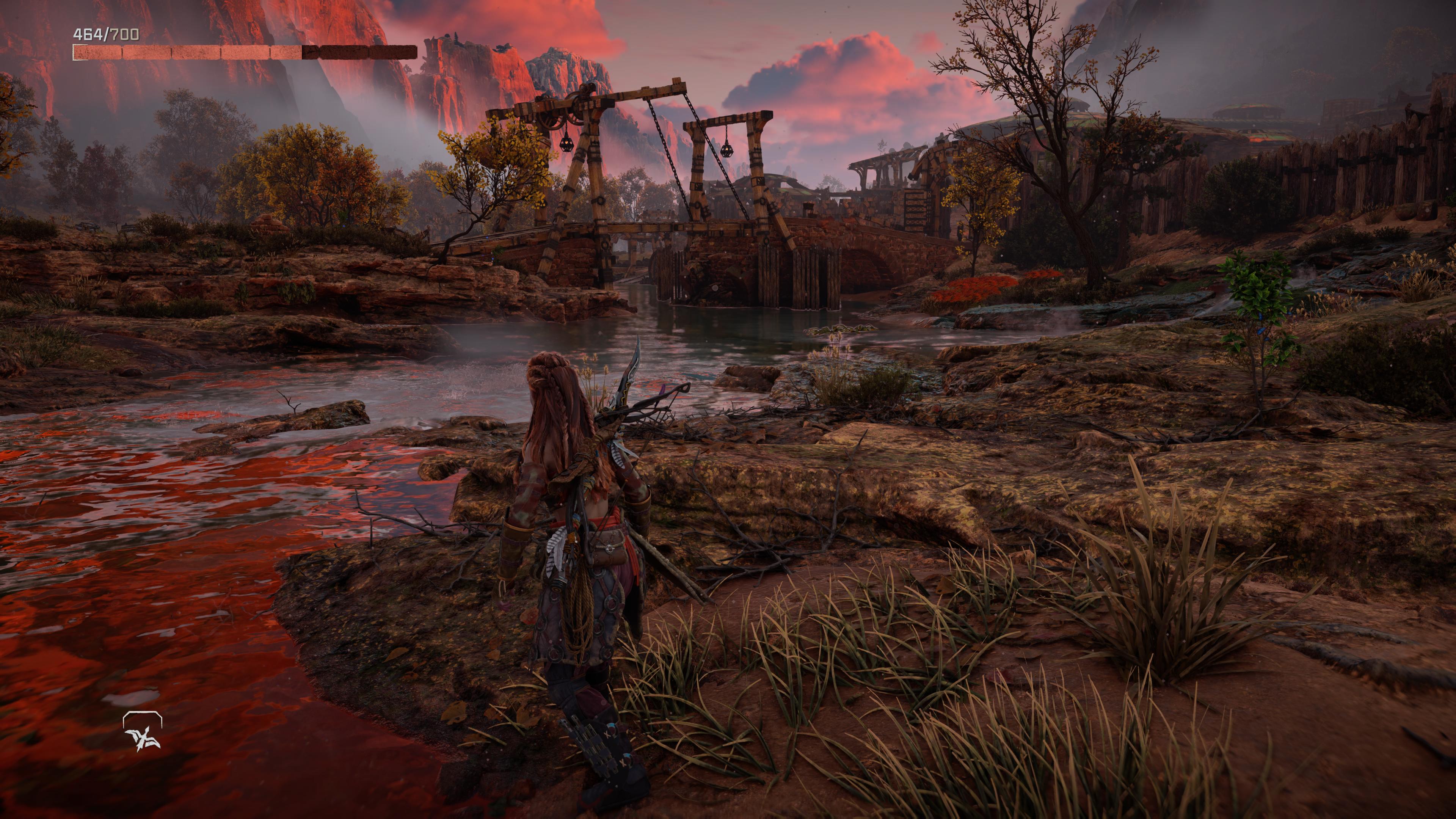
- underwhelming lighting in many areas
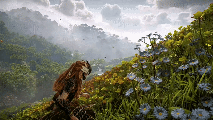
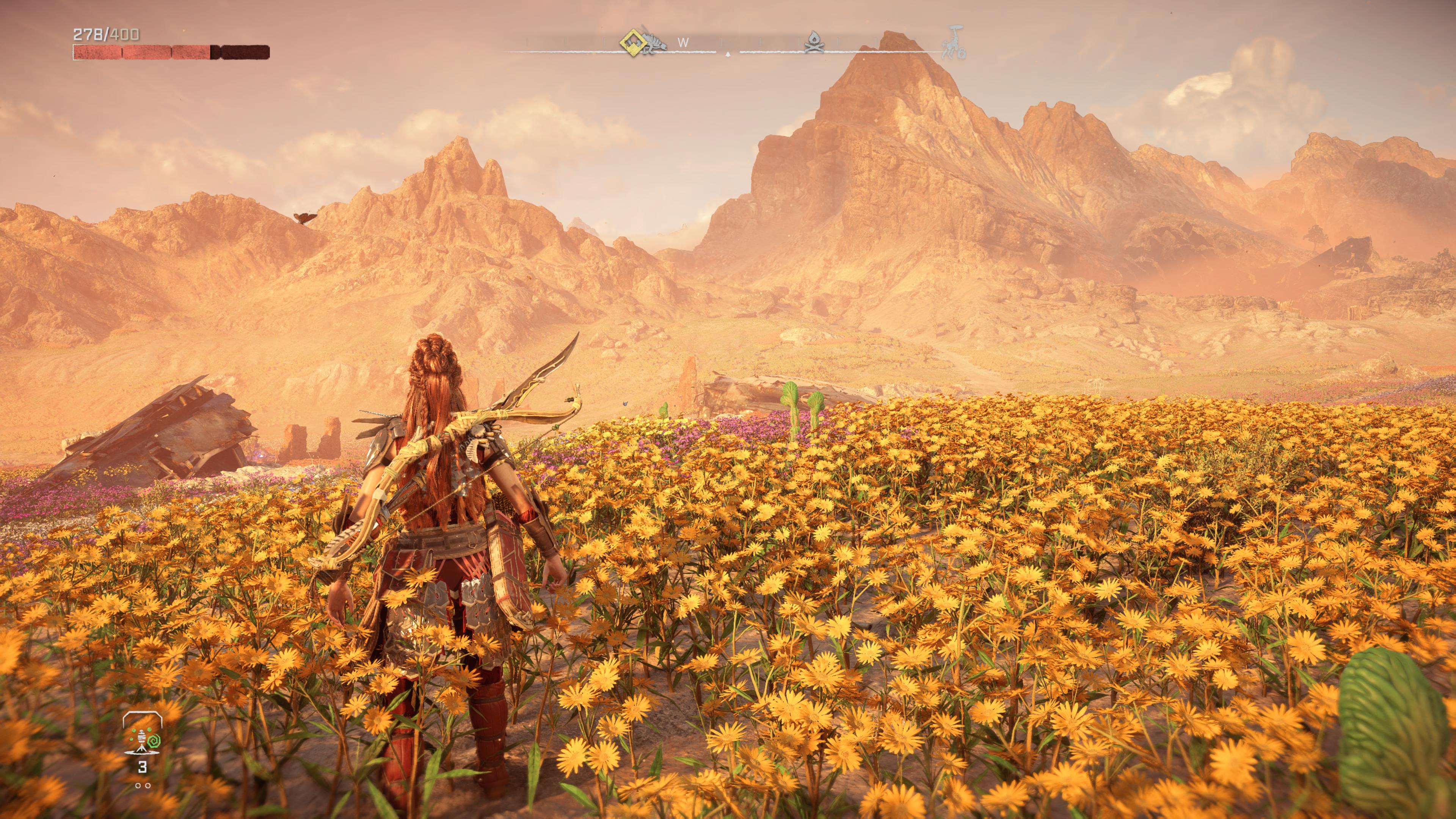
- low level of detail on rocks and stones, not just mountains in the distance. see first screenshot.
- some really bad looking grass in several areas. very odd considering foliage rendering is the game's strong suit
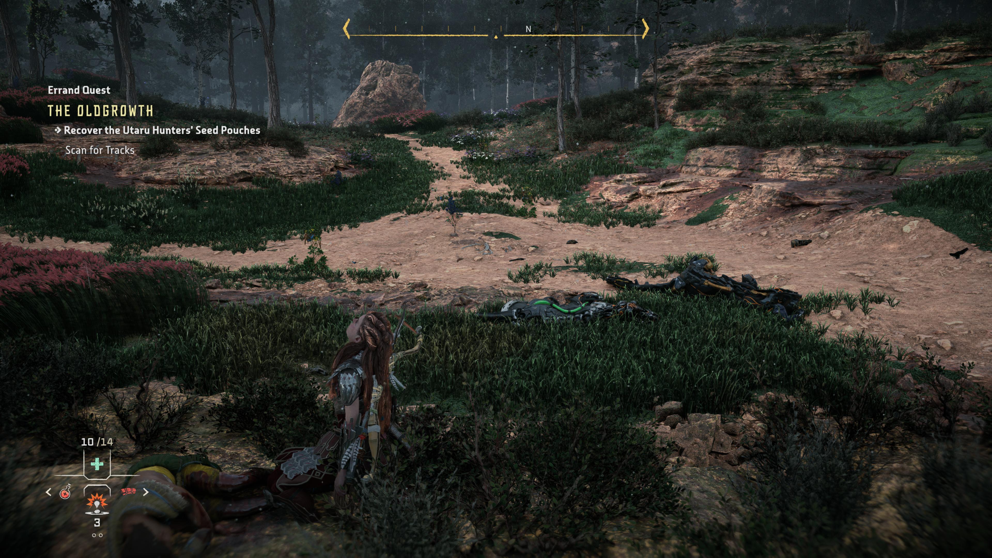
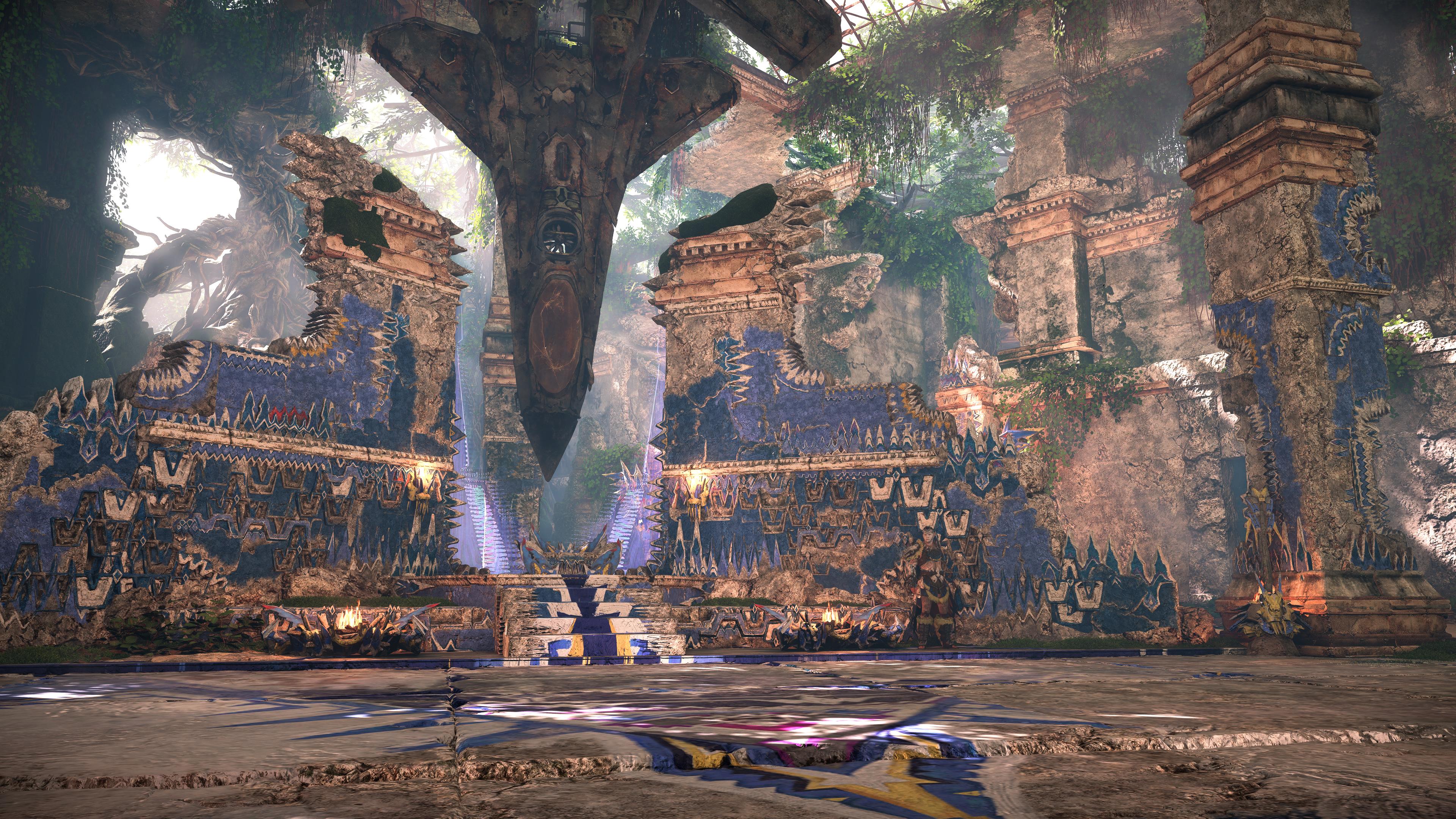
- simply poor interiors
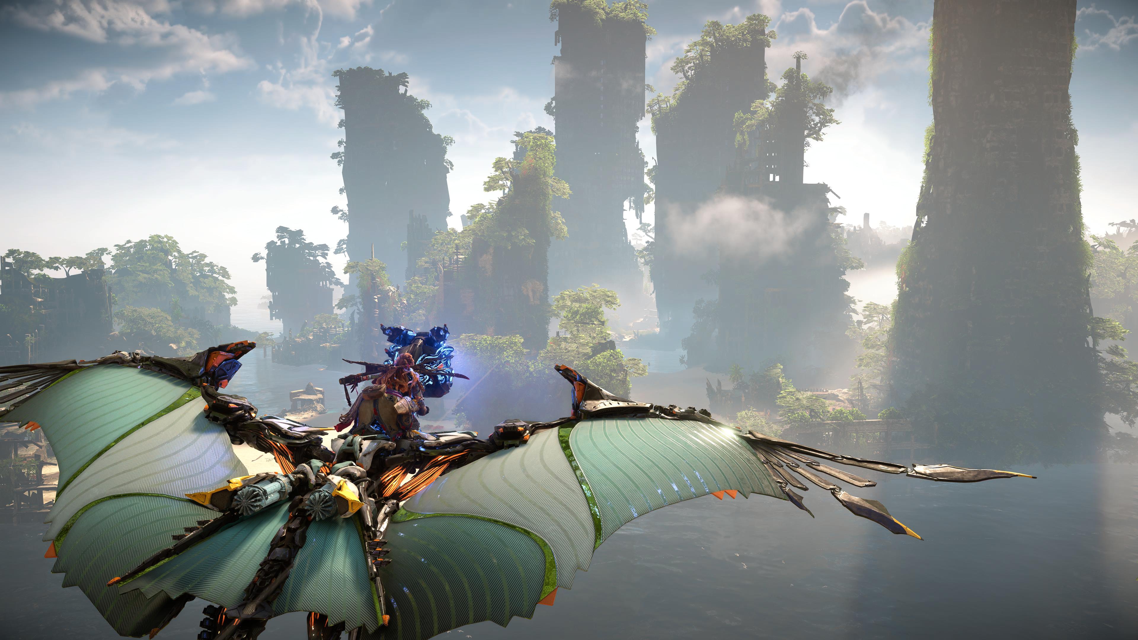
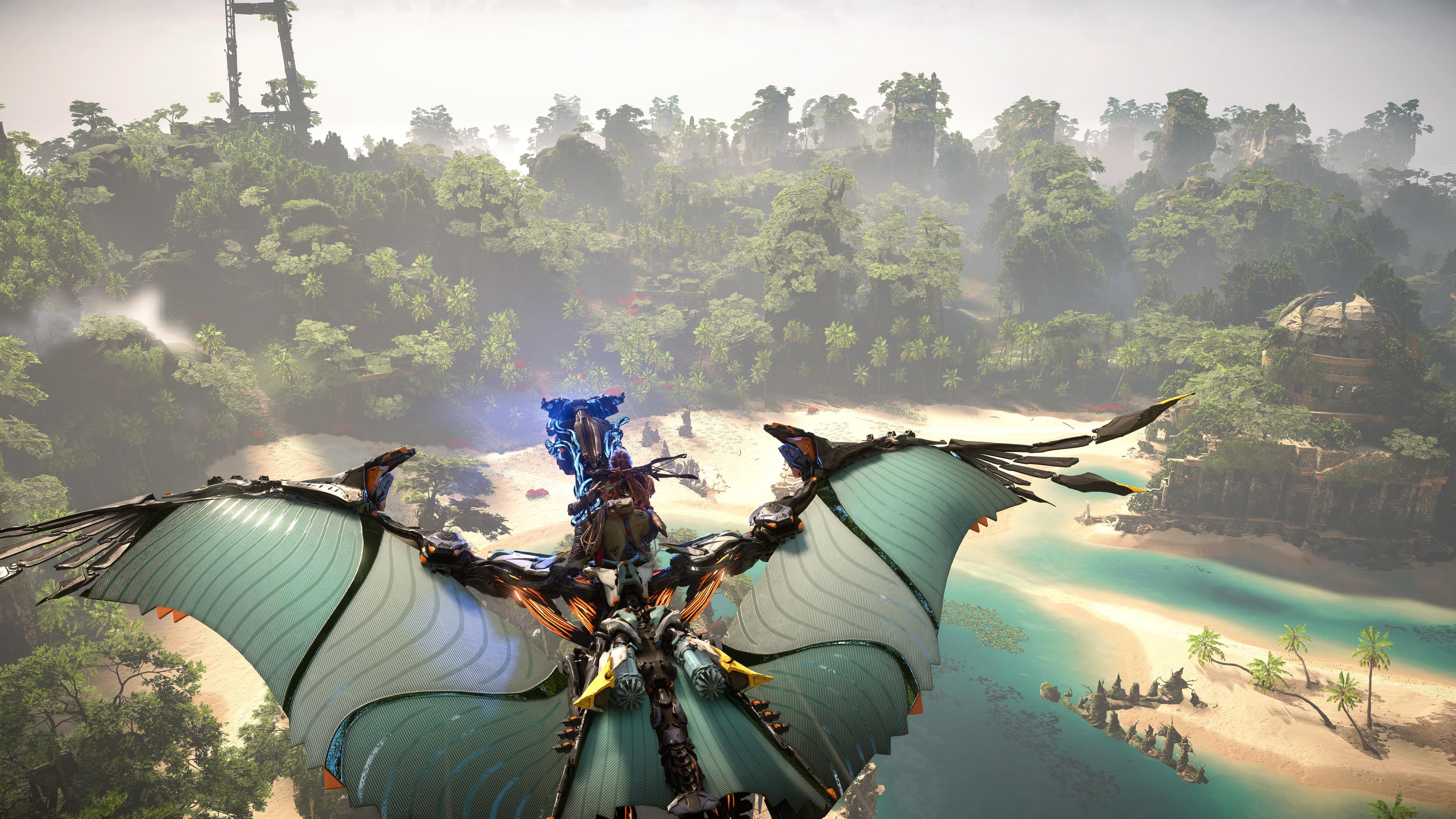
- poor LODs in the distance. Flying exposes just how bad some trees look from the distance especially palm trees.
- just a general lack of object density. you wont notice it because they do such a good job with the cinematography but a lot of the times they have the same foliage, textures and other objects repeating. i get that its supposed to be procedurally generated but Burning Shores is the first time i picked up on how simple the environments are in Horizon. At first I thought it was too much detail that was giving me an eye sore, but its actually the opposite. everything blends in because there isnt enough differentiating between different trees, foliage, and other world objects.
This is one of the few games where I took more ugly screenshots than good screenshots. It's surprisingly inconsistent.