-
Hey Guest. Check out your NeoGAF Wrapped 2025 results here!
You are using an out of date browser. It may not display this or other websites correctly.
You should upgrade or use an alternative browser.
You should upgrade or use an alternative browser.
New Zelda images (GC) inside
- Thread starter Baconäger
- Start date
Bluemercury
Member
drohne said:i do get on little hate rolls. that's observant of you.
but at any rate, i'm not militating against nintendo or zelda, i'm militating against your blinkered gaming worldviews. where the next big nintendo game is by default the best game ever, where nintendo creates more original ip than any other developer, etc. consider it a public service. or a sick jihad. really whichever.
and neo contra is so much better than zelda that i want to scream. bet you haven't played it!
Well the last 4 or 5 posts from you i've read are about trolling Nintendo, like the donkey kong jungle beat for its controls, or Metroid for its controls, or the Ds for its controls, im surprised you havent talked about this game controls........
Redbeard said:The enemy in the first pic looks horrendous, but the others are great.
True!
")
SantaC
Member
Deg said:
my fave screen
it's a fantastic screen.
missAran said:Does anything think that the Link on horse screen looks Photoshopped?
It kind of looks like link and the horse are photoshopped onto the background. I do think this is from the E3 build because the textures are not good at all. I would expect better with 1 year until release.
deadlifter said:It kind of looks like link and the horse are photoshopped onto the background.
That's a bit troublesome considering one of the most impressive parts of the screen was the massive draw distance.
Memles said:Okay...I know there were a few IBHATs early in the thread...but it's like four pictures!
I think it looks great and all...but over 250 replies for four pictures? This thing is a monster.
Yeah, it's a big deal. I can't believe it's generated this much of a response -- but I can because it's Zelda. Next time someone questions Nintendo's franchise's power to mobilize, reference this thread.
missAran said:That's a bit troublesome considering one of the most impressive parts of the screen was the massive draw distance.
It's depth of field blur, which has nothing to do with draw distance. EAD has been using the effect for most of their key titles.
ge-man said:It's depth of field blur, which has nothing to do with draw distance. EAD has been using the effect for most of their key titles.
At any rate, it's still worrisome that Nintendo feels the need to Photoshop one of its biggest franchises.
SantaC
Member
missAran said:At any rate, it's still worrisome that Nintendo feels the need to Photoshop one of its biggest franchises.
you talk like it's 100% sure that it's photoshopped...why would they? We know that the horse can ride on the field anyway.
Xenomiggs
Member
Yes, even though the screens look a bit jaggy (a problem that plagues most of Nintendo's official screenshots), it doesn't mean that the end result will be that way.
Just take a look at this official Mario Sunshine screen:

As you all know (at least all the people who've played it), it doesn't look like that. In fact, it runs smooth and jaggie-less. That's what will happen with Zelda too. I mean, you only need a glimpse of the E3 trailer to notice that it's already looking super smooth.
So yeah, in the end, this game can be a winner -- not because of the graphics -- but the art-design. If Nintendo succeeds in giving the game a brilliant art-direction, it will be an amazingly looking game, whether the textures are hot or not. (Just look at Retro's work).
Also, the depth-blur effect... could it be Nintendo's way of making the enviroments huge, without compromising framerate, details and processing power?
Just take a look at this official Mario Sunshine screen:
As you all know (at least all the people who've played it), it doesn't look like that. In fact, it runs smooth and jaggie-less. That's what will happen with Zelda too. I mean, you only need a glimpse of the E3 trailer to notice that it's already looking super smooth.
So yeah, in the end, this game can be a winner -- not because of the graphics -- but the art-design. If Nintendo succeeds in giving the game a brilliant art-direction, it will be an amazingly looking game, whether the textures are hot or not. (Just look at Retro's work).
Also, the depth-blur effect... could it be Nintendo's way of making the enviroments huge, without compromising framerate, details and processing power?
missAran said:At any rate, it's still worrisome that Nintendo feels the need to Photoshop one of its biggest franchises.
The majority of screenshots released by companies are photoshopped. Halo 2 was photoshopped, MGS3, ect. Screenshots are not the best judge on how a game looks, movies are.
God, why wasn't this what Wind Waker looked like?  And am I the only one who notices that this looks inferior to the old Spaceworld demo? But you won't hear me complain about that, b/c I want a non-cartoony Link, and it looks like we're gonna get it. Wind Waker was awesome...IS awesome, but it's not what we were promised, and now Nintendo's gotta deliver in spades. PEACE.
And am I the only one who notices that this looks inferior to the old Spaceworld demo? But you won't hear me complain about that, b/c I want a non-cartoony Link, and it looks like we're gonna get it. Wind Waker was awesome...IS awesome, but it's not what we were promised, and now Nintendo's gotta deliver in spades. PEACE.Code_Link said:Also, the depth-blur effect... could it be Nintendo's way of making the enviroments huge, without compromising framerate, details and processing power?
No. I doesn't do anything to the draw distance except trick the mind into thinking there is depth. It's not like the GC is rendering less things when it blurs the background.
Ulairi said:The majority of screenshots released by companies are photoshopped. Halo 2 was photoshopped, MGS3, ect. Screenshots are not the best judge on how a game looks, movies are.
Right, but I didn't know Nintendo Photoshopped its shots, I guess that was a bit idealistic.
Xenomiggs
Member
Pimpwerx said:God, why wasn't this what Wind Waker looked like?
Considering that the Spaceworld demo was just a movie running on the GCN hardware, yeah, this can look inferior. (Although it clearly doesn't.)
SantaC
Member
Pimpwerx said:God, why wasn't this what Wind Waker looked like?


missAran said:Right, but I didn't know Nintendo Photoshopped its shots, I guess that was a bit idealistic.
If Nintendo really photshopped their shots, don't you think they would clean up the jaggies as well? That's why i don't think it's photoshopped.
SantaCruZer said:
WOW... it's been a while. It's so strange how different software from Spaceworld looks compared to today's. Unreal.
Well how clear the jaggies are makes me think that it is P-Shopped, it just looks like it was put on top of the background.
missAran said:Right, but I didn't know Nintendo Photoshopped its shots, I guess that was a bit idealistic.
I said they *looked* photoshopped. I have a very hard time believing nintendo would photoshop any of their screens, since almost all show up in the final build of the game. It's just the combination of the blur affect and the close up jaggyness of link and the horse.
There was a reason why Super Mario Sunshine looked like a hag's rag in picture form before the big E3 unveiling and why many people dragged it through the mud because the bouncy ropes looked like a 4 sided over-sized toothpick.missAran said:At any rate, it's still worrisome that Nintendo feels the need to Photoshop one of its biggest franchises.
missAran said:Right, but I didn't know Nintendo Photoshopped its shots, I guess that was a bit idealistic.
I don't know if you're joking around or not, but these look like every other GC frame buffer capture. Nothing has been photoshopped in and it's pretty damn clear that the images haven't been resized and had AA applied like almost every other developer does. These are classic Nintendo "no bullshit" style captures.
SantaC
Member
ge-man said:I don't know if you're joking around or not, but these look like every other GC frame buffer capture. Nothing has been photoshopped in and it's pretty damn clear that the images haven't been resized and had AA applied like almost every other developer does. These are classic Nintendo style captures.
correct. Nintendo usually dont care if their screens looks like ass or not. It's weird though. I remember how bad Metroid Prime 2 looked in screenshots, and how good in motion.
btw. The spaceworld link is really ugly compared to this new one.
human5892 said:My question to drohne:
Is the Spaceworld 2000 model of Link the one you'd prefer? Because that one lacks the clothing details you so seem to detest in Link's new model.
Don't bother asking. He likes to take the contrary view in the Nintendo threads he visits, even when the opinion he takes on is almost laughable (who else in this world actually liked the first DS design for example?)
I don't know, it looks really iffy to me.deadlifter said:I said they *looked* photoshopped. I have a very hard time believing nintendo would photoshop any of their screens, since almost all show up in the final build of the game. It's just the combination of the blur affect and the close up jaggyness of link and the horse.
You may be right, but it appears, especially when the background is compared to the foreground, that it's edited. I could be wrong, and if I'm not, it doesn't really matter.ge-man said:I don't know if you're joking around or not, but these look like every other GC frame buffer capture. Nothing has been photoshopped in and it's pretty damn clear that the images haven't been resized and had AA applied like almost every other developer does. These are classic Nintendo "no bullshit" style captures.
I realize this is an early build, and for an early build, it looks stunning. I can't wait to see what else Nintendo does.speedpop said:There was a reason why Super Mario Sunshine looked like a hag's rag in picture form before the big E3 unveiling and why many people dragged it through the mud because the bouncy ropes looked like a 4 sided over-sized toothpick.
You may be right, but it appears, especially when the background is compared to the foreground, that it's edited. I could be wrong, and if I'm not, it doesn't really matter.
I'm not sure why you're so unsure of this. Did you not notice this DOF effect in both Super Mario Sunshine and The Wind Waker?
The depth of field? Why wouldn't it be?neptunes said:So I assume that blur type filter is here to stay.

Tritroid
Member
nah. Nintendo's done this before:SantaCruZer said:Look at Link's facial expression. He looks mean, like he means business. This is so unlike Nintendo! This time they are really going all out for the fans
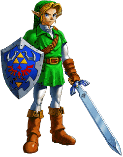
The Ocarina of Time and Majora's Mask models were very 'mean' in terms of expressions. New Link's look is just returning to that approach.
Tritroid
Member
That is awesome. Post it plz.GaimeGuy said:
soundwave05
Member
Looks awesome. Better than SW2K.

SantaC
Member
Tritroid said:nah. Nintendo's done this before:
The Ocarina of Time and Majora's Mask models were very 'mean' in terms of expressions. New Link's look is just returning to that approach.
hm yeah you are right. But Links new armor is really making him look badass.
Tritroid
Member
Oh, you didn't resize it?GaimeGuy said:It's official: The screen is perfect for desktops.
GaimeGuy said:Keep in mind, folks: The original Spaceworld mature zelda was an FMV. This is all in game stuff.
That demo wasn't FMV.
And this does look a lot lot better than that demo, imo.