• Hey, guest user. Hope you're enjoying NeoGAF! Have you considered registering for an account? Come join us and add your take to the daily discourse.

Opreation Tiger and the era of ASS UGLY 3D (give me all your ugly games Gaf!)

VGEsoterica

Member
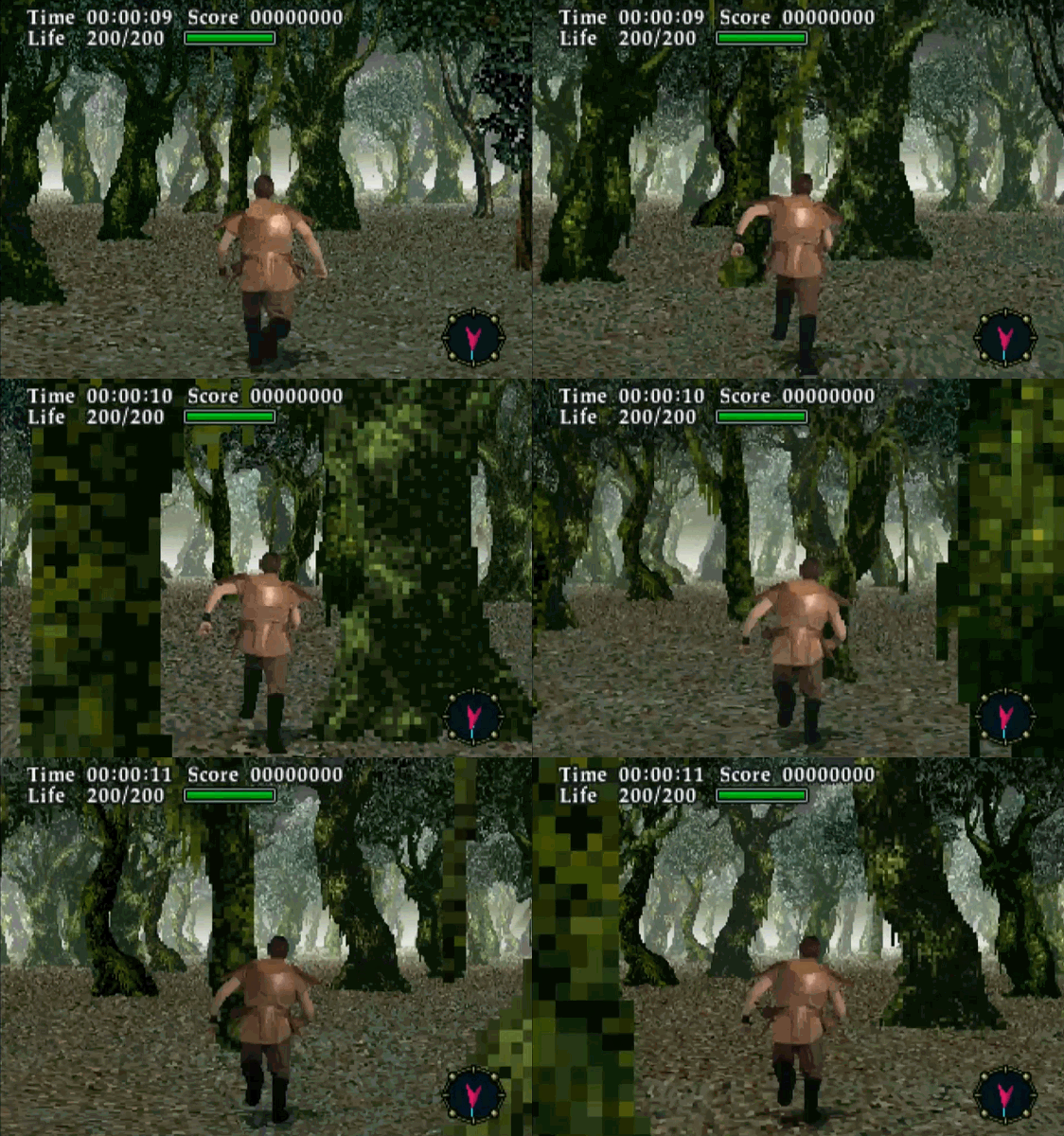
Maybe you had to grow up in the 2D era to really appreciate the transition to 3D games...and how amazingly UGLY they could be. Giant chunky polygons, pixels the size of dinner plates, faces that look like they went through a meat grinder and horribly polygonal distortion...they all look so incredibly BAD yet they all looked so incredibly GOOD when you'd never seen it before.

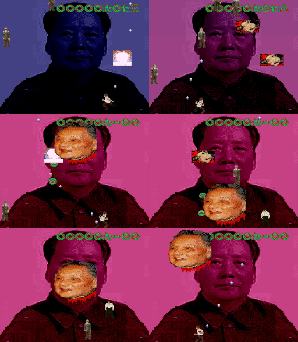
Enter Operation Tiger; an insanely rare arcade game from Taito...which is also an absolute EYESORE. Maybe one of the uglier 3D games of its era. It has pixels that basically look like a disaster...and I am 100% into it. The gameplay is exactly what you want; fast paced light gun action where you shoot baddies to some awesome Zuntata music.

Is it ugly? OH HELL YEAH IT IS! Is it fun? You are damn right

But I want Gaf's recommendation for other ugly 3D games that are wildly fun and you don't care they are ugly as sin. I hope people deliver on this one :)


Knightime_X

Member
Operation tiger doesn't look as bad as I thought.

Check out Virtua Cop or Time Crisis 1 for similar graphics.
 
Last edited:

Banjo64

cumsessed
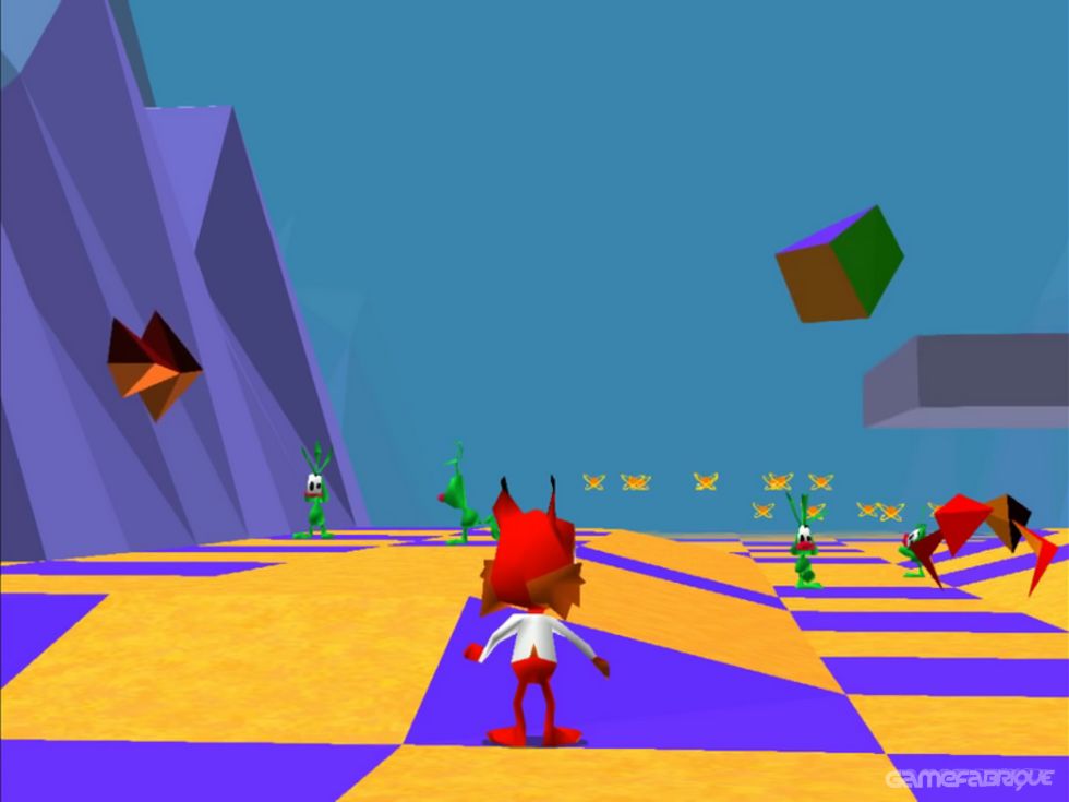
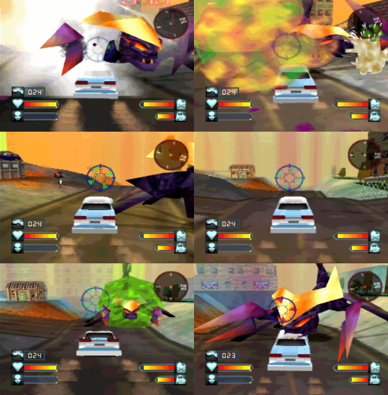
Bubsy 3D just everything about the game is hideous.

I would argue it makes operation tiger a game I have never heard off till now, look like a visual showcase.
First one that came to my mind too. Easily the ugliest game I’ve ever seen.

bubsy-3d-06.big.jpg
 

ManaByte

Banned
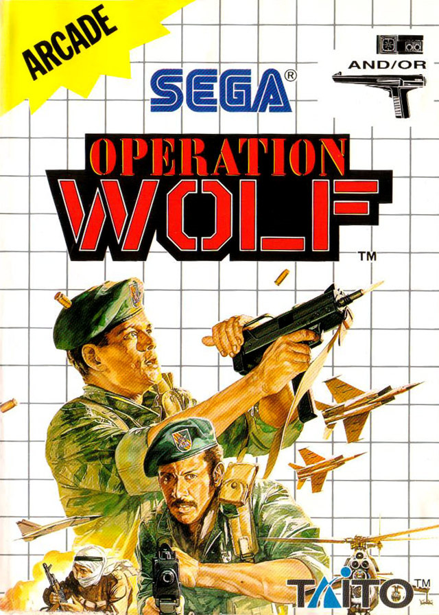
This is Operation Wolf 4 BTW.

The original is still a classic and I can remember when everyone wanted the NES cart due to how violent the arcade original was. Alas it was the NES.
 

ReBurn

Gold Member
Wut? N64 games are stunning compared to their PS1 counterparts. It’s night and day.
I mean aside from the stock Vaseline filter and fairly persistent 20 fps you're probably right. N64 games have more Vaseline than the tissue in a teenager's waste basket. At least it has a z buffer.
 

Redneckerz

Those long posts don't cover that red neck boy
Typo in your title boss - Opreation instead of Operation.

I am going for that devil's advocate take and say i like the chunkyness of this game. It is done by the Taito Power-JC System - A rather obscure machine from the 90s that was meant to go toe to toe with Sega and what not. Alas, Power-JC does not even hold a candle to Model 2 visual - but the Type Zero, which came after, was rather intriquing for its custom graphics unit.

Also what many find ugly today isn't what many found ugly back in the day - the mid 90s were all about discovering that accelerated 3D and amany were software, that had to run on 486-based machines and a cheezy Cirrus Logic VGA card. Software rendering was dope back in the day.
 

Alexios

Cores, shaders and BIOS oh my!
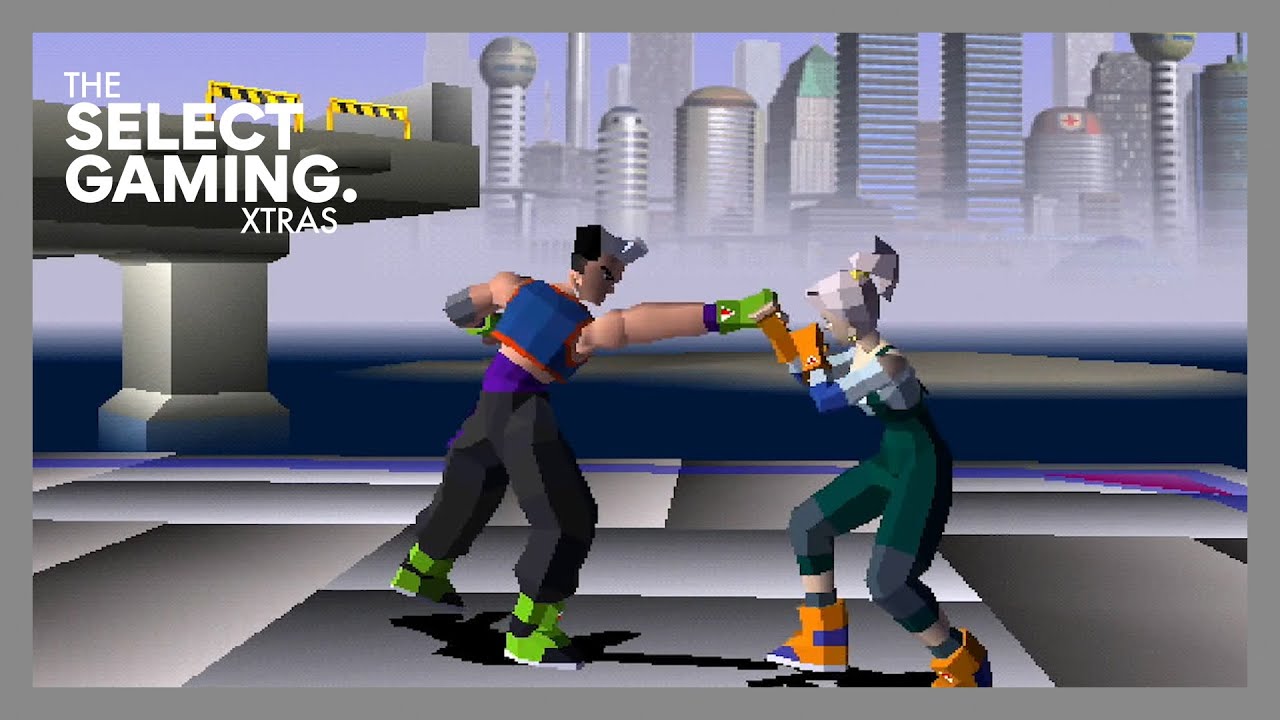
How is ~'98 the era of ugly 3D arcade games, there were beautiful stuff before/by then, Daytona USA 2, Virtua Striker 2, Sega Rally 2, Virtual On 2, Virtua Fighter 3 and loads more (even way older). In the same genre there were stuff like these. Ugly games always exist, including the current era.


Now of course these were on the most powerful boards of the time but you still had plenty great stuff that hold up even in the previous Model 2 / System 246 or whatever era with basically 32bit console graphics sans issues like low framerates/res, polygon/texture warping, low res textures etc.
Sega Saturn had some really ugly 3d games, like Virtual Hydlide.

It was the generation of butt ugly 3d games, but hey - at least it was new and therefor always better than 2d games like SotN or Rayman.
Funny how the Saturn had a boatload of awesome 2D games and great companies like Capcom, Treasure, SNK, didn't have to compromise their vision/ports much (and plenty great 3D games) and it was PS/Sony that shunned 2D making stuff like SOTN the exception rather than the rule on it.
 
Last edited:

Azelover

Titanic was called the Ship of Dreams, and it was. It really was.
First one that came to my mind too. Easily the ugliest game I’ve ever seen.

bubsy-3d-06.big.jpg
I like flat polygons for some reason. I think it's charming.

Might have something to do with nostalgia. It looks crisp to me. Fully textured games from that era look a lot uglier.
 
Last edited:

nkarafo

Member
I mean aside from the stock Vaseline filter and fairly persistent 20 fps you're probably right. N64 games have more Vaseline than the tissue in a teenager's waste basket. At least it has a z buffer.

I see you never played more than a handful games on the N64.

Anyway, i think the Saturn had the ugliest 3D games during that gen.
 
Last edited:
They both looked fine for their era. And considering they were doing things never done before, and 3D graphics were barely a thing by their release, they looked pretty good.
You're making it sound like Thief released in 1994 or something. It came out in 1998, shortly after Half-Life and over half a year after Unreal. People definitely knew they game wasn't a looker, and they weren't shy to point it out. I remember reading a review as a kid where they jokingly praised the game for being so dark because that made it harder to notice how blocky everything was.
 

nush

Member
I’d say that the Saturn is the king of bad 3D graphics. Hang On GP is one of the ugliest games I haver ever seen.

Agree, the early stuff was horrendous but it didn't stay that way once better libraries and more experience was gained on how to code for the Saturn.
 

Mato

Member
Are you guys making fun of low poly again? I can't imagine what the history of art would be like if it was solely focused on realism. No Cubism, no abstract expressionism... Low poly is absolutely an art style. If an older game is ugly it's because of bad use of color, light, bad image quality and other variables.
 
There were a lot of ugly ass games back then, but a lot of these games look very different in motion, and ALL of them look very different on an actual CRT. Not that it suddenly makes every game look great, but it helps quite a bit.

Early vs late gen was like night and day too, you have that NBA In the Zone listed above with some of the most embarrassing animation I've seen, but by late PSX you had legit motion capture and animated mouths, etc. 3D grew up really quickly.
 

nkarafo

Member
Are you guys making fun of low poly again? I can't imagine what the history of art would be like if it was solely focused on realism. No Cubism, no abstract expressionism... Low poly is absolutely an art style. If an older game is ugly it's because of bad use of color, light, bad image quality and other variables.

Low poly has it's charm but it's harder to make it look good. That's why a lot of 3D games from the late 90's era look ugly.

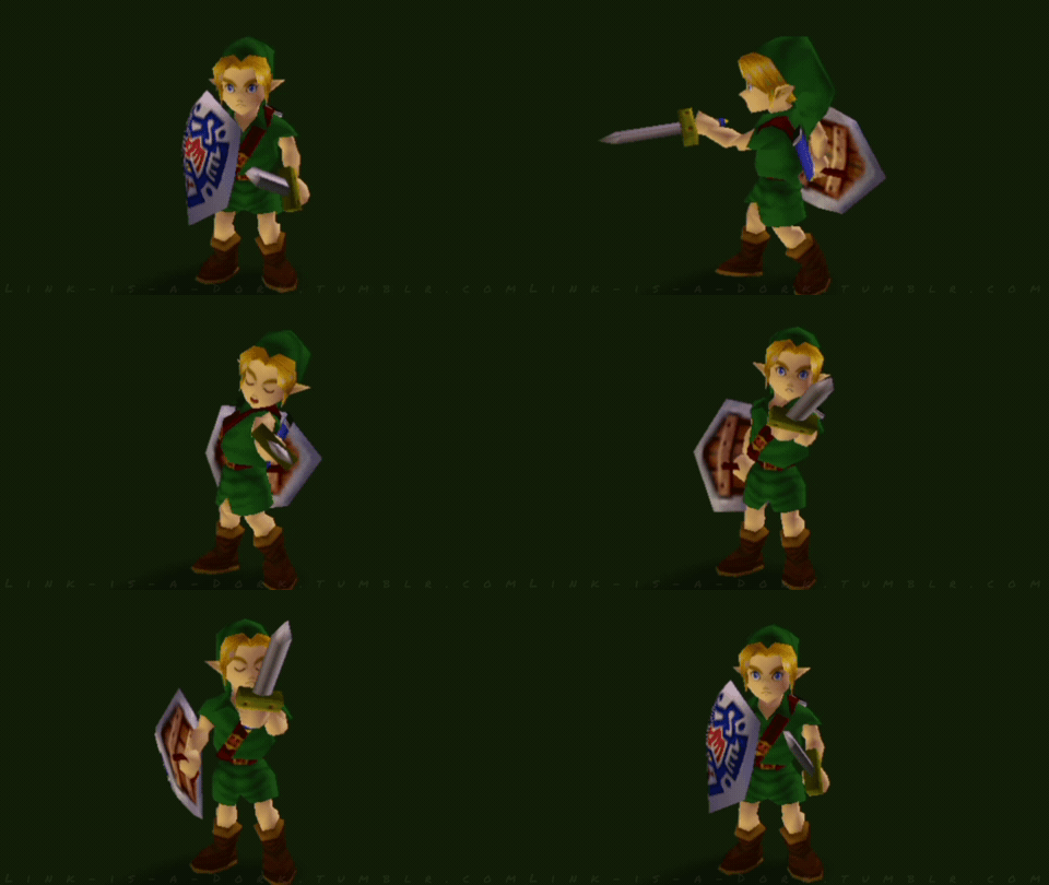
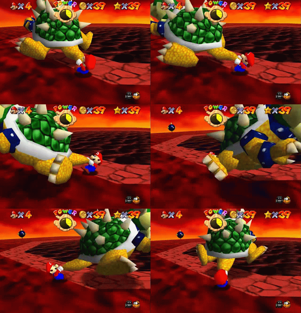
The issue is mostly the 3D models. Structures and environments are a non-issue because they use more flat areas and basic shapes. But something more complex such as animated 3D models and characters is much harder with a budget of less than 1000 polys (which i think was the max for models in that era).

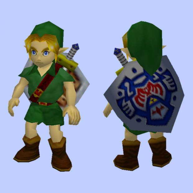
But with the right art direction you could make something attractive enough (N64 examples):

Young_Link.png


3320fff0dedbf28ed06fcd04c54bf6a79a9fcc4b.gifv


tumblr_oox8laJ9MI1ud0i5uo1_500.gifv


mario-bowser.gif


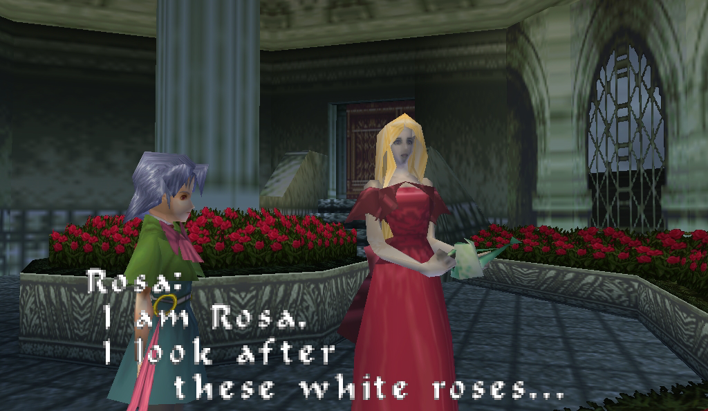
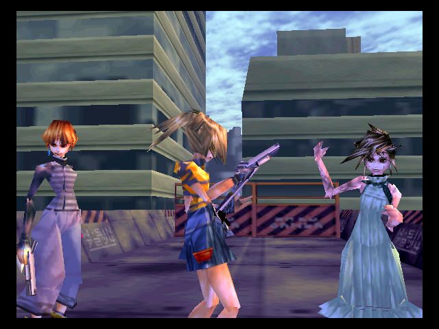
Otherwise you end up with something like this:

castlevania_n64_rosa_01.png


630885-sin-and-punishment-nintendo-64-screenshot-your-friends.jpg


tumblr_nvbhfeRkz71s3uawvo1_400.gifv


tumblr_pwpbbxOgRb1s3uawvo1_r1_400.gifv


Not shitting on Castlevania 64, Sin & Punishment or Body Harvest, they are all great but they also look hideous.
 
Last edited:

VGEsoterica

Member
How is ~'98 the era of ugly 3D arcade games, there were beautiful stuff before/by then, Daytona USA 2, Virtua Striker 2, Sega Rally 2, Virtual On 2, Virtua Fighter 3 and loads more (even way older). In the same genre there were stuff like these. Ugly games always exist, including the current era.


Now of course these were on the most powerful boards of the time but you still had plenty great stuff that hold up even in the previous Model 2 / System 246 or whatever era with basically 32bit console graphics sans issues like low framerates/res, polygon/texture warping, low res textures etc.

Funny how the Saturn had a boatload of awesome 2D games and great companies like Capcom, Treasure, SNK, didn't have to compromise their vision/ports much (and plenty great 3D games) and it was PS/Sony that shunned 2D making stuff like SOTN the exception rather than the rule on it.

L.A. Machineguns still looks legit to me today. I loved that particular generation of graphics/art style from Sega
 

Kadve

Member
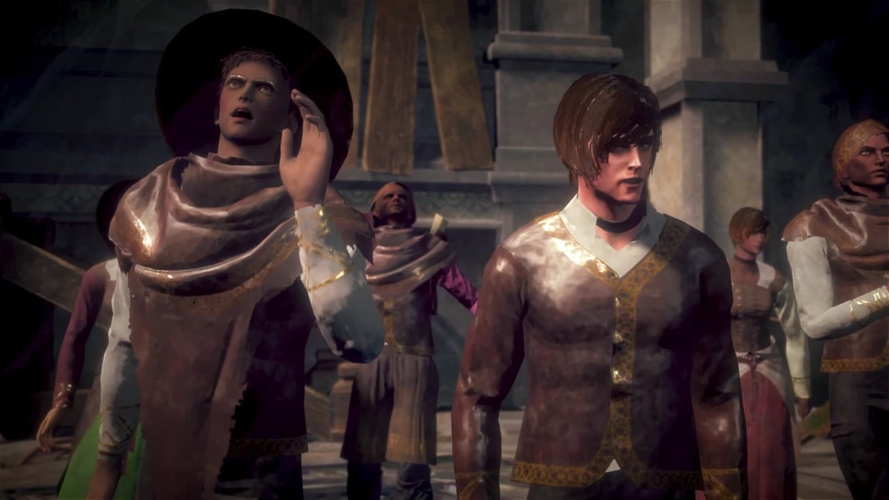
I have always wondered what's with the early 3d throwback games that we have now.

(No One Lives Under The Lighthouse as an example)

s1vOD6R.jpg


In what dimension does this look good?
 

Alexios

Cores, shaders and BIOS oh my!
I have always wondered what's with the early 3d throwback games that we have now.
Some look bad, some look good, some just prove that even though graphics have advanced well beyond what they immitate (even if they do use newer tech) they can still offer engrossing experiences (on top of being the only way to actually complete a project by a solo or small dev). Some fail.
 
Last edited:
Top Bottom