• Hey, guest user. Hope you're enjoying NeoGAF! Have you considered registering for an account? Come join us and add your take to the daily discourse.

This is a big downgrade - Silent Hill 2 Remake

RaduN

Member
The original just has static RE-like camera angles. The new version has proper cutscene/dialogue angles.

The CG portion of the cutscenes is well done in SH2. The realtime parts are not great though. That was always my biggest critique of the game. Even back then, coming from the spectacular MGS2 realtime cinematography, this was a letdown.
 

RagnarokIV

Battlebus imprisoning me \m/ >.< \m/
I gave you proof, you are just doing what a classic leftist does, gaslighting everyone , that doesnt work here friend

Recording On Air GIF

With replies like that, could we be going live soon?
 

RoadHazard

Gold Member
The CG portion of the cutscenes is well done in SH2. The realtime parts are not great though. That was always my biggest critique of the game. Even back then, coming from the spectacular MGS2 realtime cinematography, this was a letdown.

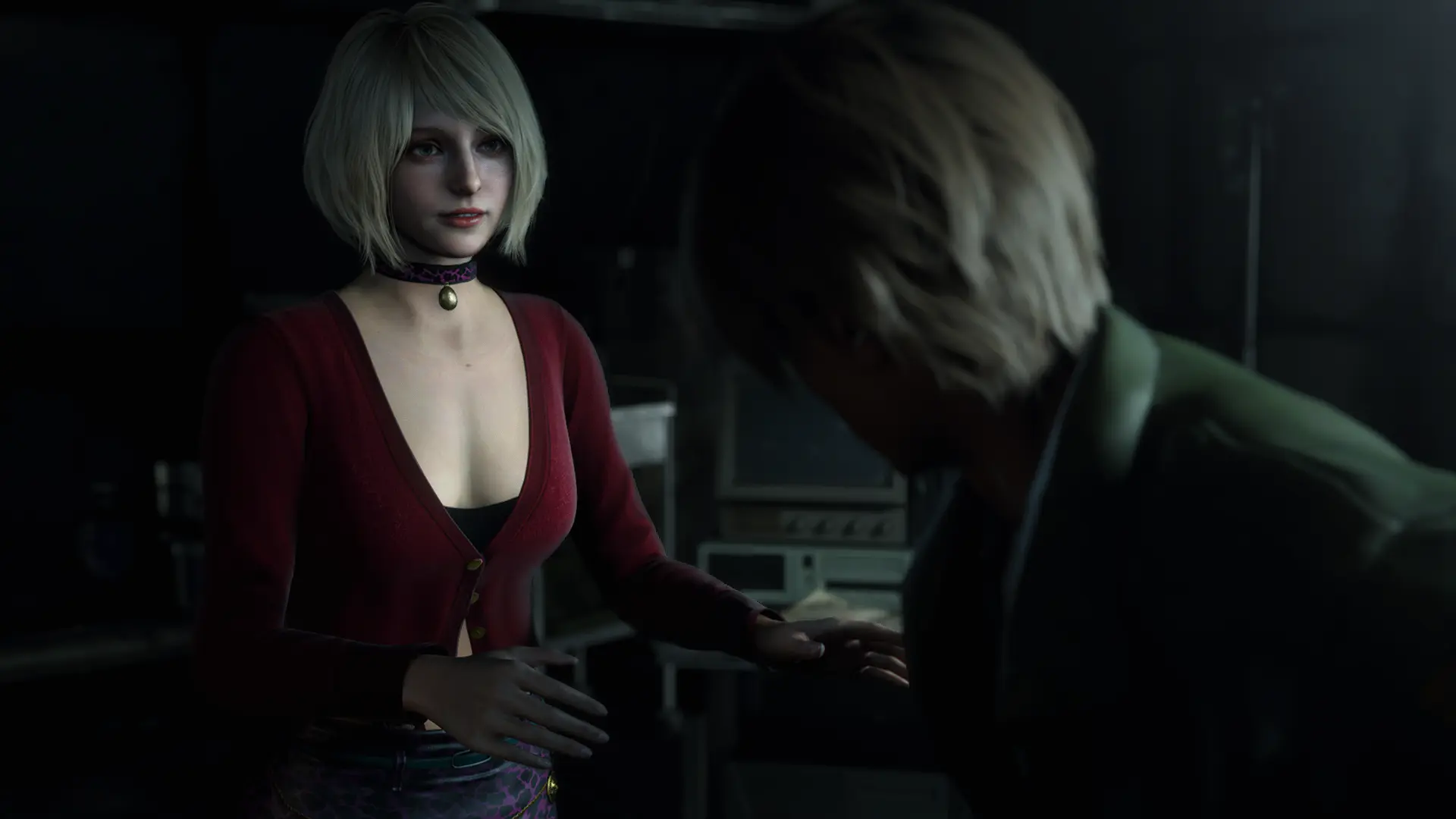
Yeah, I mean the real-time parts, like when he meets Maria. That clearly looks better in most ways in the remake.
 
Aside from the slutty outfit, old Maria had this disturbing smile that stayed with me, now she's more or less a generic woman.
Intentional or not is completely irrelevant. That plastered-on, creepy smile she had in the OG was the most striking part of the character to me to begin with. All the characters exist in that bizarre Twin Peaks-ish twilight space between dream logic, silliness and being creepy as fuck. And again, whether elements of that are unintentional doesn't matter. The vast majority of its fans interpret the outcome the same way. It creates unease. It works.

I have to reserve final judgment until I play the remake but yea I mean, it's a modern remake. The main goal is to make a game newer generations have heard about by way of reputation palatable to them so they'll buy it. SH2 is a gloriously weird product of its era, this will be a polished cover version for people raised on The Last of Us. It is what it is. Kind of a big shrug for me, I have the amazing Enhanced Edition.
 
What's with the new upbeat music in the first video? jeez.

Also, the "bad" voice acting in the original, intended or not, only further enhanced the dreamlike atmosphere of the original. This new dialogue might be more "real", but also makes it more generic and borderline cringey.

Maybe the game might have been good as its own Silent Hill entry, but as a remake this looks like a flop.
 
Last edited:
eh, I just see it as the original was on PS2 and the remake is on PS5 (PC) so they just have way more polygonal budget etc to pack in a lot more detail so things will look different regardless 🤷‍♂️ If all you want is the original in 4K, there's an enhanced edition mod for PC that will give you exactly that. Better yet just play the original on PS2, the grainy look gives it a grindhouse vibe that adds to the experience
 

Ponderling

Member
Liking the new James actor and the visuals are amazing but I never expected this remake to come close to the original, team silent had something special going on back then. Day one just to walk around and soak up the atmosphere but some of these new performances, especially Maria's are terrible.
 

Gonzito

Gold Member
eh, I just see it as the original was on PS2 and the remake is on PS5 (PC) so they just have way more polygonal budget etc to pack in a lot more detail so things will look different regardless 🤷‍♂️ If all you want is the original in 4K, there's an enhanced edition mod for PC that will give you exactly that. Better yet just play the original on PS2, the grainy look gives it a grindhouse vibe that adds to the experience
Polygons have nothing to do with talent and understanding the original material

Man the gaslighting of some people is hilarious
 

StueyDuck

Member
There's simply too much to be said about how wrong the remake gets...everything basically.
It's a fail.
For me it's the perfect analogy of a skin suit.

Something is definitely wearing a silent Hill 2 skin and pretending to be it. But it's just not recapturing the feel of the original title at all. It's hard to quantify why it's not right when the whole point of SH franchise in general is to be off, raise the hairs on your neck, make you feel uneasy.
 
Last edited:

RPCGamer

Neophyte
Fuck outta here with your gaslighting, it means what it actually means, pushing ideologies that go against the so called patriarchy, in this case removing anything that has any edge, sex appeal or harmless banter because it might hurt the feelings of someone.
No gaslighting. It's just how I see the word used nine times out of ten.

As for the game, I don't have any real connection to the series, but if people feel that strongly against this interpretation, I guess the best thing to do is wait and see. A good example of the interpretation is the Siren series - think it was made by the same person as SH thinking about it. The original was given a remake on PS3, but the creator called it something like a westerners version. Bit like The Ring films I guess.

This game might be something I get years down the line, but we'll see.
 
Last edited:

RPCGamer

Neophyte
For me it's the perfect analogy of a skin suit.

Something is definitely wearing a silent Hill 2 skin and pretending to be it. But it's just not recapturing the feel of the original title at all. It's hard to quantify why it's not right when the whole point of SH franchise in general is to be off, raise the hairs on your neck, make you feel uneasy.
As I said in a previous post, I think the limited art style fitted the creppy aesthetic better. Less is more etc...
 

Naked Lunch

Member
Bloober was always the wrong team for this project.
This was known from day one.

There was only ever one Team Silent - and they are long gone.
They captured that lightning in a bottle - once in a generation - creative vision that we havent and wont see again in gaming.
The Silent Hill series should have been retired from that point on.

For me, I just enjoy and revisit the original 3 games on PS2 (and sometimes The Room as well), when I get the urge - and ignore the rest.
I refuse to ruin my memories of the originals by playing these remakes and piss poor HD collections.
 

StueyDuck

Member
As I said in a previous post, I think the limited art style fitted the creppy aesthetic better. Less is more etc...
It absolutely helped, but I still feel a talented person can do the same with modern visuals.

Konami just did what Konami does best, made the wrong decisions... I don't know who would've been the right studio for this remake. But bloober wasn't it.
 

BlackTron

Gold Member
eh, I just see it as the original was on PS2 and the remake is on PS5 (PC) so they just have way more polygonal budget etc to pack in a lot more detail so things will look different regardless 🤷‍♂️

If only the PS2 was powerful enough to render all the polygons for those big heads but alas, they had to narrow the jawline due to technical limitations...
 

Kasane89

Neo Member
The biggest difference to me is, that the female characters are just not likeable. the tantrum angela pulled in the remake clip compared to the og...eww, i just wanted her to leave already. unbearable
 

MujkicHaris

Member
The remake lacks the subtle shadow-light play and presents it too safe. This type of game has to have strong contrast, it's 101 of the genre.
I mean just look at the example below. Without zooming, it's obvious that the remake has its ambient light cranked up resulting in lack of contrast, depth, especially on characters. I will go even further and say that the image on the left looks way more realistic.

PqlLEAz.png


Kk1M6vQ.png


Also, another important thing... Environment textures. Beautiful textures on the left in the example below. Remake looks like it's afraid to step out of any bounds set by modern muddy, plastic-looking PBR. Too muted and flat, where is the grittiness, dirt? Just because you have volumetric light it doesn't mean you have to mute everything in the background. Not to mention that the cutscene lacks diversity in camera expression. Slap some over-the-shoulder, flip the camera a couple of times and call it a day.

BOKk3pc.png


The remake does look acceptable but I don't think that's enough and fair for series as legendary as SILENT HILL.
 

Nickolaidas

Member
The urgent need for some to have attractive and "fuckable" video game characters needs to be studied by psychologists.
Honestly, it's not about being fuckable. I don't want *every* female character to bounce her tits and flaunt her ass like she's a character from a Korean gacha game (though those are nice).

My problem is that female faces in western games are starting to have so exaggerated facial expressions that literally piss me off. Also their facial features are more and more androgynous. And what annoys me the most is that devs do this ON PURPOSE. It doesn't matter whether they do this because they're scared so much of the next kotaku hitpiece or whether the devs themselves feel that female breasts, make up or buttocks must never be shown on screen ever again, the result is the same.

Female beauty is censored, and that is flat out retarded.
 

MiguelItUp

Member
Saying the video in OPs post is "woke" is the epitome of looking for something in nothing IMO. I mean come on man, lmao.

In majority of the clips and videos you can see that Maria, while looking a bit different, still has the same personality. If not more so. She just has a new outfit. Is that new outfit "woke"? The new design? It really shouldn't be. But people love to believe what they want to believe.

There were numerous articles stating how Konami wanted to change more than what Bloober wanted to. Bloober wanted to stick to the source material moreso apparently.

I feel like a lot of people want this to fail, because they hate Bloober, they "love" the original so much, etc. I wouldn't be surprised if majority of the "loudest" voices are coming from people that weren't interested, that were never interested.

I also know that Konami/Bloober consulted Sweet Baby Inc in some way. How? I don't know. We don't know. But they're a consultation company. Which means studios ask for their assistance, they provide, and the studio decides if they want to go with them or not. But of course you have the brigade that sees the name and wants to rage without knowing any context. If you were to ask me, I wouldn't be surprised if they contributed to things revolving around mental health, or something similar. It makes sense to me as SH2 contains characters that display various forms of broken. Konami/Bloober were probably concerned about things being "offensive" or something along those lines.

Regardless, they don't push developers and publishers aside and force them to make changes. That's not how consultations work.

Seeing folks blow their gasket in here because others don't agree is pretty wild. Especially to call them Era members when they're just like, "Nah" or "I don't know bro..." lmao.

I'm not a fan of a lot of modern art styles, hell, I'm not a fan of a lot of modern tropes in games. But in the end I just want good/great games, and if this can be one of those, I'm beyond happy.

When the original Silent Hill 2 dropped I was 13/14 years old. I played it, loved it, and it left a lot of marks. Primarily because there was no other game I had played at the time that revolved around the content it did. I still love the original, and will continue to regardless of how the remake is or turns out. At this point I just hope it's decent, and if it's more than that to me, cool.

Also, side note: Maria's original outfit is in the game. You can look at it, and she also holds it up. What if there were alternate outfits and she could wear it? You never know. 🤷🏻‍♂️
 
Last edited:
Top Bottom