BattleMonkey
Member
Game looks more Clone Wars to me now than it did before. The artstyle especially with how they are doing textures seems to be alot like the current show. The original reveal visuals were just ugly.
bjaelke said:Force choke: October 2008 vs. April 2011
Lightsaber duel: October 2008 vs. April 2011
Came across it on the official forum. Just amazing how long they came since those cartoon-y, clone wars-like pictures released 3 years ago!


Billychu said:This thread is becoming difficult to read on my phone.

Billychu said:This thread is becoming difficult to read on my phone.
http://www.imgur.com/NELX4.jpg[img][/QUOTE]
[url]http://www.neogaf.com/forum/showthread.php?t=329737[/url]
It's like Christmas came early! And twice! Not as good as a native app, but it seems really useful regardless.czartim said:
BattleMonkey said:Game looks more Clone Wars to me now than it did before. The artstyle especially with how they are doing textures seems to be alot like the current show. The original reveal visuals were just ugly.


The update today wont be beta or release date related.czartim said:I'll be refreshing my email all day on the off chance...
bjaelke said:Good interview with Damion Schubert on companion characters and crafting: http://torwars.com/2011/04/29/swtor-crafting-damion-schubert-video/
The update today wont be beta or release date related.
shhhh yes it willbjaelke said:The update today wont be beta or release date related.
Well, regardless of whether it is or not, on May 4th EA will announce its full year release schedule broken into quarters so we will be pretty close to a date regardless.czartim said:shhhh yes it will
yes it will
Which also happens to be the unofficial Star Wars day.Nirolak said:Well, regardless of whether it is or not, on May 4th EA will announce its full year release schedule broken into quarters so we will be pretty close to a date regardless.
bjaelke said:Force choke: October 2008 vs. April 2011
Lightsaber duel: October 2008 vs. April 2011
Came across it on the official forum. Just amazing how long they came since those cartoon-y, clone wars-like pictures released 3 years ago!
Take a look at this Sith Warrior as he develops and amasses power in The Old Republic. While there are many paths to choose from, this example gives you a small glimpse of the armor and abilities a Sith Warrior can claim as he pursues his own destiny.
Hello everyone, my name is Michael Voigt, and Im the Lead UI Artist here at BioWare Austin. In this blog, Ill share some of our vision and goals for the user interface in Star Wars: The Old Republic and the solutions that we used to achieve them.
You can still wear "traditional" robes later on. They have a lot of different designs already: http://media.dhcdn.com/2011/04/4792/4792-1020x700.s_cam14.jpgMadraptorMan said:Holy crap Sith Marauder looks badass...do you have to become all cybernetic roboty looking though? Or can you stick with the cool cloaks n such?
Derwind said:Damn people are quick here.
Just wondering, by the video it shows the Sith Marauder using stealth. I didn't think that class had that ability. Why does it have it?
I hope we can change that around cause...bjaelke said:
BattleMonkey said:There was a preview that showed one of the Jedi classes had stealth as well, though it sounded limited in nature. The sith Stealth possibly is the same and not a full blown stealth like a rogue in other games.
They mentioned it in the developer blog with advanced classes. It's called Force Cloak:Derwind said:I thought only Consular Shadow and Sith Assassians were the only Jedi able to utilize stealth. :/
I was surprised that a marauder could use it as well...
Instant. 1 min. cooldown. Obscure yourself with the Force, becoming difficult to detect, greatly reducing your threat, and increasing movement speed by 30% for 6 seconds. Dealing or receiving damage ends the effect prematurely. Marauder ONLY.
Gvaz said:I hope we can change that around cause...
Gvaz said:I'm not looking for accessible, I'm looking for a clean interface with all the information I want, where I want it.
Inability to modify the UI is actually a mark against it, I'd say.
Speculator said:/QUOTE]
I'm totally making one of these.
I agree with you, it should be possible to rearrange the UI according to preferences. Unfortunately, it doesn't sound like it is available in the current build.Gvaz said:I'm not looking for accessible, I'm looking for a clean interface with all the information I want, where I want it.
Inability to modify the UI is actually a mark against it, I'd say.
Yes, the hotbar at the bottom of the screen can be expanded to show two lines of ability icons. Damion also talks about this here. You can also add two additional bars for more abilities right now - one at the left and one at the right.
Ability icons can be dragged around to different quick slots; the bar can also be 'locked' to prevent accidental dragging.
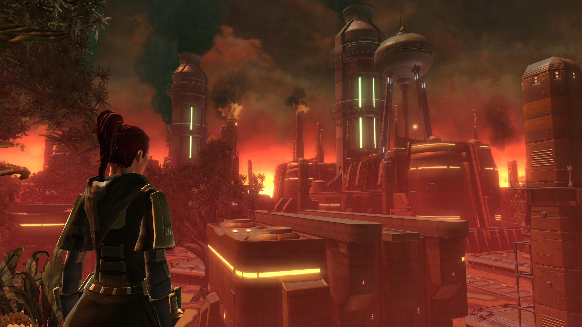
FYI, you can now see a bigger version of the final screenshot in the blog here. For those wondering, that Jedi Guardian is on the planet Voss.
Last but not least, something we can't convey in screens is that we have subtle but (IMO) pleasing sound effects associated with the UI that really make the game experience feel more Star Wars-y.
