The art style of the Demon's Souls remake looks terrible

I guess I'm just gonna have to come to terms with the fact that this is a remake more in the movie sense than the usual video game sense, as in, a completely different fucking thing only tangentially related to the original.

if we loose the "levels" in the process i will be happy.
 
Demon's Souls and Bloodborne are From Software games through and through.
Demon's Souls[a] is an action role-playing game developed by FromSoftware for the PlayStation 3 under the supervision of SCE Japan Studio. It was published in Japan by Sony Computer Entertainment in February 2009, in North America by Atlus USA in October 2009, and in PAL territories by Namco Bandai Games in June 2010. The game is referred to as a spiritual successor to FromSoftware's King's Field series.


Both are PS IP's so Japan Studios has the assets and have worked on the games.
 
washed out colors is an art style and many prefer it in these games since it gives a mood to it.these games have gotten rid of any mood and look generic now just like shadow of collosus

washed out was never an art styles, it was the limitation of the consoles and the engine at the time.
 
Oh gamers.... The insatiable whores of the XXI century.
No matter how much you give it to them, they are never fully satisfied.

-"I want a remake!"
Here's a remake
-"I don't like it" "too pretty! The original was darker"

-"I want a remaster!"
Here's a remaster
-"I don't like it" "higher res takes away from the original"

- "I want a powerful console"
Here's a powerful console
- "I don't like that color, not gonna buy it until you make it glow in the dark pink"

- "I want an ultra detailed game full of visual effects"
Here's the game you asked
-"I don't like it! That enemy belt buckle should be 2 shades darker"

This is so true. Gamers are acting like children.
 
Nowadays you can't get away with making a game that is literally 95% in shades of grey and greyish brown. With today's graphical detail it would just end up looking even more weird than the original did or was intended to.

One big problem is that the lack of detail in old games was often a limitation, but good studios built around it to turn it into a design and visual element. But transposing those games into current technology completely changes the baseline, and it's sometimes impossible to make a modern game really feel like the original at a first glance. It also doesn't help that Demon's Souls especially accentuated the lack of detail in several environment and monster designs, and that in general it was a bit of a mishmash of visual styled in and of itself. Which I'd even argue in some cases was more due to Miyazaki making the best possible game out of what he had been given, rather than an intentional design choice from the very start.

I guess I'm willing to argue that if in the original 9 places out of 10 were brown-grey walls under a blue-grey sky with almost nothing going on in the world other than a bunch of weird enemies roaming the map, that was enough of an intrinsic thing of the technology available back then and the particular circumstances in which the game was created that there should be room for more variety, reimagining and differentiation in a full remake done from the ground up to look like a next gen game and a more appealing experience. There are some things that would not work as well in a 2021 game, and would only be there because "they were in the original" even though they just don't belong.


All of that said, we can definitely argue the direction the new designs went. But I think it's better to see a bit more of the game in its wider scope before calling it either perfect or terrible.
 
Last edited:
It looks amazing. If I am obsessed with the original art style I will play the original.

How anyone can come away and not think it looks breath taking is beyond me.

Subjective and assumption.
How dare they like different things than you, darn bastard should like what I like! ¯\_(ツ)_/¯
 
washed out was never an art styles, it was the limitation of the consoles and the engine at the time.
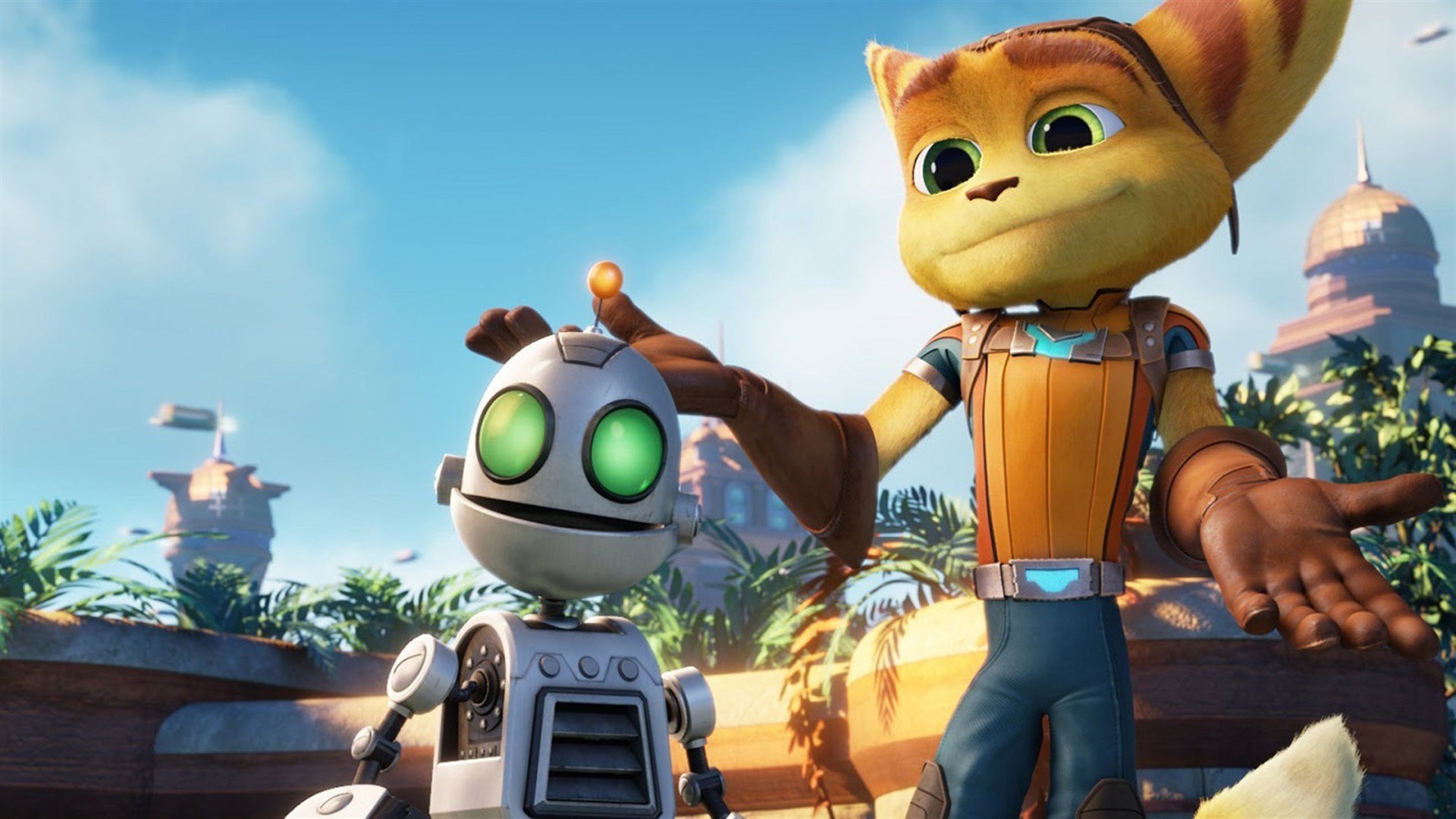
What limitations of consoles forced developers to use washed out colors? Enlighten us. Even on PS3 you have games like Uncharted and Ratchet and Clank, which are anything, but washed out colors.
 
i think it looks great. in fact i think they've done a fantastic job improving the visuals. i would hate if they just faithfully replicated it. they've replicated it but made changes to make it look better. there is far more detail and the design changes to enemies/structures/areas is well done.

Why go through all of the trouble of a "remake" only to keep everything brown and gray? Don't let the technical limitations of the past hamper the future, I'm sure if they could have made the game look like this back then they would have.
 
Looks a million times better. In fact, I hope Bluepoint gives FromSoftware their engine because From's engine sucks balls leaves a lot to be desired.

EDIT: sucks balls is too harsh as Bloodborne is not that bad but certainly not PS4's finest hour.
 
Last edited:
Demon's Souls[a] is an action role-playing game developed by FromSoftware for the PlayStation 3 under the supervision of SCE Japan Studio. It was published in Japan by Sony Computer Entertainment in February 2009, in North America by Atlus USA in October 2009, and in PAL territories by Namco Bandai Games in June 2010. The game is referred to as a spiritual successor to FromSoftware's King's Field series.


Both are PS IP's so Japan Studios has the assets and have worked on the games.

"Supervision" = Sony paid for the game and are close observers.
 
Looks a million times better. In fact, I hope Bluepoint gives FromSoftware their engine because From's engine sucks balls.
My personal issue isn't with environments or the colour but enemy and boss overall re-designs, I personally wish they would improve the models without changing the designs. Currently it's very western design similar to Blizzard games and I'm really, really not fan of. I avoid Blizzards games because I hate that art direction and I really didn't want to see that in Demons Souls.
 
My personal issue isn't with environments or the colour but enemy and boss overall re-designs, I personally wish they would improve the models without changing the designs. Currently it's very western design similar to Blizzard games and I'm really, really not fan of. I avoid Blizzards games because I hate that art direction and I really didn't want to see that in Demons Souls.

Fair enough. I do agree that From's character art looks cooler.
 
Last edited:
Played all souls games. Love the franchise.

It looks great overall. The original had atmosphere because it looked like shit.

Redesign of enemies suck. They dropped the ball there and should go back to the drawing board Sonic style.
 
Last edited:
What limitations of consoles forced developers to use washed out colors? Enlighten us. Even on PS3 you have games like Uncharted and Ratchet and Clank, which are anything, but washed out colors.

Are you blind...there is a big difference in colors from ps3 to ps4.

the-ratchet-clank-trilogy-playstation-3-ps3-1337694400-153-12-1362709674-1280x720.jpg


ratchet-and-clank-ps4-playstation-4-1.original.jpg
 
The remake looks just awesome. Can't wait to replay it again! Remember to knock all the bodies down in the valley of defilement!
 
I do like the atmosphere in SOME shots, like how pitch black the area surrounding the Vanguard is, and there is a ton of added detail to the world, so I'm cautiously optimistic.

Of course, still think the original is superior(and the best From game), so I really don't like them not being involved or even credited... and I also feel like the PS5 is kind of needless. The PS4 still looks great, and I'd like to think it could handle this(though maybe I just don't want to buy a new system yet, lol).
 
Color-wise they missed the point in my opinion. The remake looks way too colorful, and does not respect the original gradients and tints.
 
Last edited:
Anyone saying this remake is "too colorful" or looks like a blizzard game or darksiders is either taking the piss or needs to get their head checked.
 
I reckon people should hang on until they've seen a bit more than 20 seconds of promo vid and 5x promo bullshots before writing a game off.
 
I bet this thread wouldn't exist if the game wasn't being remade by Bluepoint., and still looked the same as it does now.

They're adding detail to a game that's more than 10 years old - and when you do, things inevitably change.
 
Last edited:
Looks fucking mint. I'll be buying for sure.

Terrible? no OP. Your way off target.
 
Last edited:
People calling bullshots now,
can't wait to laugh in your faces a year from now, or so.

I thought it was quite obvious I was being flippant. You want to wait a year to laugh over a video game promo image being real or not? Whatever rocks your boat.
 
Last edited:
I thought it was quite obvious I was being flippant. You want to wait a year to laugh over a video game promo image being real or not? Whatever rocks your boat.
Wasn't directed towards you, really. I'm sure I'll laugh plenty this coming year over other things not pertaining to this thread and topic. Comedy is subjective, my boat will rock so fucking hard pretty soon.
 
Well, I loved the reveal and this is my no. 1 PS5 game I'm looking forward to. Of course the remake was going to look different, the way games are built nowadays is completely different in terms of lightning, so it was not possible to keep the same shades and colors. I'd argue though, if someone is that locked in with the original design, they can use PS3 emulation on PC, a remake will always have something different, otherwise it would literally not be a remake, but a remaster, and this one looks incredible so far.

Oh, and yeah, I think that intro is realtime. PS5 is doing some amazing things.
 
Shit looks so good and don't get it twisted og Demon Souls had alot of areas to fix so I'm glad they have out tht style and polish into it.
 
We're also missing sound and motion. It's hard to call a mood off of just a photo in an interactive medium.

The ray tracing is going to alter some lighting as well. I'm all for it. The design changes, I'm having a hard time deciding at the moment. One thing they are not is Blizzard or Darksiders.

Have you seen the Vanguard demon from PS3? There's not much there. The eyes and teeth are iconic, but he's basic as hell.
 
I prefer the original art style of Demons Souls, the designs in the remake seem to have a westernized look to it. The most evident in the trailer was the change in the design of Flamelurker (assuming it was Flamelurker in the trailer that they showed)

Not saying its bad, its just different.
 
I am worried it might lack the powerful atmosphere of the original, which had a spookier vibe than the other souls games... but it's too early to say.

I need to see gameplay in motion before I draw any conclusions, I don't think you can really tell the vibe from promotional images and the trailer.
 
This is pretty interesting.

This is kind of what I'm talking about. Even without "anime" art style you can easily tell difference between Japanese aesthetics and western aesthetics, even game like Ghost of Tsushima that has Japanese setting, its still very much western game both in design and aesthetics.

Again this still Bluepoints choice, they can make what they want but I don't like it, to me its not "upgrade" to change the Japanese aesthetics to western one.
 
Last edited:
This is pretty interesting.


That was a pretty good read but I do wonder though if it is the limitation of the hardware that makes some of these Japanese games more beloved. I've been feeling that way about Final Fantasy and even the latest Devil May Cry.

edit: a Jim Henson shop creature style for a big rpg sounds amazing. Make it kinda of spooking and not for young kids and I would be completely sold on it.
 
I get it, they're going off script. But a remodeled upresd Boss would look bland and grey.
People aren't saying it needs to be the exact same colors.
Just that it should try to hold close to the general feel that was gloomy and dreary. I don't think the only way to make a gloomy game is to look bland or have little details so I don't see any reason they couldn't have maintained the general atmosphere.
 
It's not really true considering voices differ in large populations. Satisfied people don't speak their minds as much as the offended.

I think treating gamers as one entity, one voice, is completely Innacurate.

Agree, I'm a gamer my self but sometimes we react like spoiled kids.
 
Top Bottom