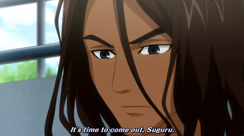
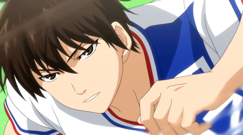
It's interesting looking at these screencaps because I haven't seen that far in Tsuritama yet and I actually feel something almost "opposite" to your opinion based on what I've seen (only the first couple of episodes).
From the very first trailer the colours have "confused" me slightly in that the backgrounds are painted with what I think of as "character art" colours. It's like I'm expecting the whole thing to move at any given time, like in the excellent
OP to Welcome to the NHK.
I agree that everything is very bright, but it also creates a very homogenous style in a slightly negative sense - for my tastes there's not enough contrast, to be honest. It's like the whole show is one big, bright, perky thing - and although that's admirable, I'm not sure it's necessarily my cup of tea. That partly extends to the characters, although having not watched enough of the show I don't think I can assess those fairly.


