tommib
Banned
How much should I be paying for it? I see crazy prices on eBay.I'd recommend buying the disc loose if you're going to do it.
How much should I be paying for it? I see crazy prices on eBay.I'd recommend buying the disc loose if you're going to do it.
I wouldn't pay more than $50 for it. You might call a local mom and pop store and see what they sell it for. If you can find it cheaper online, grab that copy. At first I would have said $15-$20, but it's gone up a lot since I last looked. A lot of the sold copies on eBay went for over $50. I'd filter the ones eBay has and see what the cheapest listing is. Also check other outlets, but don't spend $70 on it. lol I'd sell you my copy if you thought about that.How much should I be paying for it? I see crazy prices on eBay.
Would you recommend this to me, Vick?
It's expensive on eBay but I got a PS3 and never played it.
I would definitely recommend the game, but not on PS3.Would you recommend this to me, Vick?
It's expensive on eBay but I got a PS3 and never played it.
Same, Bus to Nowhere has stuck with me ever since.Also, Yamaoka is a genius, but I love the music in the entire intro section of Downpour by Daniel Licht. Rest in peace.
Was I asking youThis is not true. It looks better i was watching the 4k gameplay trailer and it looks pretty solid graphics and animation the acting is not bad at all.
Was I asking you
I just played Xenia PC version for about two hours. In 1440p at 60fps. The only issue I still got is shader compilation stutter, which is annoying. I hope it will lessen more and more as more shaders get compiled. But it is playable and looks pretty good.If you really want to give it a shot, I would try to track down the game on 360 along with a used Xbox, as that version is drastically superior in many ways and probably cheaper as well.
Enlighten us. What is it then?This is not a Remake. Not in my eyes anyway.
A low effort remakster.Enlighten us. What is it then?
A low effort remakster.

I'm willing to give it a chance. I only played the original SH2 many, many years ago. This still has another 4+ months of development to go and I'm hopeful it all comes together in the final stretch.
Realistically, it may not be on par with the original, but if it's a 7-7.5/10, that's okay for me if I'm honest.
Theres been many a game I've enjoyed that weren't critical darlings in my gaming time.
There is plenty of talk about how this remake is completely oblivious about original's subtlety in delivering the themes and narrative, and how completely off this one is, in terms of characterisation, VA and pretty much everything that made the original such a complex and cohesive experience in the first place.Unless you're a rabid culture warrior I haven't seen anything at all worthy of major complaint yet.
The negativity surrounding the game really makes me sad, because there are far more relevant things to worry about. Such as the fact that the content found in the original release is not going to be considered sufficient for a full-price release in the 2024 marketplace. Its a relatively short game, and the different endings don't add a huge amount to the play-time.
But no, rather than discussion over if and how they are going to address actual content and gameplay updating, we're side-tracked onto ideological conflicts about the width of a side-character's jawline. As if that matters to anyone!
There is plenty of talk about how this remake is completely oblivious about original's subtlety in delivering the themes and narrative, and how completely off this one is, in terms of characterisation, VA and pretty much everything that made the original such a complex and cohesive experience in the first place.
I mean, look a few posts above yours for a quick example of: i have no clue what the fuck the original was all about, but i'm the director of the remake.
Is this projection? I see no reason why non-SH fans will make up playing the classics just to shit on this game. Anybody who's actually placed the game, in the period it was released would know right of the bat that the gameplay was "clunky", even back then. That was part of the charm. But then fans would know this because they played the original game and jumping to the PS2 was a big improvement. Comparing it to modern control conventions is ridiculous and shows you're not arguing in good faith.What is truly baffling, is that a great majority of people complaining about this and calling the original SH2 a classic, have likely never played it, emulation or otherwise.
I mean we're going on the better part of 3 decades...
This is akin to REmake coming out and saying it looks horrible and if you really want to experience it, go back and play the PS1 classic.
I replayed SH2 and 3 this year, and 3 was great but 2 was damn near unplayable. Gameplay is/was shit... that damn wooden board.
Anyways, I'm excited and had zero hype or faith prior to this latest transmission.
This effort by Bloober looks amazing, and anyone saying otherwise is part of the problem, and the reason we can't have nice things.
Really? You're putting Bloober in the same category as CAPCOM's A-team? So whenever some one else makes an open world game, they should be given the benefit of the doubt that it will have the same quality as R* output? Come on, mate, please be serious. I know this remake has unearned criticism but nobody can take you seriously with responses like these.I think the criticism has gotten to the point that it's now just 'fans' being such jaded fucking bastards that even a pretty competent looking remake, and possibly the best traditional looking SH release since SH4, is being shit on over such pettiness. The Resident Evil remakes like RE2 and RE4 get a ton of praise and themselves had some similar concessions in minor areas like character design, yet when this gets a similar quality of treatment it gets mercilessly shit on. Double standards out the ass.
It's like people in this forum forget the PlayStation existed then. The games were janky and fiddly. It's why we've always wanted the next-gen experience. But we learned to love them anyways and going from that to the PlayStation 2 was a massive game changer for pretty much most sequels. SH included.If I hear one more millennial/zoomer say "janky" again and again (youtube reactions to this remake) I'm gonna crack some heads.
Look, I don't wanna play the age card for the sake of it, but to understand the bigger picture
and context of SH2's impact you had to be there back in 2001, I was 23 back then.
And this context is that even back then, it was 'janky'. Every seasoned gamer back then was perfectly aware
that is part of what makes it tick.
Impressions so far look decent imo, certainly refreshing enough in the parts where it's desirable.
And besides, they still have some time to polish things up before the master code goes gold.
You guys say boomers and us genX'ers are old men screaming at clouds, but you youngsters are quite the champions at complaining too.
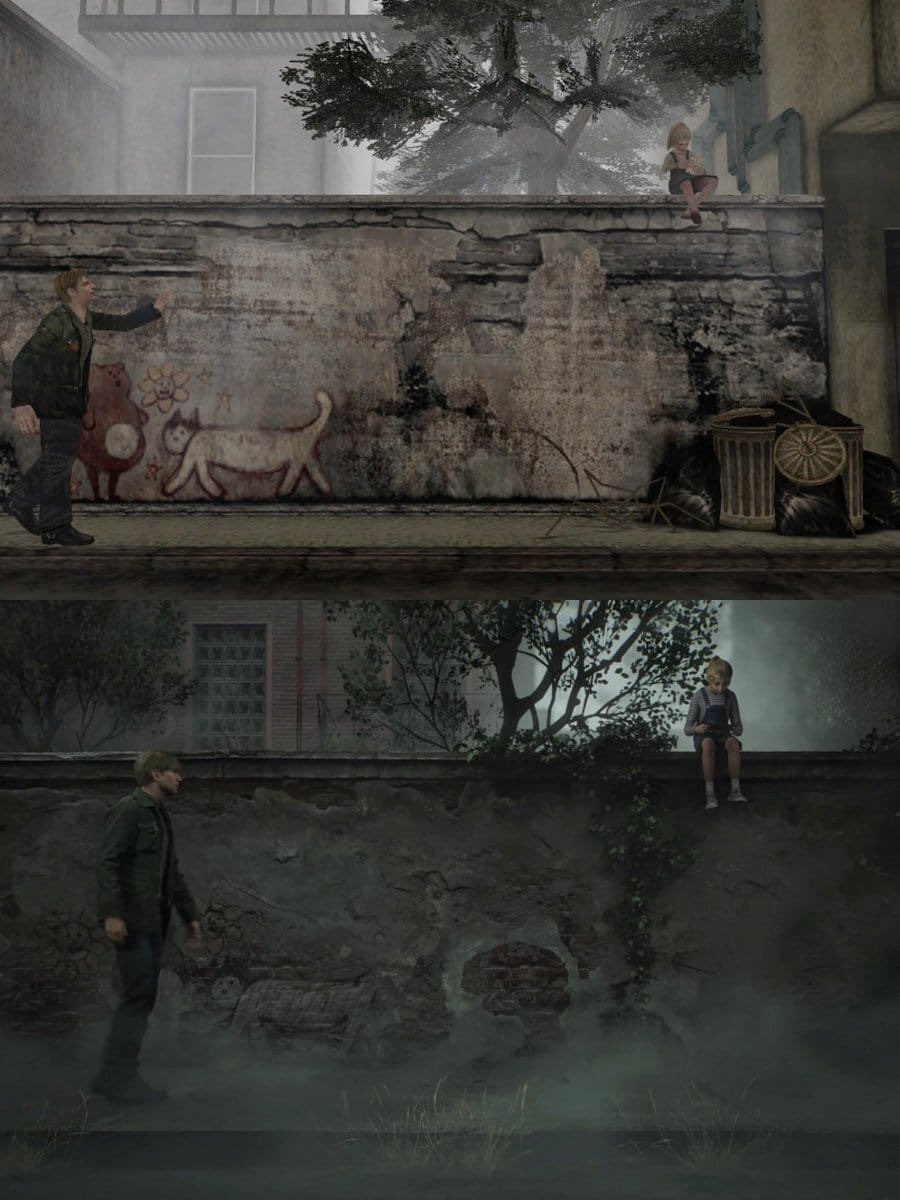
While there is a big jump graphicallyShe's meant to be out of reach.


Yeah the original was really ahead of its time and still holds up quite well visually.While there is a big jump graphically
This particular side-by-side doesn't really show it.
That's not a knock on SH2 Remastered visuals, But credit to the original.
It's made to think there a 23 year difference between them.
Nah. The perspective is the same (in that scene i mean). The Remk is simply not giving 2 shits about the symbolism, that's it.No, if you're talking about the Laura on the wall shots they probably had to change it keep it visually consistent.
See, interesting thing about Silent Hill 2 visually is that there are no ceilings. Well, strictly speaking every room*, almost every corridor, has its height artificially extended in order to accommodate the camera. Its a weird thing because based on the way the view works you tend not to consciously notice how "off" it all is. More problematically for Bloober, now they are upping the overall detail and changing the camera position I doubt they can get away with the same visual sleight of hand and will have to adjust stuff.
Go play the original, or watch a walkthrough and its very apparent that the dimensions of the games interior spaces are simply not realistically proportioned. Then compare it with the footage of the remake's gameplay... I think its pretty obvious that they've adjusted it down to make it more naturalistic.
Its funny, this is a massive, massive consequential detail of changing the presentation to fit modern expectations, and yet it's all about costume changes for the peanut gallery.
*Actually the one exception is the Flesh Lip fight as that actual needs the the weird double-height area for its mechanics.
Really? You're putting Bloober in the same category as CAPCOM's A-team? So whenever some one else makes an open world game, they should be given the benefit of the doubt that it will have the same quality as R* output? Come on, mate, please be serious. I know this remake has unearned criticism but nobody can take you seriously with responses like these.
I just checked but don't have it anymore. I would've sold it to ya at a reasonable price otherwise. I don't get the praise for it, thought it was yet another shitty SH Direct To DVD style sequel whwn it came out.How much should I be paying for it? I see crazy prices on eBay.

Silent Hill 2 was a showcase with shadows and fog. There was nothing like it. Shadow rendering was above anything else at the time. It was peak technology. Your lantern would cast real time shadows on everything. I never saw that before SH2 back in the day.First of all, asKiller8 said, you have to be delusional if you thought that gameplay reveal looked bad. I mean the details, lighting, seamless fog. It was amazing, not sure what some of you here are expecting. Secondly, all those that are so stuck on the old SH2 and making comparisons, I really think you should look at the faces of the characters from then and then compare. They look so outdated and doll-like. Not sure if its this thread or another one that made a screenshot of side-by-side of new and old designs. It's laughable but the point is people have some nostalgia effect not letting them think those old faces look way worse than the ones today.
Also SH was never a graphical powerhouse even at its peak so not sure why the already great-looking remake needs to reach some impossible graphical fidelity as if it was known for pushing boundaries. You say controls and gameplay looks janky? Have you played old SH 1-3? What exactly are you comparing it to because I dont see new resident evil games doing any better. This isnt The Last of Us. You arent some superhero that can wield every weapon perfectly or climb a building with his bare hands. You are just a dude that picked up that plank off the floor.
I agree. They destroyed plenty of plot derivatives within the last trailer alone. I was assured I would get a code to test this under the sheets...She's meant to be out of reach.

Looks like she's just chilling and playing Animal Crossing in the remake.She's meant to be out of reach.

Silent Hill 2 was a showcase with shadows and fog. There was nothing like it. Shadow rendering was above anything else at the time. It was peak technology. Your lantern would cast real time shadows on everything. I never saw that before SH2 back in the day.
That's Flightsim or HB2.And what exactly is the problem in the Remake with the fog? Its the best fog I have seen yet in modern gaming.
Mmm....no.First of all, asKiller8 said, you have to be delusional if you thought that gameplay reveal looked bad. I mean the details, lighting, seamless fog. It was amazing, not sure what some of you here are expecting. Secondly, all those that are so stuck on the old SH2 and making comparisons, I really think you should look at the faces of the characters from then and then compare. They look so outdated and doll-like. Not sure if its this thread or another one that made a screenshot of side-by-side of new and old designs. It's laughable but the point is people have some nostalgia effect not letting them think those old faces look way worse than the ones today.
Also SH was never a graphical powerhouse even at its peak so not sure why the already great-looking remake needs to reach some impossible graphical fidelity as if it was known for pushing boundaries. You say controls and gameplay looks janky? Have you played old SH 1-3? What exactly are you comparing it to because I dont see new resident evil games doing any better. This isnt The Last of Us. You arent some superhero that can wield every weapon perfectly or climb a building with his bare hands. You are just a dude that picked up that plank off the floor.
Really, are you sure OG Silent Hill 2 had better facial design:

Never said that. Just acknowledging that the original was a graphical powerhouse. The remake has amazing fog as well.And what exactly is the problem in the Remake with the fog? Its the best fog I have seen yet in modern gaming.
ps. As others said, the original was an incredible graphical achievement back then, and it's sequel too.
Reading a lot of the comments in this thread and others, I wonder why would any developer try to please whiny little bitches, it serves no purpose they wont be pleased no matter what. One guy is complaining about a fucking graffiti, the original game had graffiti in some walls, that I am not going to look for them, they are there. And some other people are complaining for such ridiculous stuff which is ok, if they don't like it that is fine, but stating that something turns to shit just because they don't like something is ridiculous, because it's not a quality of the product issue, it's a personal dislike and that's it.I don't get blooper team, they are wondering why everyone hates them. Then nearly every person says that the Angela design is not good.
But instead of appreciate the feedback, they are just like: STFU, we are not changing that.
So there they have one reason why everyone hates them, but they are just in denial.
Silent Hill 1 was more graphically advanced and immersive compared RE2, you are comparing a game with full 3D scenery to a semi 2D title with pre rendered backgrounds.Sorry but no. I was there when RE2 was killing it in every magazine and when SH1 came out it looked dated and was talked about in reviews. SH2 and 3, nobody said they didnt look good but no, nobody said this is some out of this world graphics that people expect now.
Silent Hill 1 was more graphically advanced and immersive compared RE2, you are comparing a game with full 3D scenery to a semi 2D title with pre rendered backgrounds.
_04.png)

I think people forget that Silent Hill had a town map on the PS1 rendered in 3D?
He's not wrong.
Late 90's PS1 3D didn't look flattering even back in the day.
RE2's pre-rendered backgrounds give it a distinct visual advantage when looking at them both.
_04.png)

I think people forget that Silent Hill had a town map on the PS1 rendered in 3D
They was pushing the system and that's why it aged badly
I quite like SH1 graphical style despite its limitations, it was a decent effort. But in all fairness a game like Soul Reaver which also came in 1999 showed that PS1 could produce much more impressive visuals in a fully 3D world.I think people forget that Silent Hill had a town map on the PS1 rendered in 3D
They was pushing the system and that's why it aged badly
Lmao she looks like a regular person instead of an actress.
